
Honda Debuts Stripped-Down Logo Symbolizing Its Future With Electric Cars

Image via Honda
Honda is gearing up for a new era in electric mobility, and it marked this fresh direction with the introduction of a new logo at CES 2024. The updated emblem, set to grace oncoming EVs, denotes the automaker’s embrace of the electric revolution, heralding a new chapter in its storied history.
Since its last update in 1981, the ‘H’ mark has become an iconic symbol of Honda’s identity. Recognizing the winds of change in the automotive sector, however, the company has now chosen to refresh the monogram to align with its foray into more sustainable models that represent the future of mobility.
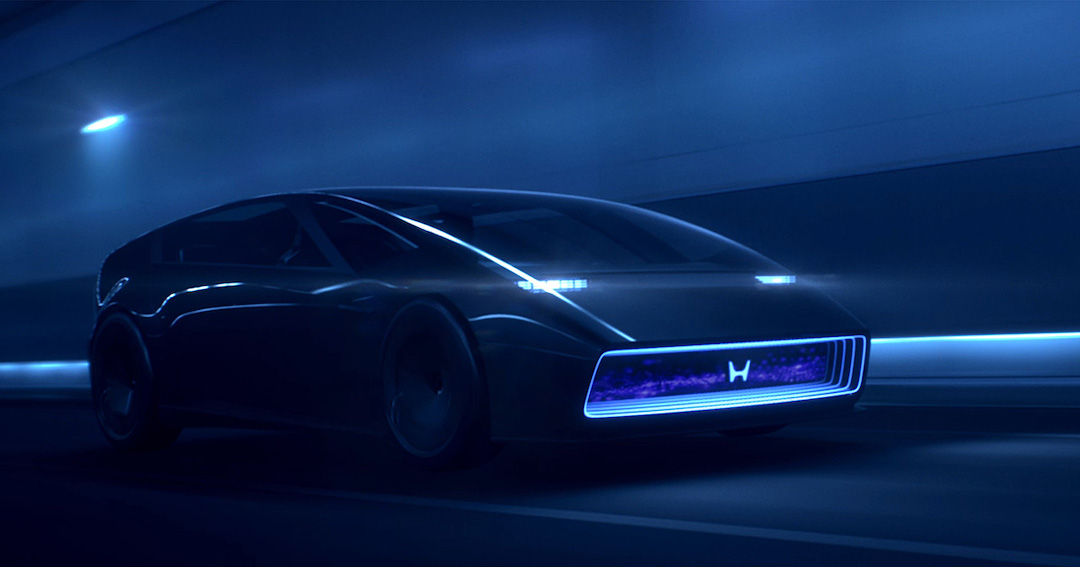
Image via Honda
The sleek design is a departure from the traditional look, opting for a frameless ‘H’ that exudes a modern, minimalist vibe. This iteration mirrors the evolving nature of Honda’s vehicle lineup, particularly its upcoming 0 Series of electric vehicles, which are “thin, light, and wise.”
The sides of the ‘H’ in the new logo are less upright than its predecessor, creating a sense of dynamism and fluidity that speaks to the brand’s vision of progress and movement.

The old H mark (left) VS the new “frameless” H mark (right). Images 161068688 © Fiskness | Dreamstime.com and Honda
The vertical lines also resemble two outstretched hands, nodding to the brand’s dedication to expanding the possibilities of mobility and continuing to meet the changing needs of its customers. They’re a visual representation of the company’s commitment to innovation and adaptation in a rapidly shifting automotive landscape.

Image via Honda
As Honda charges into the EV market, the new logo stands as a beacon of its readiness to drive into the horizon and is poised to adorn its electrified, next-generation models.


