
The CW Trims Down Its Name & Logo But Leaves A Tingle On The Tongue

Image via The CW
The CW is channeling a new image to spice up its brand identity. This overhaul, led by Chief Marketing Officer Chris Spadaccini, comes on the heels of Nexstar Media Group’s acquisition of a majority stake in the network.
The brand is now dishing out a “CW hot sauce” with its new red-orange color palette, complemented by pink “icing” and light green “mint” accents.
Spadaccini, who took the helm of The CW’s marketing efforts following the Nexstar takeover, has been the driving force behind this transformation. The facelift aims to present a more unified and modern image for the network, and this includes not just the eye-catching new color scheme but also a logo revamp and the introduction of new branding elements like ‘the stage’ network symbol and a sonic branding system.
🚨BREAKING: The CW debuts a new logo pic.twitter.com/l7R5fpN3Fj
— The CW news (@CWshows) January 12, 2024
One of the most noticeable changes is the simplification of the logo, distilling “The CW” to just “CW.” Accordingly, this tweak enhances readability on digital platforms and mobile devices.
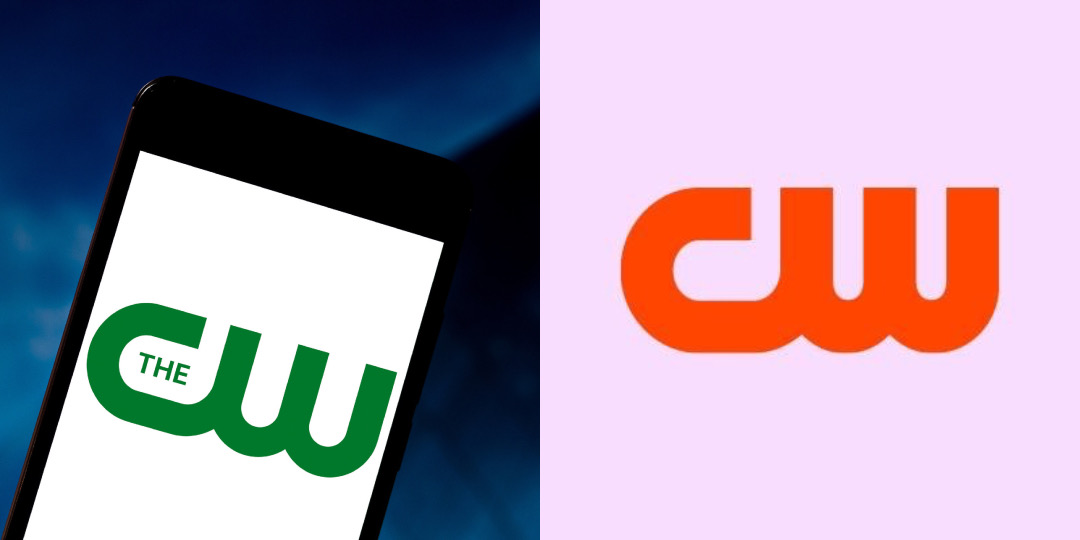
Old logo (left) VS new logo (right). Images 148288811 © Rafael Henrique | Dreamstime.com and The CW
To be clear, the network will continue to refer to itself as “The CW,” with “The” being implied.
The CW’s new branding a.k.a. their Hot Sauce branding is set to kick at this Sunday’s Critic’s Choice Awards.
— spongieupdates (@spongieupdates) January 12, 2024
-Network will still be The CW just not emphasized in the logo anymore.
-“Dare to Defy” slogan is gone.
-Signature Green color now red-orange. Dubbed as “hot sauce” pic.twitter.com/htiPKrUNLV
Another key addition to The CW’s branding toolkit is ‘the stage’, a dynamic network symbol where the CW logo expands and contracts to convey information to viewers. Complementing this visual element is a new sonic branding system, which features the sound of a striking match, cleverly tying in with the hot sauce theme.
In line with these sweeping changes, The CW has decided to retire its previous slogan, ‘Dare to Defy’. As of now, there are no plans to introduce a new tagline.
Beyond being just cosmetic, the makeover is part of a larger strategy to revitalize The CW following the buyout by Nexstar in 2022. This redesign also addresses previous inconsistencies in brand presentation and updates the slightly dated logo to better suit digital formats and the company’s evolving content, including skimming original scripted programming in favor of acquired and unscripted content, as well as new ventures into sports programming.
‘The CW’ has rebranded to ‘CW’ with a new logo. pic.twitter.com/HhMHIKEDgc
— DiscussingFilm (@DiscussingFilm) January 12, 2024
The CW’s fairly new parent has set a goal to steer the network towards profitability by 2025 and is adopting a “Moneyball”-like approach, focusing on cost-effective strategies to rebuild and reposition the brand.
[via Variety, Cord Cutters News, ComicBook.com, images via various sources]


