
Uber Unleashes All-Encompassing Brand System To Ride Beyond Transport
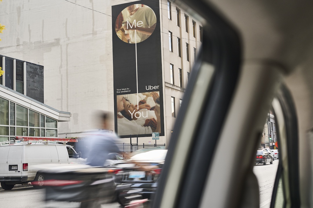
Image via Jones Knowles Ritchie
Uber is shifting gears and steering towards a far-reaching horizon with its latest brand refresh.
Spearheaded by global branding powerhouse Jones Knowles Ritchie (JKR), the move is a full-throttle acceleration into a future where Uber is seen not just as a ride-sharing app but as a comprehensive mobility platform, covering services like food delivery, freight transport, and artificial intelligence research.
Uber’s most recent logo revamp, introduced in 2018, is still relevant today, so reinventing the wheel is unnecessary. The brand’s offerings, however, have diversified ambitiously. To keep pace, the company tapped JKR to create a “kit of parts” versatile enough to represent Uber’s growing range of services while maintaining the essence of mobility and accessibility that lies at the heart of its experience.
View this post on Instagram
For the road ahead, JKR has distilled Uber’s identity into three simple symbols: a circle, a line, and a square. These basic shapes, integrated with the existing branding, have become the building blocks of a brand language designed to spark movement and connection.

Image via Jones Knowles Ritchie
Circles denote departure points, squares mark destinations, and lines chart the journey between. Together, they form visual metaphors for Uber’s mission to ease and enhance the way we travel, whether it’s to the office, across town for a meal, or transporting goods across the country.
View this post on Instagram
This system is crafted to convey movement and the rich tapestry of experiences that movement enables, employing photography, illustration, and design elements to tell a story of possibility and progress.

Image via Jones Knowles Ritchie

Image via Jones Knowles Ritchie
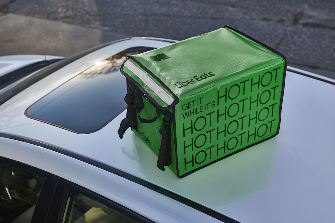
Image via Jones Knowles Ritchie
[via Creative Boom and Design Compass, images via Jones Knowles Ritchie]


