
Nescafé Wakes Up Its Coffee Packaging In New Brand Refresh
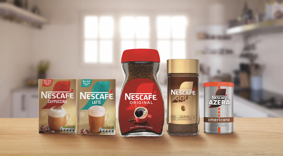
Image via Nestlé UK
Nescafé, the beloved coffee brand that’s been waking fans up for 85 years, has brewed a refreshed look to keep pace with the fast-evolving tastes of aficionados.
This facelift aims to sprinkle a dash of modernity across the company’s entire range, including Nescafé Original, Nescafé Gold Blend, Nescafé Azera, and the Nescafé Frothy Coffee selection, ensuring these favorites not only taste good but look good on the shelf too.
While Nescafé describes the rebranding effort as “major,” the adjustments are rather subtle, seemingly meant to enhance rather than overhaul its familiar look.
Although probably indiscernible to the eyes of customers—no matter how sleepy or alert they are—the accent mark is now more prominent and will consistently appear in a vibrant red across all packaging, coupled with the addition of bean imagery to further emphasize the Nescafé’s rich coffee heritage. Previously, some jars and bags depicted the accent in white, but the refresh locks its personality in.
To underscore sustainability as part of the forefront of its new chapter, Nescafé now declares that every bean used is “100% responsibility sourced coffee” on every jar and pack. That means those who need their morning cuppa can constantly enjoy their brew knowing that it comes from a carefully selected source and responsibly grown by farmers from coffee-rich regions around the globe.
The fresh, mildly caffeinated identity is paired with the ‘Make Your World’ tagline, reinforcing a dedication to making a positive impact on both people’s lives and the environment, from the farm to your mug.
“This relaunch represents a significant milestone for our brand as we continue to evolve and stay ahead in the ever-changing coffee industry,” notes Sophie Demoulin, Nescafé marketing director at Nestlé UK and Ireland. “By introducing new captivating pack designs, and making substantial investments in the brand, we want to demonstrate that we are dedicated to delivering exceptional coffee experiences to our fans. We know that coffee enthusiasts have [an] emotional connection with the brand and we are confident that our refreshed new look will resonate with them.”
[via Convenience Store and Grocery Trader, cover image via Nestlé UK]


