
Disney+ Sheds The Blues And Quietly Refreshes Its Logo
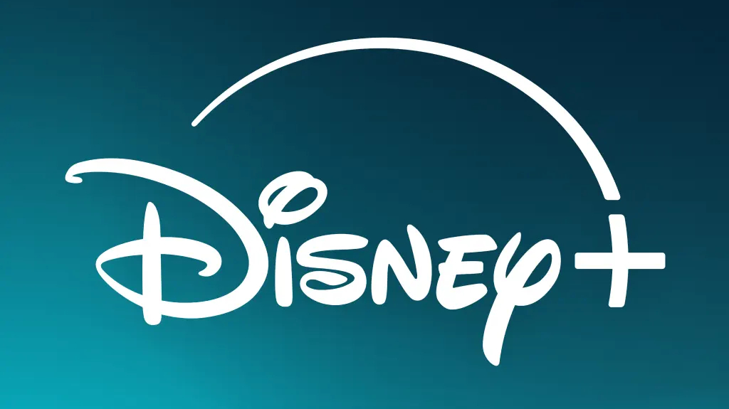
Image via Disney+ / Apple App Store
Eagle-eyed Disney+ subscribers who grew up pointing out hidden Mickeys might have noticed a subtle shift in its visual identity, with the streamer’s iconic blue logo sprouting a touch of green and morphing into a new teal shape.
The entertainment behemoth has remained mum on the official reason behind the refreshed color scheme. However, the most likely theory links it to Disney+’s anticipated full integration with Hulu, whose brand is signified by a neon green. Since December, Disney Bundle subscribers have had access to a beta version allowing them to watch Hulu shows directly within the Disney+ app, featuring a dedicated Hulu tile alongside other Disney-owned brands like Pixar, Marvel, Star Wars, and National Geographic.
@DisneyPlus NEW LOGO?!? pic.twitter.com/YXPepYWh2M
— brianna ðŸ‰ðŸ³ï¸ðŸŒˆ (@briiannagorskii) March 23, 2024
Another possibility is that since streaming services are a crowded space, with many platforms like Paramount+, Max, and Prime Video sporting similar brandings, the new teal might help Disney+ stand out in the sea of blue.
#DisneyPlus logo color has been changed.🤔 pic.twitter.com/DeEmQm5qq4
— Jonathan (@JonathanLeo648) March 21, 2024
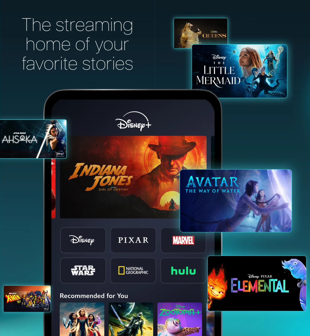
Image via Disney+ / Apple App Store
Symbolically, Disney+ has always been known for its family-friendly content, while Hulu boasts a broader library with more mature programming. As Disney+ welcomes more adult-oriented shows, the blue hue, traditionally associated with trust and security for younger viewers, might not fully reflect the platform’s evolving identity. Teal, a blend of blue and green (which happens to be Hulu's signature color), could represent this growth, signifying a wider audience range, The Direct suggests.
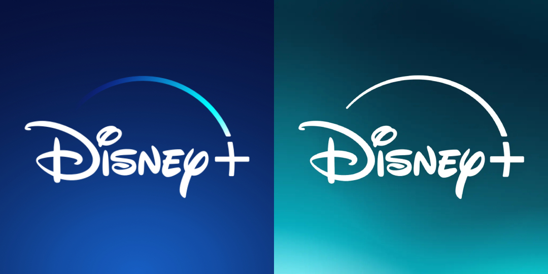
Old color scheme (left) VS new color scheme (right). Images via Google Play Store and Apple App Store
With the complete one-app experience set to launch right about now, the updated branding has made its appearance on the Apple App Store. With that, it’s yet to make the transition in the Google Play Store.
Did @DisneyPlus change the color of their logo? pic.twitter.com/Fi5a8KbC9W
— Iccy15 (@Iccy151) March 20, 2024
On that note, while Disney+ is set to enrich its library and cater to a broader audience with on-demand Hulu favorites, Hulu + Live TV will remain exclusive to the Hulu app.
[via The Direct, Evening Standard, Cord Cutters News, Laughing Place, images via various sources]


