
Lamborghini Dashes Into The Future With First Logo Makeover In Over 20 Years
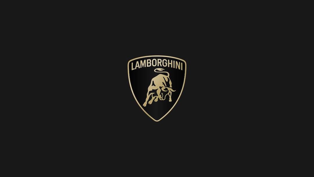
Image via Lamborghini
The unmistakable raging bull of Lamborghini has gotten a subtle makeover, marking the Italian automaker’s first logo redesign in over 20 years. Instead of going full steam ahead, the update reflects Lamborghini's desire to project a more modern image while staying true to its heritage.
Fans will notice the changes are evolutionary rather than revolutionary. The shield that houses the bull remains, but with a thinner, flatter outline. The character itself sheds some of its three-dimensionality, adopting a cleaner look.
View this post on Instagram
Meanwhile, the Lamborghini wordmark overhead has been revamped with a broader, custom-designed typeface to align with the brand’s new corporate font, designed to echo the sharp angles of its vehicles. This new typeface, christened ‘Automobili Lamborghini’, will be used across all the company’s communications.
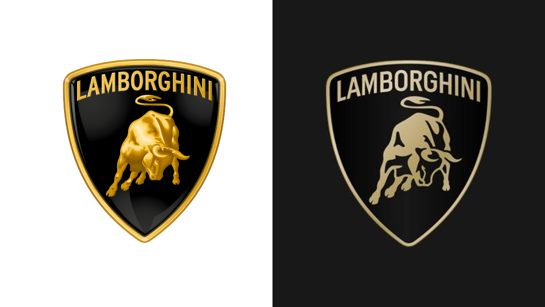
Old logo (left) VS new logo (right). Images 124368733 © Raffaele1 | Dreamstime.com and Lamborghini
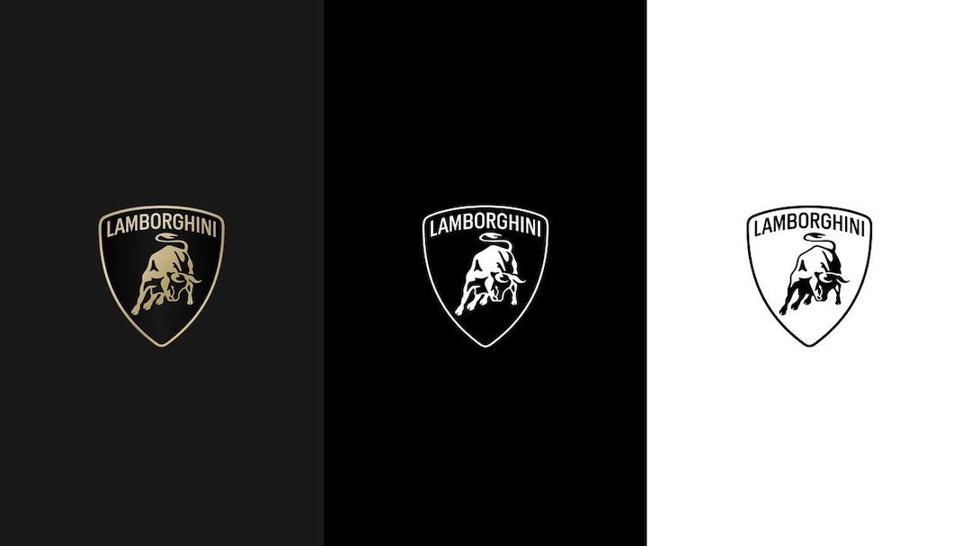
Image via Lamborghini
This refresh comes as Lamborghini embarks on ‘Direzione Cor Tauri’, a strategic shift towards sustainability and electrification. The brand states the emblem’s minimalism and bold black and white primary colors embody its core values of being “brave, unexpected, and authentic”—qualities that will undoubtedly be crucial as it navigates the changing automotive landscape. A touch of heritage is retained with the use of yellow and a new gold accent color.
For the first time, the raging bull will also exist on its own on the company’s digital platforms, separated from the classic shield for a more prominent presence. This branding acceleration will become an integral part of the automaker’s distinctive identity and will also be applied on future cars.
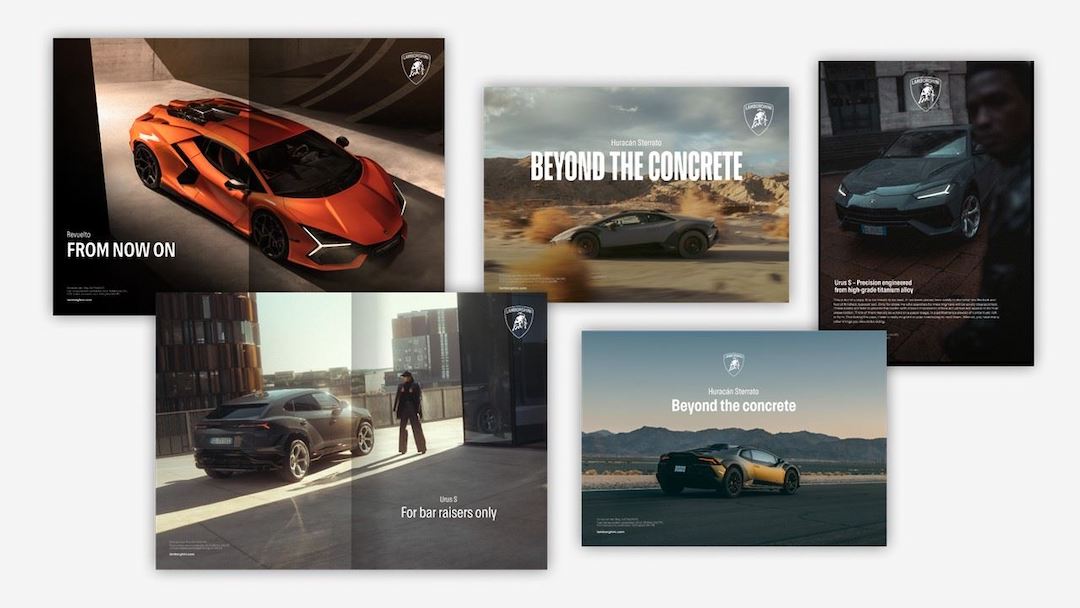
Image via Lamborghini
While some might yearn for a more drastic overhaul, there’s good cause for not getting full of bull. The iconic raging bull is instantly recognizable, and this subtle evolution ensures it remains relevant for future generations. It’s a self-assured move that underscores Lamborghini’s hope to both honor its past and embrace the exciting road ahead.
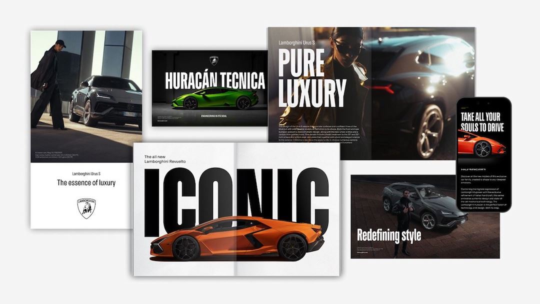
Image via Lamborghini
[via Top Gear, Dezeen, Lamborghini, images via various sources]


