
Lotus Biscoff Presents ‘Warm’ New Brand Makeover With A Hidden Smile
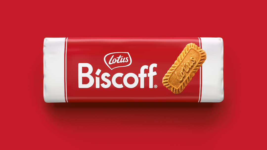
Image via BrandMe for Lotus Bakeries
Lotus Bakeries has just put a fresh coat of icing on its world-renowned Biscoff cookies, enlisting brand consultancy BrandMe to whip up an enhanced, unified brand identity that resonates with diverse markets.
Known for their unique taste and originating from a cherished Belgian recipe dating back to 1932, Biscoff cookies have captured the hearts of snack lovers worldwide, so BrandMe had some big shoes to fill. The secret to the recipe was to harmonize the brand’s look across the globe while celebrating the spiced cookie’s broad appeal.
It was also important that Biscoff’s vibrant personality and tasteful experience were folded into a modern and inclusive design that embodied warmth and friendliness at every turn.
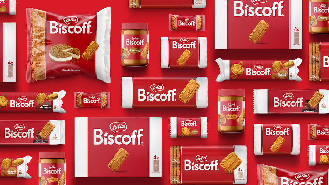
Image via BrandMe for Lotus Bakeries
Designers baked up a look that amplifies the Biscoff name, complete with a semiotic smile—formed at the top of the wordmark—to echo the brand’s positive and welcoming nature.
Even the dot on the ‘i’ is shaped like the beloved cookie, ensuring the essence of Biscoff flavors every aspect of its identity.
Biscoff Bold, the cookie’s new bespoke typeface, chomps out the cursive with chunky letters and soft curves, embodying its approachable and cheerful character.
Video via BrandMe for Lotus Bakeries
A sweet tidbit is the 19.32° angle at the corners of the characters, referencing the year the original Speculoos cookie was born. Paired with the contrasting red and white color palette, the font ensures the delicate snack stands out in the cookie aisle.

Image via BrandMe for Lotus Bakeries

Image via BrandMe for Lotus Bakeries
For more Biscoffy goodness across its communications, Lotus Bakeries has adopted a set of comprehensive brand guidelines to ensure the same warmth anywhere around the world. These include the introduction of a secondary font, VAG Rounded LT Pro, which mirrors some of the softness seen in the dominant font.
Would you take a large bite out of this rebrand?
[via Under Consideration, Financial Times, The Grocer, images via BrandMe for Lotus Bakeries]


