
Skittles Reinvents Its Rainbow With Refreshed Brand Identity
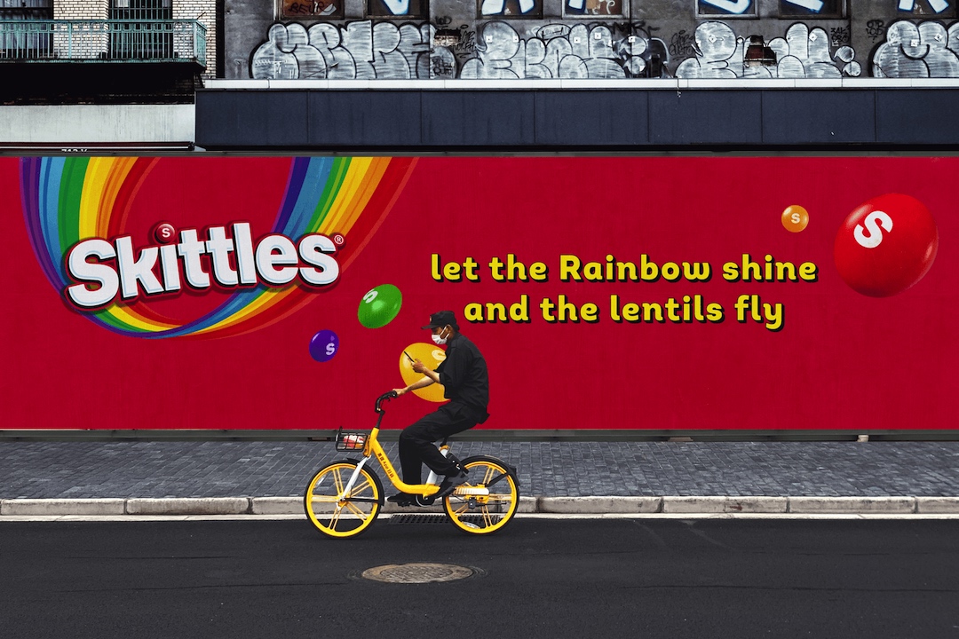
Image via Elmwood
Candy giant Mars Wrigley isn’t afraid to play with its food—especially when it comes to Skittles. The iconic rainbow-hued candy brand recently underwent an overhaul, orchestrated by the brand design consultancy Elmwood, with the goal of revitalizing its visual profile while retaining its core identity.
Video via Elmwood
Three key elements underpin the new taste for the rainbow. First, the team tackled the typography. The Skittles typeface, a longtime brand staple, has gotten a refresh to boost its clarity and impact. As Elmwood’s design director Paul O’Brien describes it, the logo now has “a harder shadow” to give it more attitude, while also incorporating a subtle arch for a sense of movement and a playful curve on the ‘K’ that reflects the brand's personality.
Video via Elmwood
Video via Elmwood
Next, the heart of Skittles’ packaging—the signature rainbow—has gotten a makeover too. It’s now bolder and brighter, designed to grab attention on crowded candy shelves and translate into the digital world, where clear, vibrant visuals are crucial.
To capture Skittles’ unique tone of voice, the team crafted a new design aesthetic that tells a story, dubbed “Nonsensical.” It offers an entertaining release from common sense, remaining joyful and freeing while magnifying Skittles’ fun-loving persona.
Video via Elmwood
Finally, the individual candies, affectionately nicknamed “lentils” by the brand itself, have been given their own space on the pouch. Separating them from the rainbow allows for consistent use of the upside-down rainbow and logo within this dedicated area, creating a clearer and more adaptable canvas for future brand storytelling. These lentils now have a signature layout that bursts with movement, captured by flowing visual effects.
Video via Elmwood
Video via Elmwood
This strategic revamp, rolling out in the UK, aligns perfectly with Gen Z’s preference for authenticity and brands that don’t take themselves too seriously.
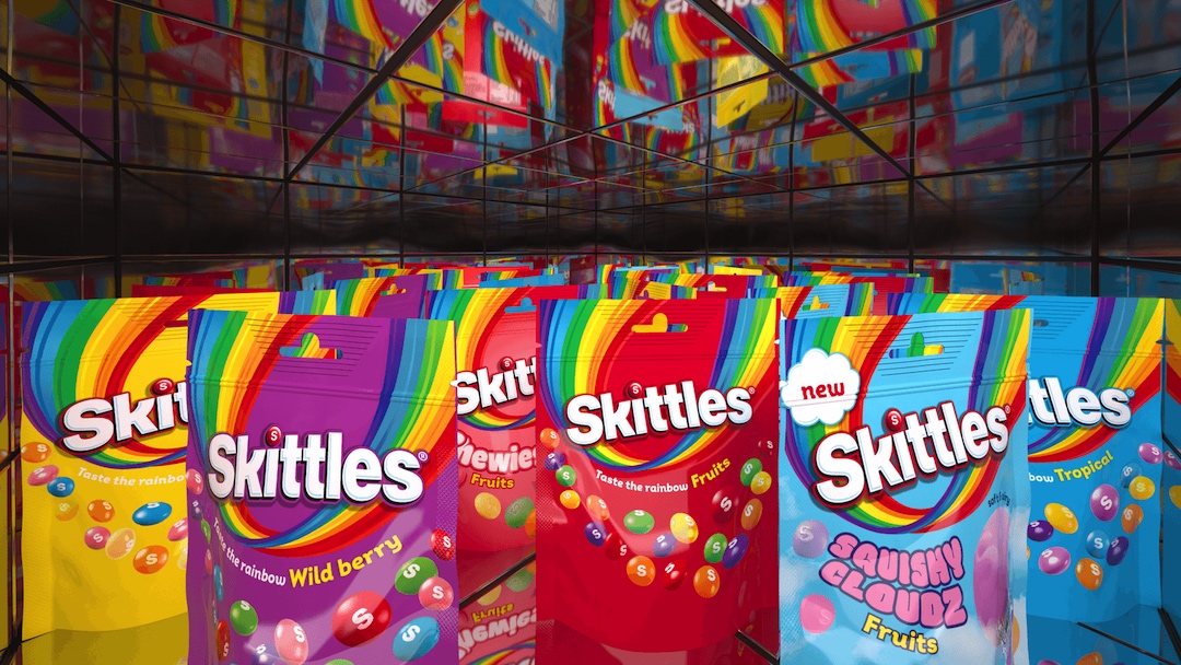
Image via Elmwood
Video via Elmwood
Video via Elmwood
[via Creative Boom and License Global, videos and images via Elmwood]


