
Canadians Dump On Army’s New Logo Design—What Is It, Really?
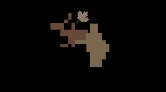
Image via Canadian Army
The Canadian Army will need some camouflage to keep its new branding attempt hidden from discerning eyes. Last week, it presented a new logo that has left many scratching their heads.
The new design features a tan maple leaf hovering over a patch of brown and beige pixels. The army reasons that it’s a detail from its new camouflage pattern, the Canadian Disruptive Pattern Multi-Terrain.
Introducing a new icon and refreshed tagline for the Canadian Army, featuring the new CADPAT MT (Multi-Terrain) pattern.
— Canadian Army (@CanadianArmy) May 3, 2024
It is designed to complement our official Canadian Army logo.
To discover more about the CADPAT MT, follow this link: https://t.co/Q8i5lhNxeK pic.twitter.com/5ve3ZpEUGM
The confused public isn’t sure what to make of it, with many quickly dubbing it everything from a “pixelated moose” to a “Minecraft character milking a moose.” Many commentators were more blunt, asserting that it looks like a “moose taking a dump.” Well, duty calls.
Is it a Rorschach test?
— 🤿 🳠Lindsay Stephenson 🦈⛵ (@SailsAloha) May 3, 2024
E.T phone home pic.twitter.com/LM0bkfw1fq
— Kiamika1995 (@ChadChabanel) May 3, 2024
is that a moose taking a dump behind a shrub?
— B〽ï¸ODE (@BM0DE) May 3, 2024
Its a moose taking a shit....love it.
— Libor (@bubbaluce) May 3, 2024
The army has since scrambled to clarify that this isn’t a replacement for its classic emblem of crossed swords and maple leaves under a crown. Instead, it’s a “supplementary design” meant for communications and animations.
Whoever designed and signed off on this is going to need their free tampons stuffed in their ears to avoid hearing all the laughter https://t.co/tWPf0jChNM
— Fraserburn (@Fraserburn) May 4, 2024
It looks like a Minecraft character milking an elk.
— White Wabbit Warrior ðŸ‡âš”ï¸ (@wabbitwarrior) May 3, 2024
Uh oh, stinky pic.twitter.com/WpqceUAqCl
— Kjell Anderson 🌹 (@Kjella30) May 3, 2024
The Canadian Army has not changed its official logo. We remain proud of our official emblem.
— Canadian Army (@CanadianArmy) May 3, 2024
The icon launched today is a supplementary design only that will be used in the bottom left corner of certain communications products and in animations for videos. pic.twitter.com/iOLvJ2HBlB
[via CBC and Daily Hive, images via various sources]


