
Co-Op Takes The Attention Away From Itself For Once In Fresh Brand Overhaul

Images via SomeOne
The Co-op’s new look is all about celebrating you, the member, and the power you hold as a co-owner. The UK’s major consumer cooperative has undergone a significant makeover to emphasize the key aspect that sets it apart—member ownership.
Designed over six months by London branding agency SomeOne, the identity revolves around a reimagined logo. The iconic clover emblem has been deconstructed into a series of distinct shapes, dubbed ‘Membershapes’. These shapes symbolize the individual ownership stake held by each Co-op member. The concept reinforces the idea that the company is truly owned by the people it serves.
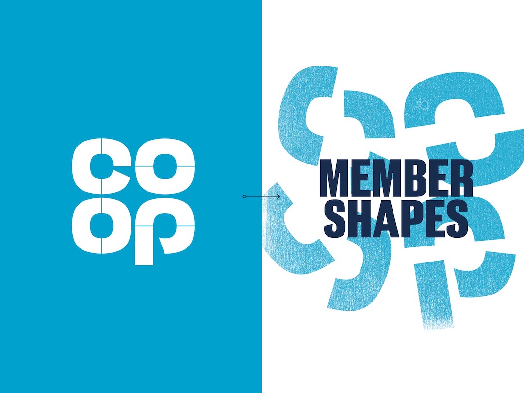
Image via SomeOne
“It says something of a brand, and their intentions—that it’s prepared to break up its core brand asset—the logo, to be truly seen as a brand that does business differently,” says SomeOne creative director Shaun Turnbull.
“The breaking up of the symbol was limited to five pieces, the most iconic forms that would be recognizable even when isolated. The role of the Membershapes is to hero Co-op’s individuality and bring to life Co-op’s differentiating qualities. It also has another role, a role to help the brand flex in multi-channel communications, this is something the brand has struggled with from what we heard when speaking with key stakeholders. The Membershapes can be used as; a window, a holding device, a pattern, a graphic device or a piece of storytelling.”
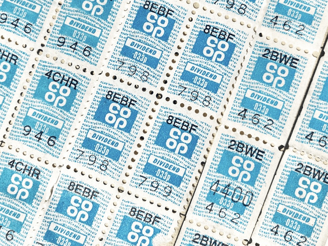
Image via SomeOne
Further amplifying this message is a bespoke typeface called ‘Co-op Headline’, co-created with type foundry F37, which incorporates subtle curves that echo the shapes derived from the logo, creating a sense of visual cohesion. The new identity also features a set of expressive icons that exude a friendly and approachable personality.
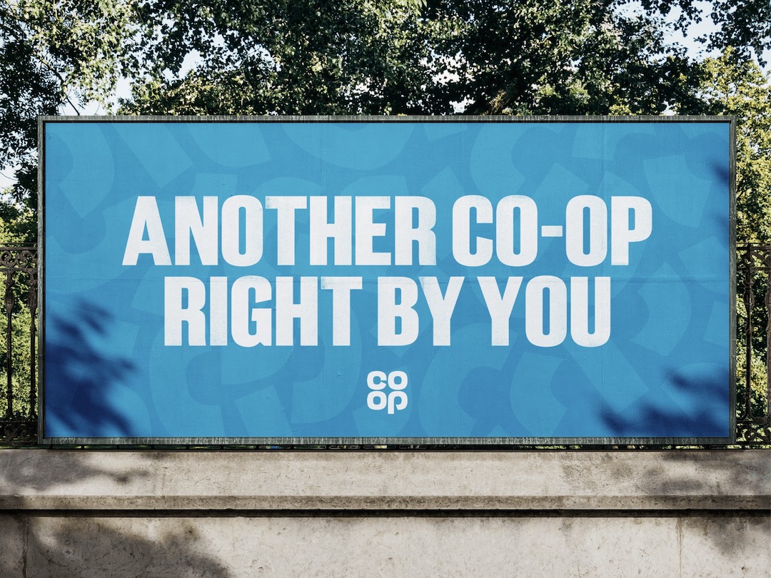
Image via SomeOne
The accompaying film, directed by Sam Gainsborough with Blinkink, swaps out glossy food shots for the humble receipt—often an afterthought—to convey Co-op’s values-driven message The video’s modest color palette and the use of the familiar receipt resonate perfectly with the theme of spending consciously, not enriching wealthy executives.
It's a well-needed move, considering Co-op's ambitious goal of increasing its member base to eight million by 2030.
[via Creative Review, Creative Boom, Retail Times, images via SomeOne]


