
Tupperware Unpacks Fun New Brand Identity, And This One’s A Keeper

Image via Landor
Tupperware has been poppin’ and lockin’ with food storage for decades, but lately, its image has needed a little… unboxing. To prepare for its debut on retail fronts, the company has undergone a rebrand to recapture the hearts (and kitchens) of younger users.
Problem is, Tupperware’s legacy is so strong, it’s practically become synonymous with food containers, regardless of their manufacturer. This means its image has been diluted over the years. It’s time to reclaim the Tupperware name.
And with plastics gaining a bad rep, the company hopes to reiterate that its quality boxes aren’t like disposables—they can be used time and time again, for generations to come.
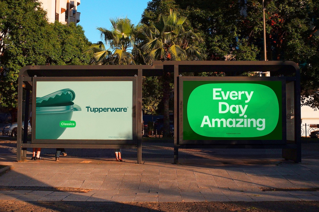
Image via Landor
Video via Landor
The container maker has thus tapped branding agency Landor to remind everyone why they love Tupperware, while also snagging the attention of younger audiences. Its new mantra, “Useful is beautiful,” reflects sustainable products that enhance one’s life, not just store leftovers.
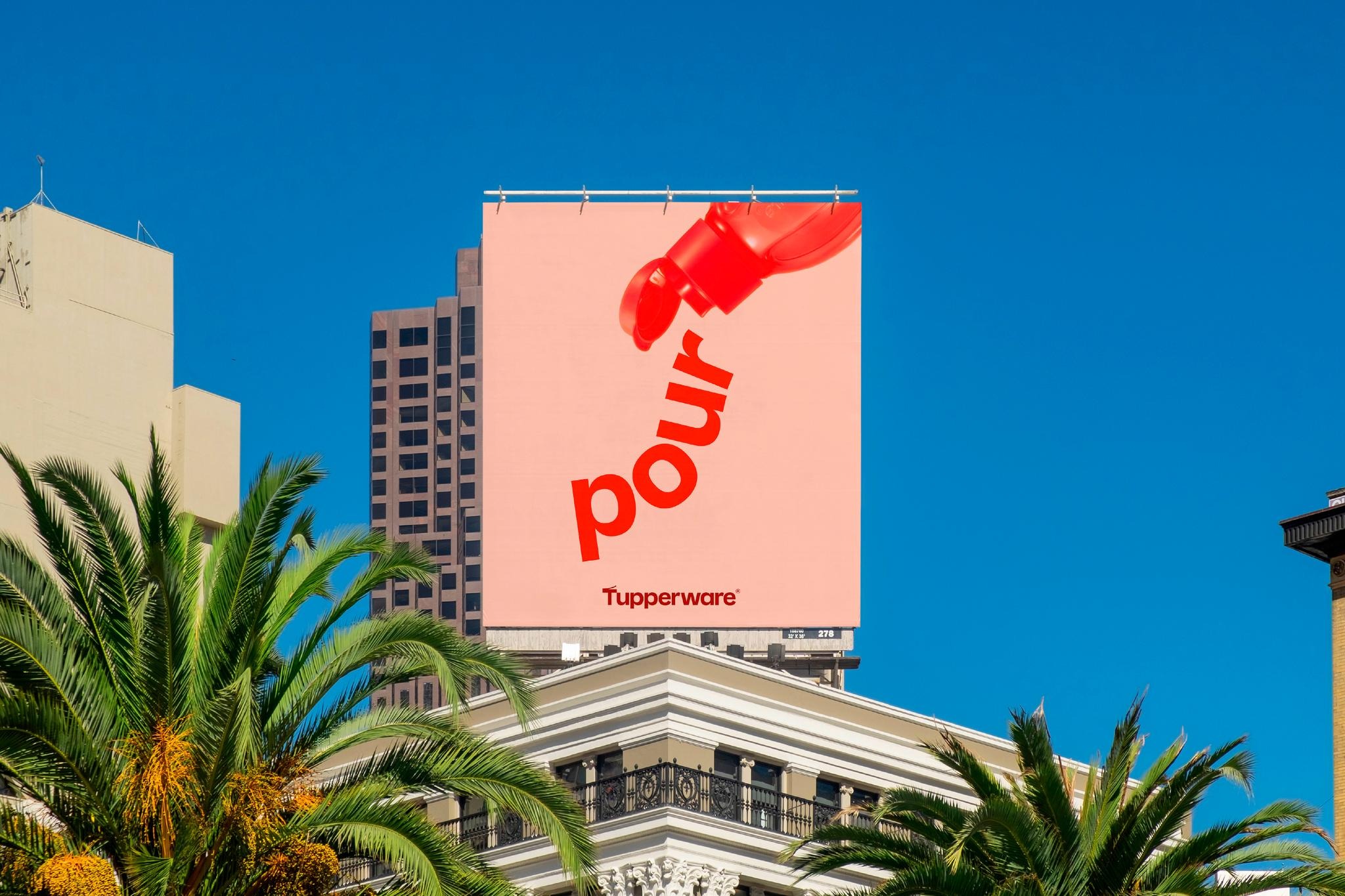
Image via Landor
Video via Landor
A new logo cleverly mimics the iconic container opening and closing, a subtle nod to the brand’s heritage. Fonts and visuals take inspiration from Tupperware’s signature shapes, weaving a cohesive story. Meanwhile, photographs showcase the products in action to highlight their functionality.
The new icon, a ‘T’ with an open lid, symbolizes the endless possibilities within each container.
Video via Landor
Video via Landor
The brand isn’t just about keeping food fresh anymore, it’s also about empowering owners to take control of their meals and whip up delicious dishes years down the line. So, do you own tupperware or do you own Tupperware?
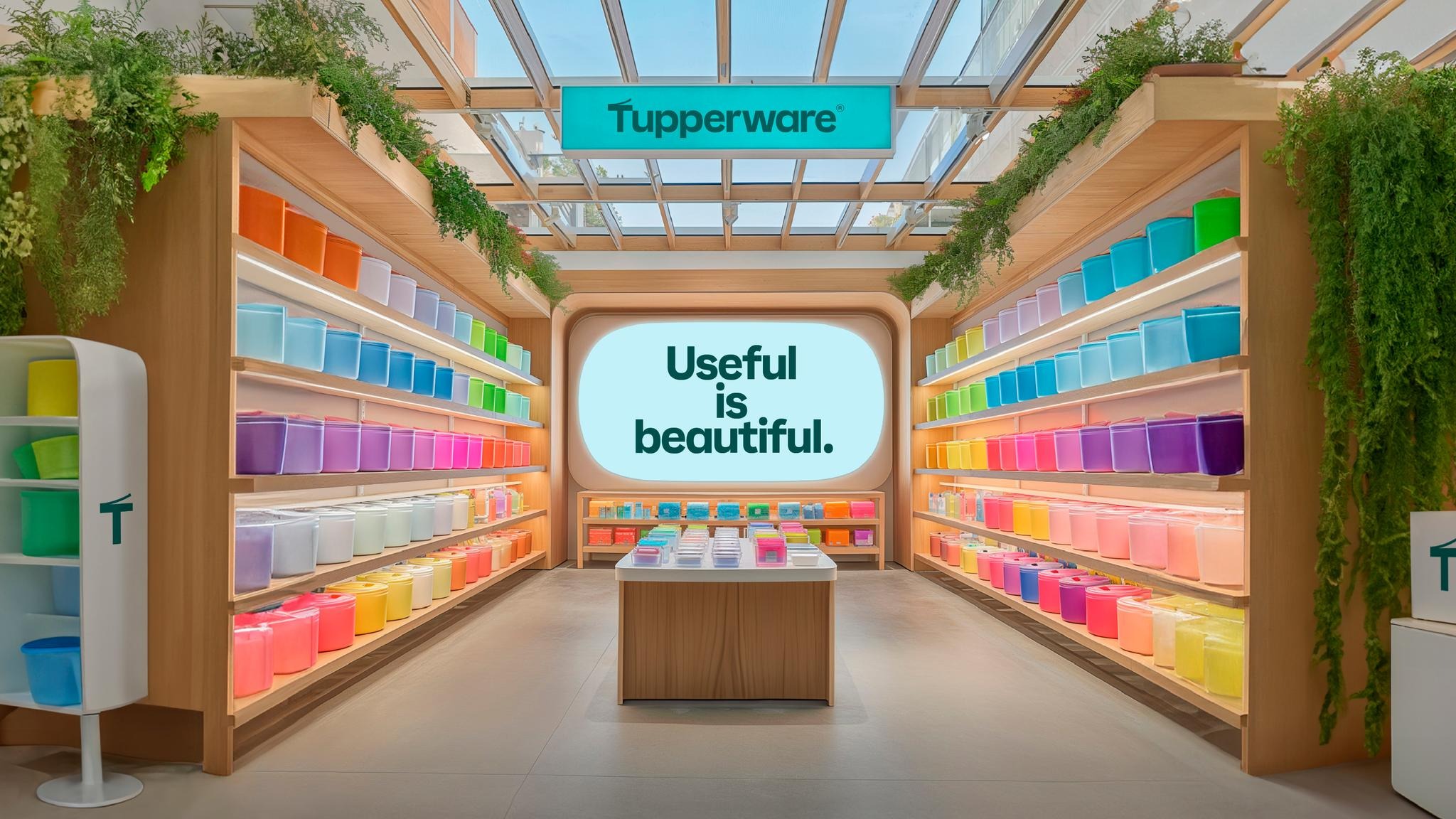
Image via Landor
Video via Landor
[via Landor]


