
KitKat Unwraps New Logo To Better Bounce Off Shelves & Remind Us To Have A Break
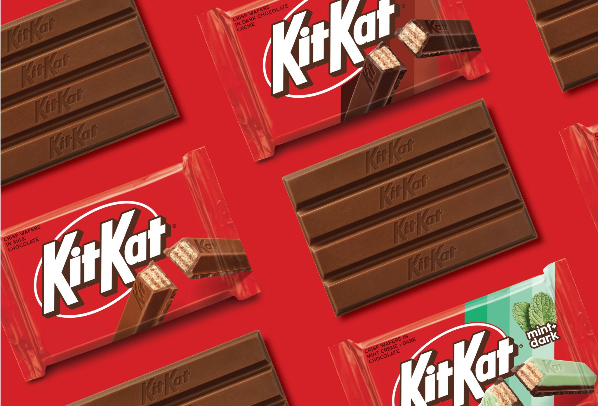
Image via Sterling Brands
Break us off a piece of that fresh new look. KitKat is serving up a visual makeover, and it’s anything but wafer-thin in style.
The iconic chocolate bar brand has unwrapped a sleek makeover for its US market, courtesy of New York City-based Sterling Brands. This refresh aims to give KitKat a modern edge while still preserving the nostalgic charm that has made it a household name for decades.
The updated logo catches the eye with its cleaner, more retro aesthetic. Sharper edges and thick drop shadows create a look that feels both fresh and familiar. It’ll certainly stand out more on shelves.
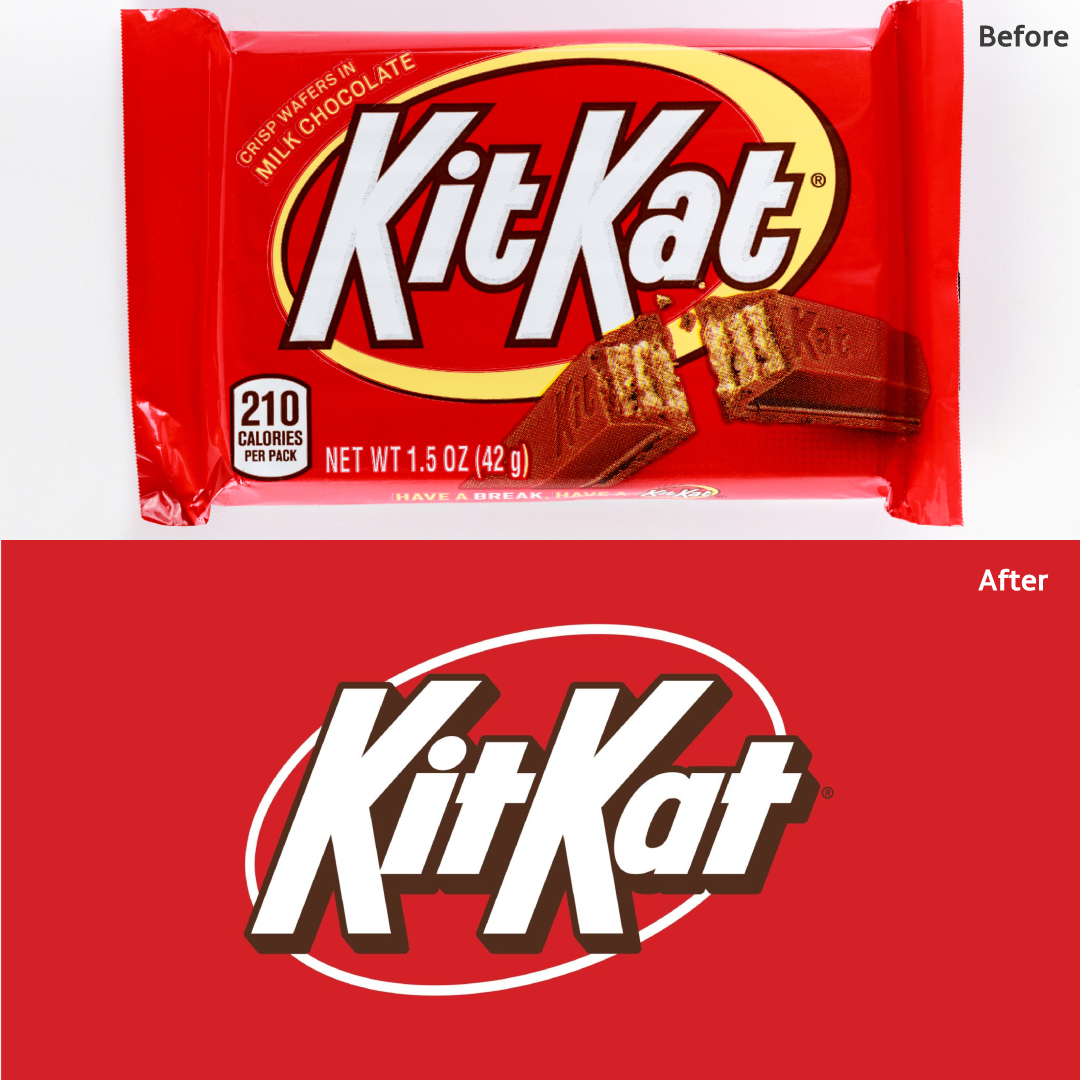
Old logo (above) VS new logo (below). Images 238633761 © Olesya Semenov | Dreamstime.com and Sterling Brands
Guiding the gaze toward the KitKat name is a slimmer white ring replacing the previous off-white, thicker band. This adjustment provides a more symmetrical appearance to the overall design. Further, the letters have been squeezed closer together for greater cohesion.
View this post on Instagram
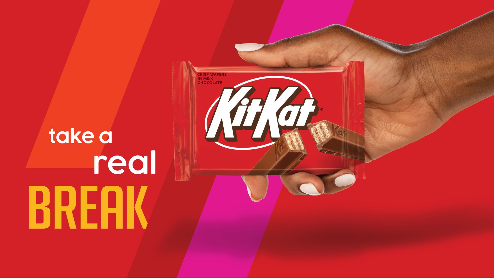
Image via Sterling Brands
According to Sterling Brands, the overhaul “celebrates the crispy, creamy taste of KitKat, activating the brand with the upbeat, kinetic energy of KitKat’s iconic ‘break.’”
It’s worth reminding that this logo update is exclusive to the US market, where the previous design was already quite similar to the new version. Fans of the chocolate bar in the UK, for instance, will continue to see the familiar red wordmark with its distinctive terminal over the ‘a’ (shown below).
View this post on Instagram
So, does the new look give you plenty to chew on?
View this post on Instagram
View this post on Instagram
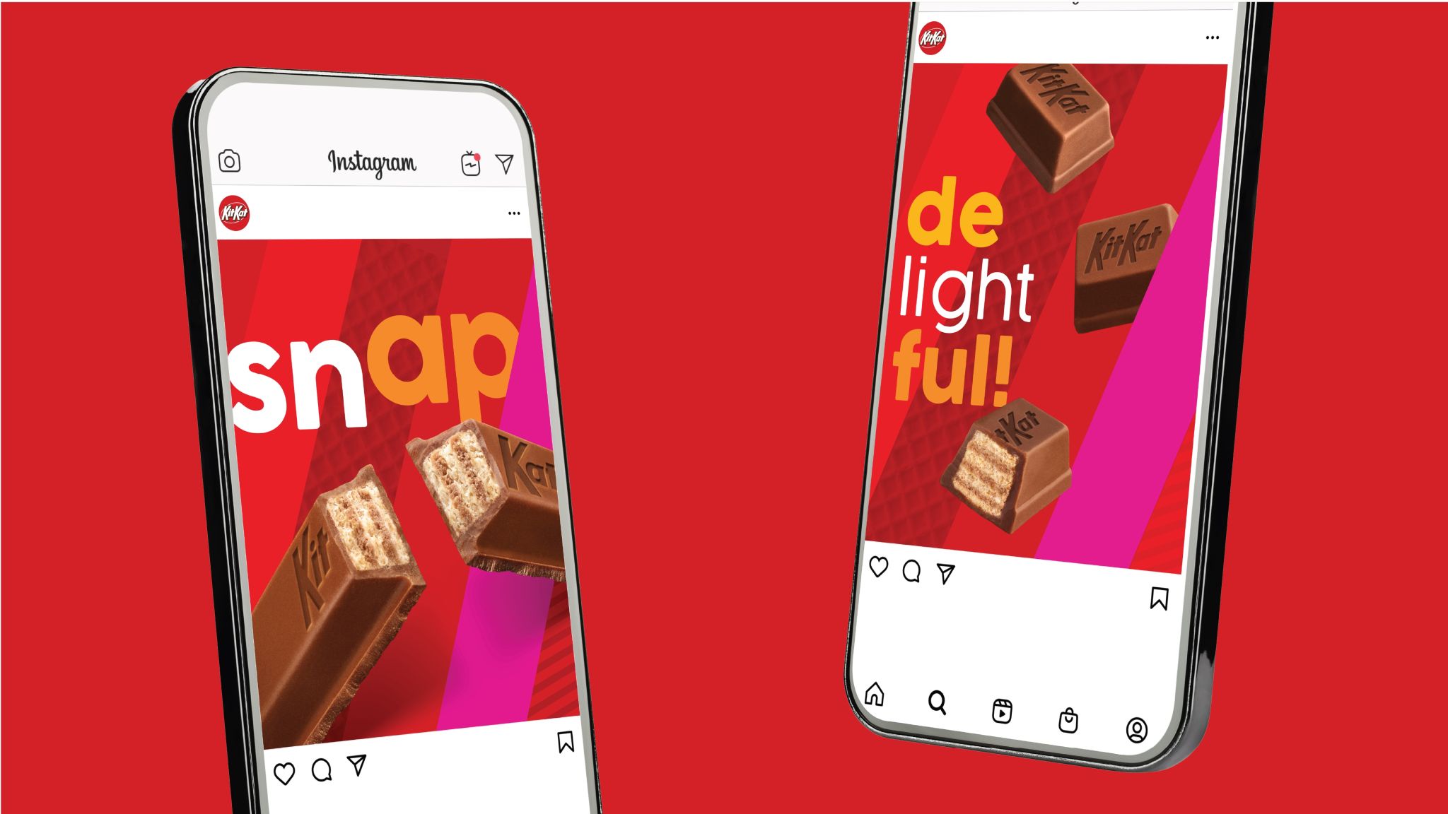
Image via Sterling Brands
[via Canny Creative, Brand New, Sterling Brands, images via various sources]


