
Harris-Walz Campaign Makes Blink-And-Miss Yet Impactful Changes To Its Logo
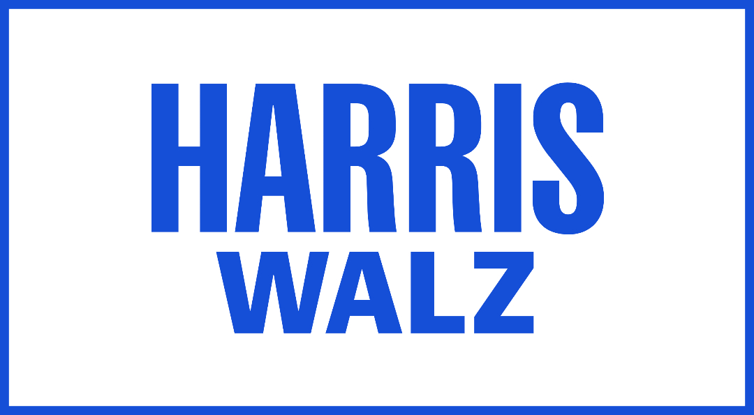
Image via Harris Walz Campaign
The Harris-Walz campaign logo has had a slight makeover. In the fast-paced, high-stakes arena of politics, this one would be easy to miss. The changes are small, but they make a difference in visual clarity.
The creative minds at Wide Eye, the agency behind Kamala Harris’s 2020 campaign visuals, have once again put their stamp on her political image. This time, it has teamed up with Type Supply’s Tal Leming to give the Harris-Walz logo a fresh yet familiar facelift.
At first glance, you might not spot the differences, but they’re there. The crossbar in the ‘H’ of “Harris” now sits perfectly centered, the ‘Rs’ have been given a leg up with reshaped limbs, and “Walz” stands a tad taller.
As Vice President Harris joins forces with Minnesota Governor Tim Walz, this logo refresh comes at a crucial moment. The design aims to project strength and reliability through its clean lines and straightforward approach. The typefaces chosen—‘Fearless’ for “Harris” and ‘Balto’ for “Walz”—strike a balance between modern aesthetics and a nod to Harris’s previous campaign.
Charles Nix, senior executive creative director of Monotype, shares some insight into the need to act fast with these logos. The campaign “doesn’t have a full year to be tested in focus groups,” he shares in an email to DesignTAXI. “It speaks plainly and urgently.”
“It’s a throwback to a classic political poster style (think KENNEDY, ROOSEVELT, TRUMAN, and as others have pointed out CHISHOLM). Those posters are from a time of fewer typefaces—of relatively generic big wood-type sans serifs,” Nix adds. “Printed quickly, their style is their message: Get it out now and make it shout!”
[via Fast Company, Daring Fireball, Jonathan Hoefler, images via various sources]


