
Sandisk’s Audacious Logo Revamp Sparks Bytes Of Praise
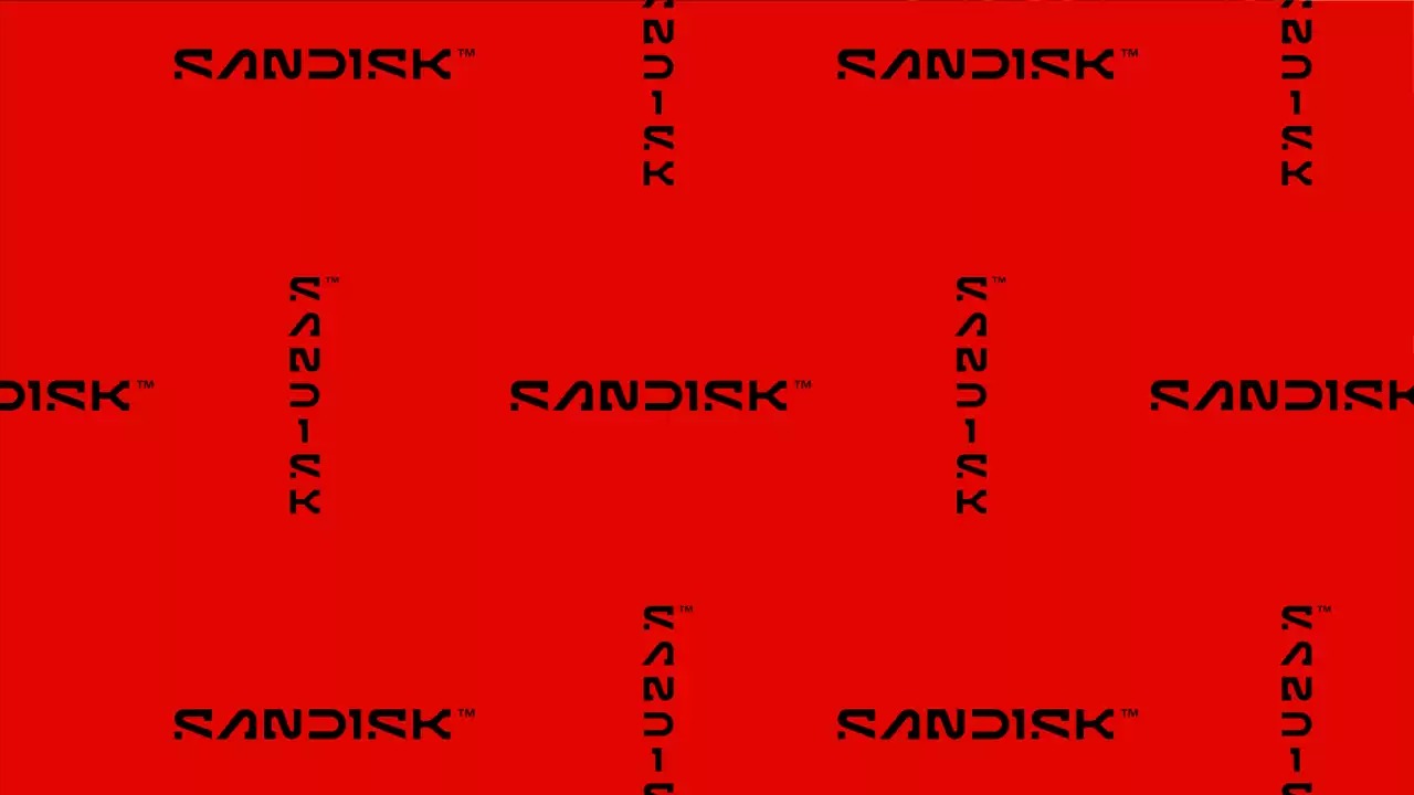
Image via Sandisk
Data just got dressed up for success. Sandisk (no longer SanDisk), the renowned maker of flash drives and memory cards, has unveiled a futuristic rebranding effort, signaling its intention to stand independently from parent company Western Digital. This visual refresh introduces a minimalist logo and streamlined branding, comes with a philosophy rooted in progress and collaboration, emphasizing its role as a catalyst for data-driven possibilities.
The updated logo abandons the inter-capped styling Sandisk has used since 1995 in favor of a sleek slab serif typeface. Key features include an open ‘D’ and a pixel-inspired ‘S’, symbols chosen to represent collaboration and innovation in technology.
SanDisk revealed their new logo pic.twitter.com/3mlrHxCR1W
— Dexerto (@Dexerto) December 18, 2024
Joel Davis, Sandisk’s vice president of creative, explains that the design starts with a single pixel, reflecting the infinite potential and scalability of its flash memory products. The company’s new identity aims to highlight its commitment to mobility, versatility, and empowering customers through efficient and reliable data solutions.
“Enabling people to experience the potential of their data and move forward in making aspirations real is at the heart of what we do and we were very intentional in creating a mark that embodies the spirit of this thinking," shares Davis. “Our visual brand philosophy is inspired by the future and all the diverse ways our customers consume data. Starting with a single pixel, the new Sandisk mark uses bold visual language while being rooted in the idea that progress is not an end point but a way of being.”
The rebranding also marks a strategic moment for Sandisk as it prepares to operate independently from Western Digital, which acquired the company in 2016. By stepping into its own spotlight, Sandisk seeks to reaffirm its role as a leader in the flash memory market while addressing evolving consumer needs. The company plans to emphasize its legacy of resilience and innovation while adopting a forward-looking approach to meet the demands of modern data consumption.
new @SanDisk pic.twitter.com/UD9PjQRT2t
— Kote (@kotecinho) December 18, 2024
Almost across the board, observers have applauded the boldness of the design compared to other recent rebrands—or re-“blandings”—by companies like Jaguar.
Loving the new Sandisk logo. Pulling off something this bold and experimental must’ve faced a mountain of pushback, but whoever championed it deserves just as much credit as the designers who brought it to life
— Greg Washington (@gregmwashington) December 18, 2024
pic.twitter.com/gw5JZ82dQJ
A decent and creative rebranding in an age of shitty soulless arial 12 rebrandings the designers were goated genuinely this is such a breath of fresh air that makes me want to buy SanDisk SD cards despite not actually having any use for them just bc I want it to b successful https://t.co/ou326VhRvZ
— voretetas (@orgafaizyuri) December 18, 2024
This is great. Has personality, not another jaguar logo. Really like it
— Jesper Bylund -- e/acc (@JesperBylund) December 18, 2024
One fan adds they’d “rather drive a Sandisk than a Jaguar.”
The futuristic edge and purposeful feel have Sandisk placed among the ranks of NASA, which has a similar sci-fi-like vibe. With that, some have jested that the open letters in the wordmark represent “data loss.”
Ok WOW! SanDisk cooked with this rebrand. Love the futuristic look … are we living in the future yet? pic.twitter.com/Y2RQ3QtWCP
— Rohan Tandon (@lucidstarfield) December 19, 2024
For some reason, the new logo conjures connotations of Data loss.
— angturil (@angturil) December 18, 2024
The cuttoff letters represent the data you lose when their stuff corrupts
— son canucku (@son_canucku) December 19, 2024
The company plans to complete its separation from Western Digital, which acquired Sandisk in 2016, by early 2025.
This is great. Has personality, not another jaguar logo. Really like it
— Jesper Bylund -- e/acc (@JesperBylund) December 18, 2024
Unashamedly cyber and optimistic about technology. Like.
— thisisgrey (@thisisgrey) December 18, 2024
[via Mumbrella, Absolute Geeks, Fast Company, cover image via Sandisk]


