
Korean Air Lands A Fresh Identity, Marking Its First Rebrand In Four Decades
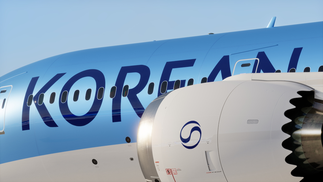
Image courtesy of Lippincott
Korean Air is soaring into the next era with a refreshed brand identity, marking its first major redesign in 40 years. Partnering with global consultancy Lippincott, the airline has unveiled a modernized look that emphasizes a sunny outlook of becoming a premier international carrier while strengthening the city of Seoul’s position as a global aviation hub. The rebrand coincides with the airline’s ongoing transformation following its merger with Asiana Airlines, reinforcing its status as South Korea’s flag carrier.
Rooted in the brand’s Excellence in Flight ethos, the redesign prioritizes elevating Business and First-Class offerings while delivering a hospitality-inspired passenger experience.
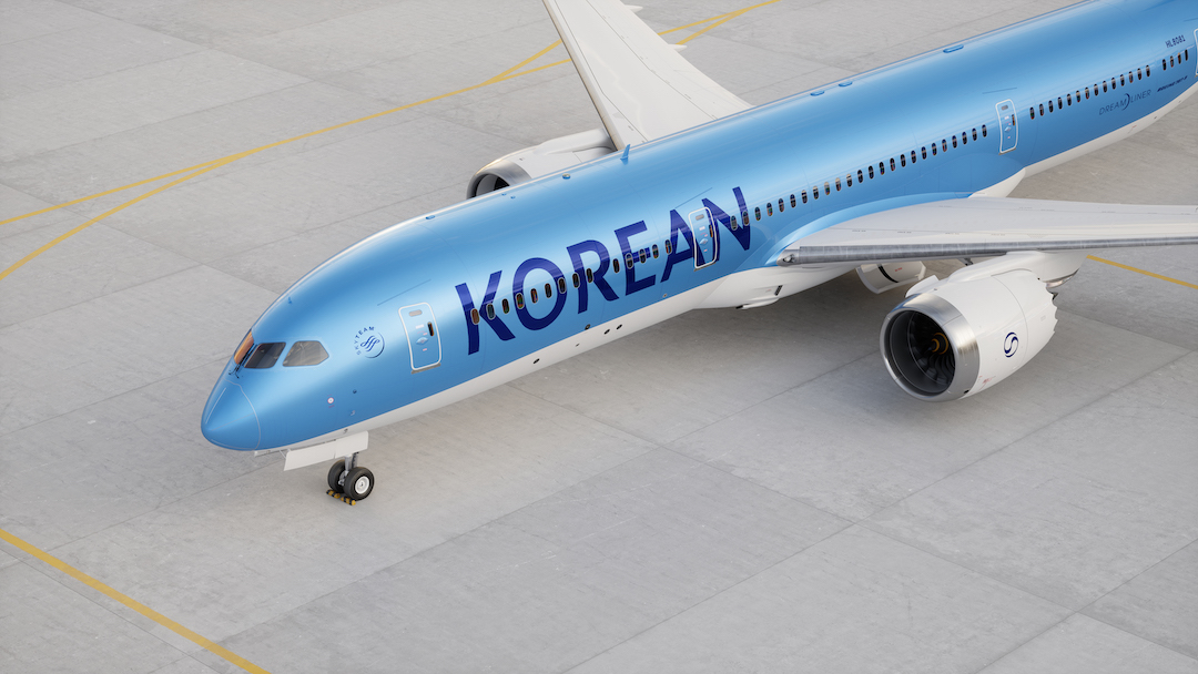
Image courtesy of Lippincott
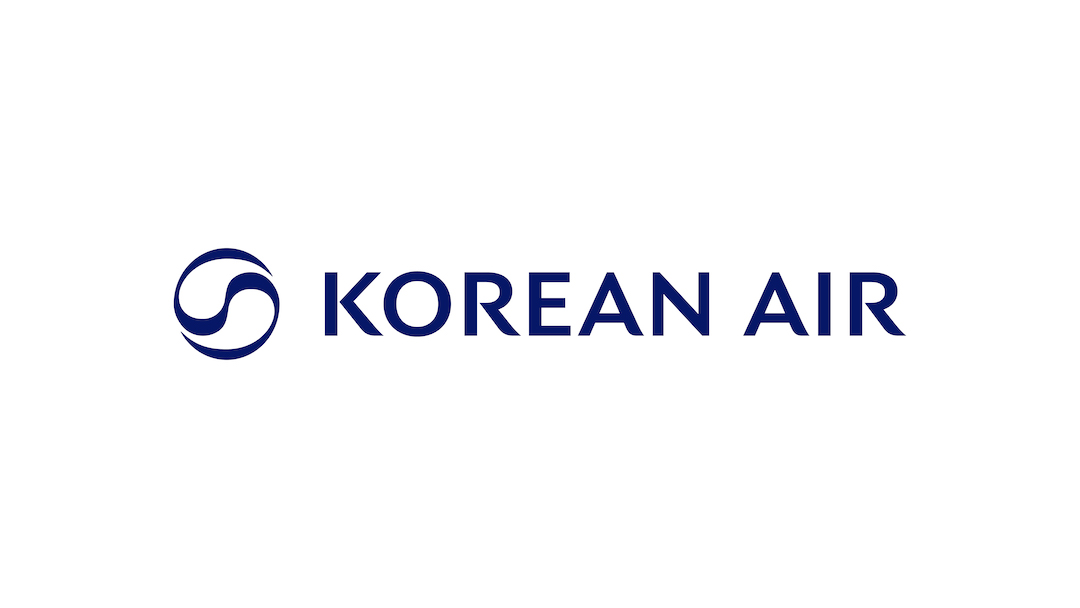
Image courtesy of Lippincott
At the center of the redesign is a refined version of the Taeguk, the iconic symbol drawn from South Korea’s national flag. The updated emblem balances strength and elegance, drawing inspiration from Sangmo Nori, a traditional Korean dance known for its flowing ribbon movements, symbolizing prosperity and continuity.
The Taeguk now stands alone, offering greater visibility across Korean Air’s fleet and interior cabin design, which has been reimagined by London-based studio Priestman Goode.
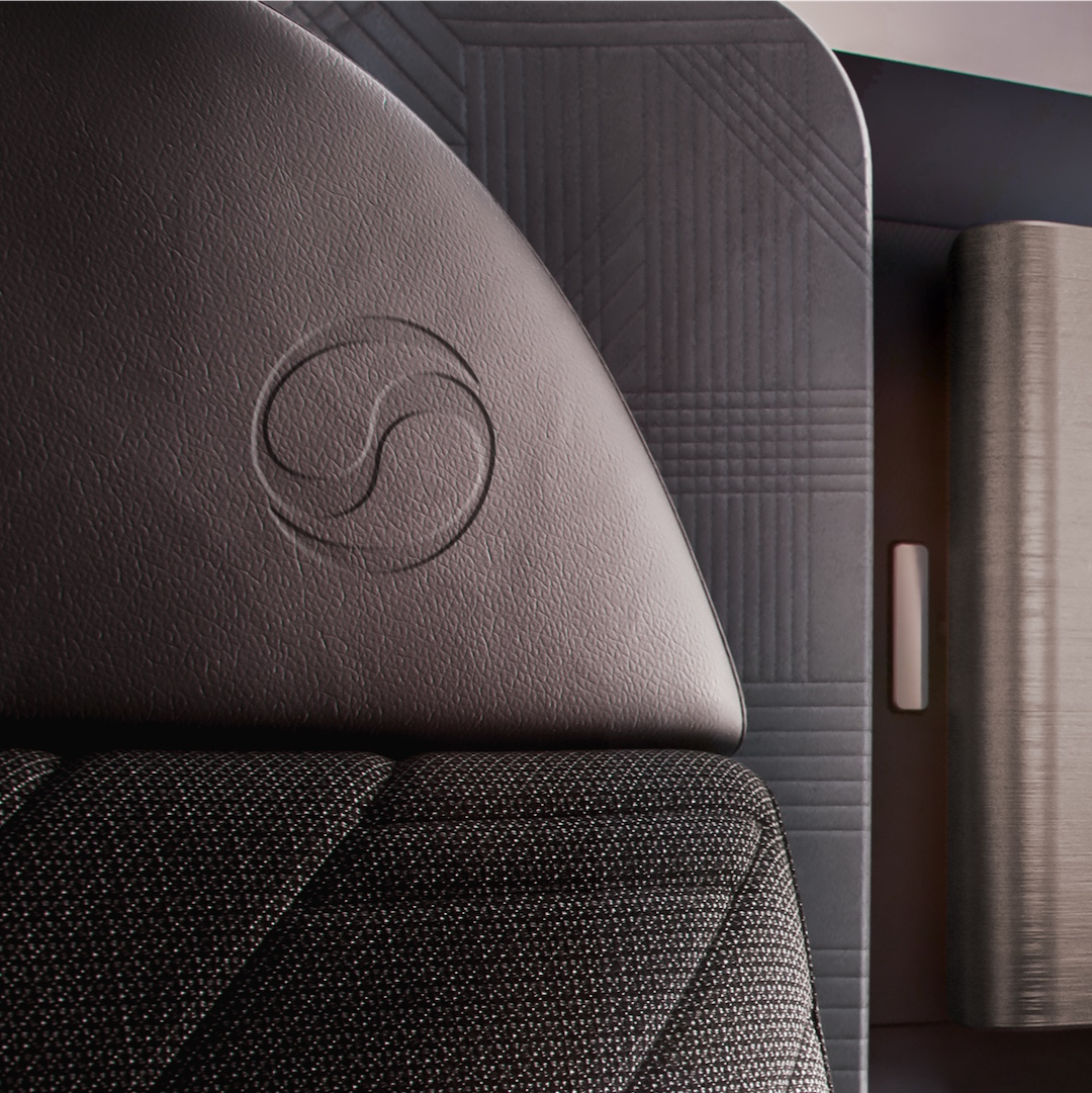
Image courtesy of Lippincott
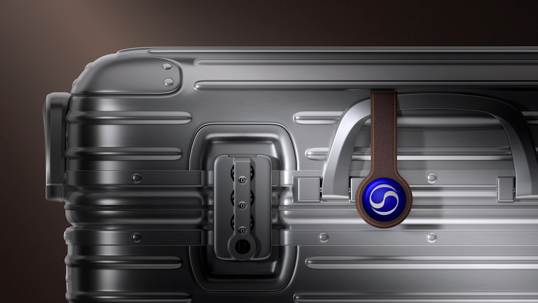
Image courtesy of Lippincott
Before:
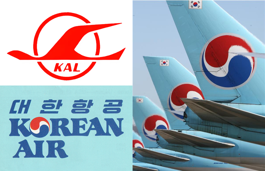
Images courtesy of Lippincott
The airline’s logotype has also undergone a transformation, now reflecting the sleek sophistication of luxury hospitality brands. The word “Air” has been removed from the fuselage, leaving “Korean” as the focal point to reinforce the airline’s roots and ensure they make their mark in airports worldwide. The typography, too, features delicate, calligraphic-inspired strokes that mirror the elegance of the Taeguk.
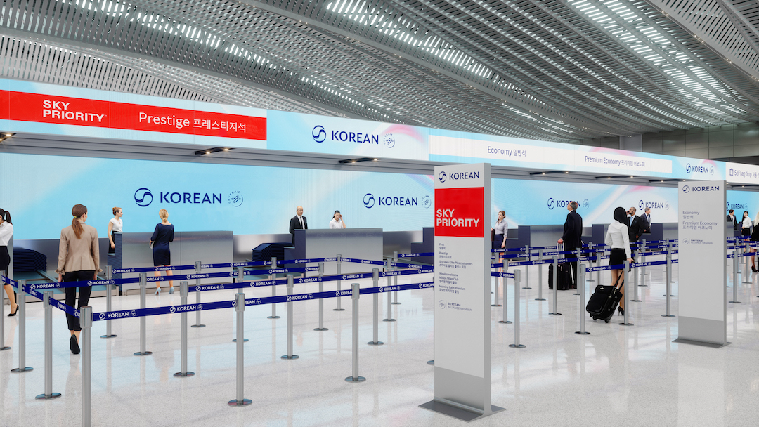
Image courtesy of Lippincott
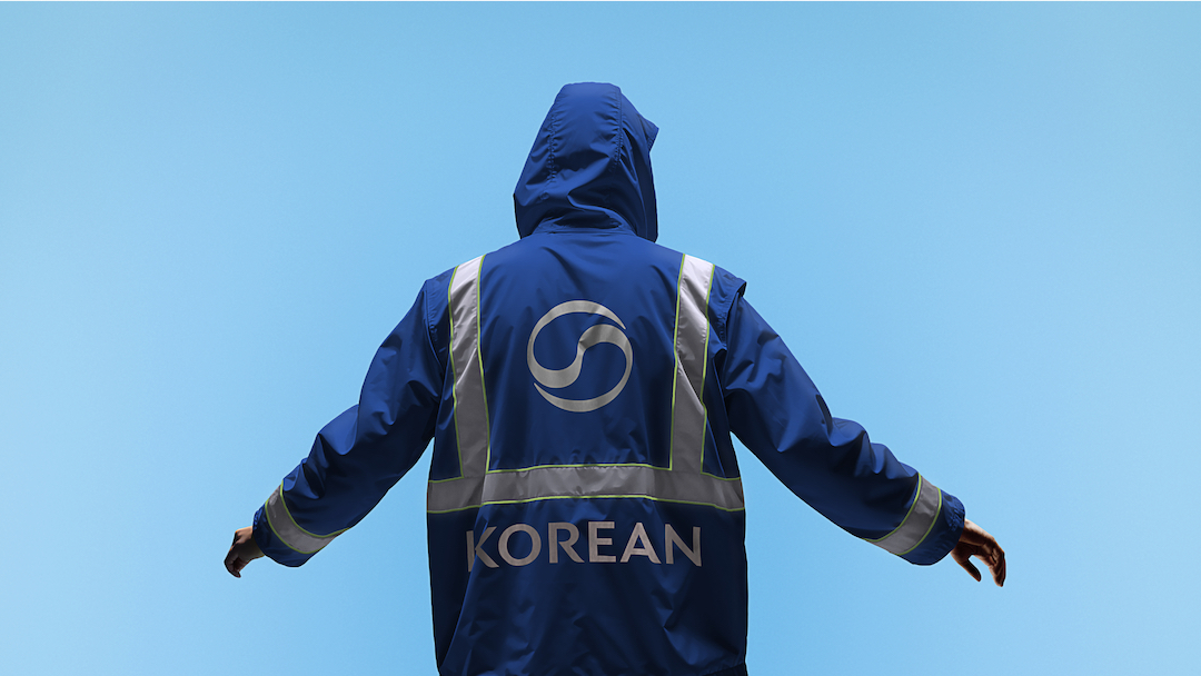
Image courtesy of Lippincott
As far as the airline has flown to adopt a modern look, Korean Air has retained its signature blue color scheme for frequent fliers to feel right at home. The rejuvenated livery incorporates a spectrum of blue hues with subtle accents that complement the dark neutral tones of the redesigned cabin interiors. These updates extend beyond the aircraft, reaching into the airline’s digital platforms and customer touchpoints.
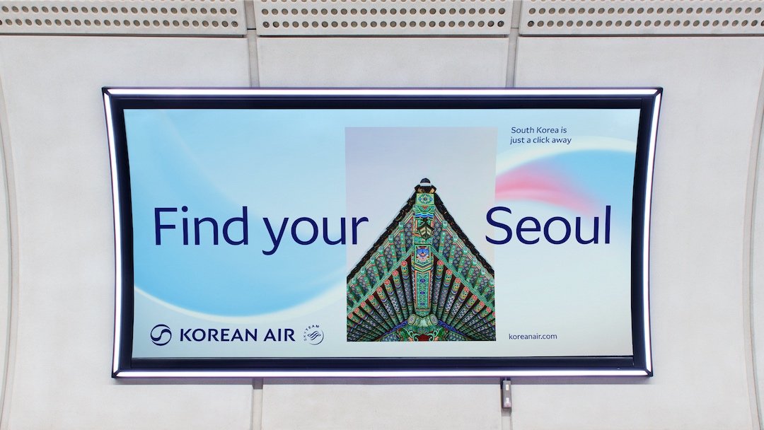
Image courtesy of Lippincott
Korean Air’s high-flying updated branding will make its official debut in March 2025.
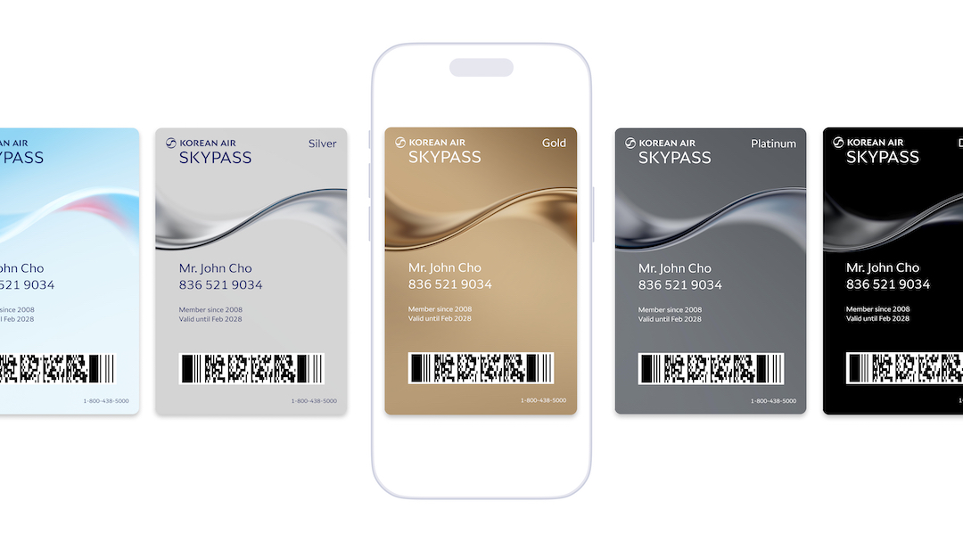
Image courtesy of Lippincott
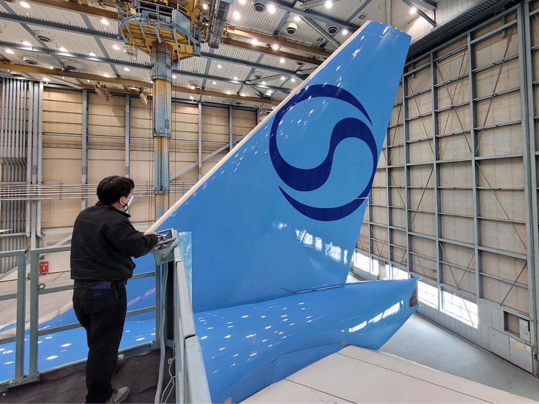
Image courtesy of Lippincott
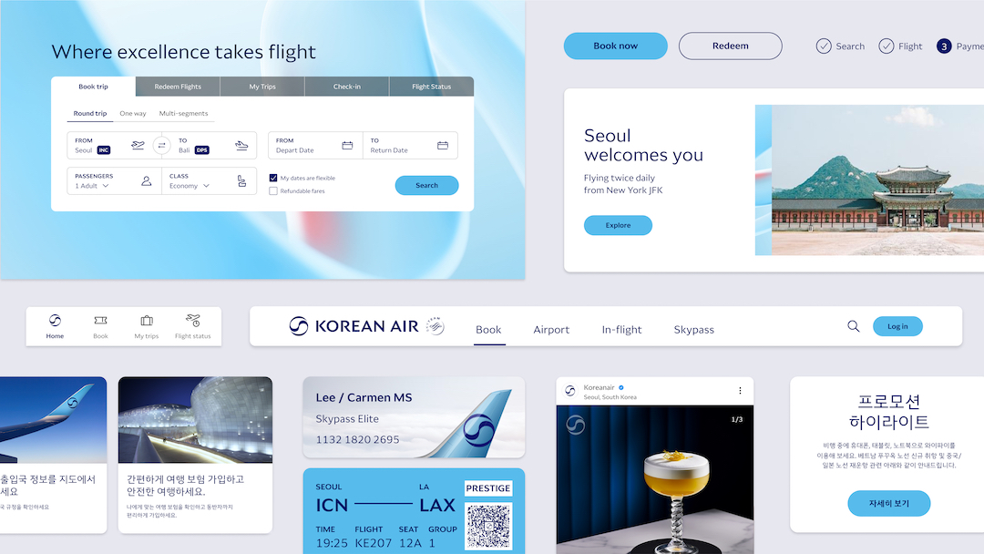
Image courtesy of Lippincott
[via Lippincott, images courtesy and featured with permission]


