
MTA Rolls Out First Wholly Redesigned NYC Subway Map In Half A Century
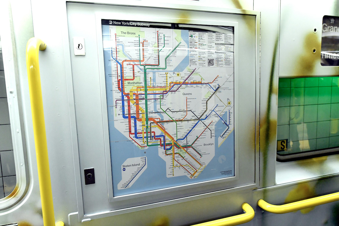
Image via Marc A. Herman / MTA / Flickr (CC BY 2.0)
New Yorkers are about to embark on a new journey of visual navigation as the Metropolitan Transportation Authority has unveiled a fully redesigned subway map for the first time in almost 50 years, swapping out the long-standing version from 1979.
The new layout, officially released on Wednesday, replaces the familiar tangle of lines and borough outlines with a cleaner, more schematic design aimed at modern riders and digital screens alike.
Say hello to a new subway map! Today, the MTA unveiled a new subway diagram that provides riders with essential travel information in an easily readable, bright, and orderly manner.
— MTA (@MTA) April 2, 2025
Check it out on digital screens in stations, and as it rolls out on train cars over the next… pic.twitter.com/M7OxqL4YQ1
Crafted by the MTA’s Creative Services Mapping Department, the new map features bold, color-coded lines laid out on a stark white background, with simplified borough shapes and horizontal labels designed for easier reading.
Stations are marked by high-contrast black dots with white characters, and QR codes link to real-time updates on service changes. The visual overhaul is meant to be more accessible to low-vision users and those with cognitive disabilities, with better spacing, improved legibility, and clearer service information baked into the layout.
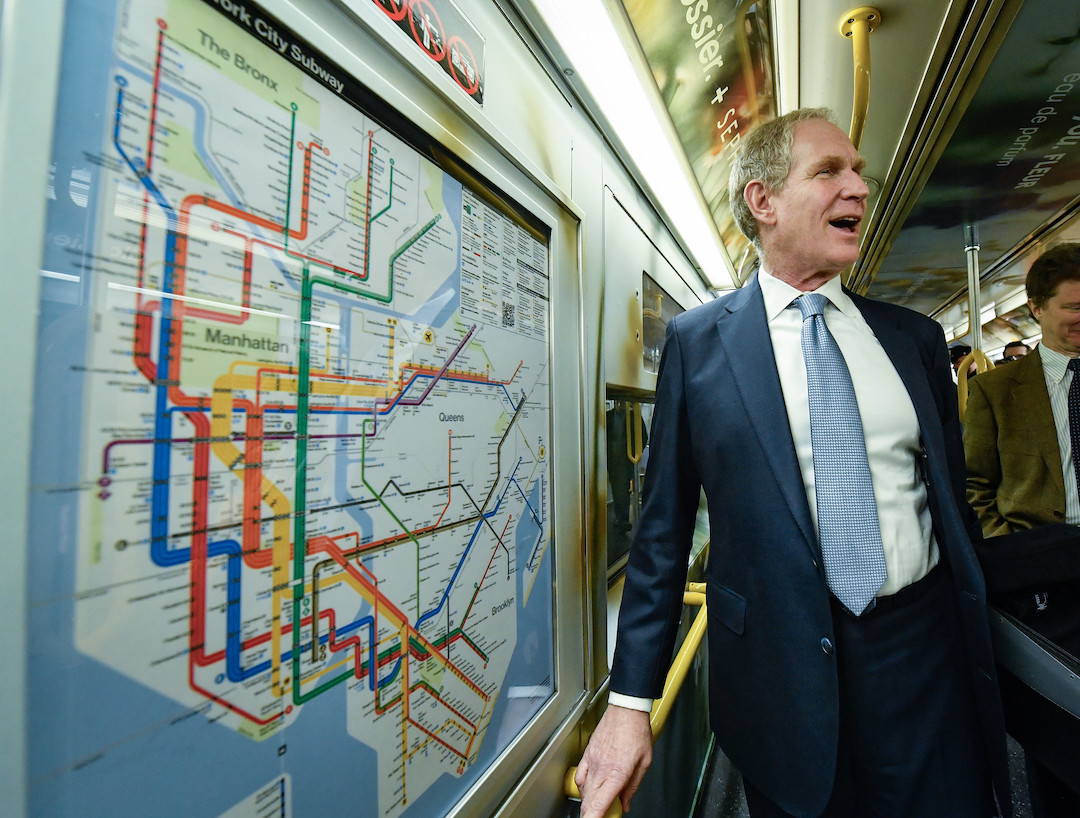
MTA Chair & CEO Janno Lieber presenting the newly revamped New York City subway map. Image via Marc A. Hermann / MTA / Flickr (CC BY 2.0)
The redesign stems from years of work and public feedback, incorporating elements from iconic past maps—like Massimo Vignelli’s 1972 version—while addressing usability concerns tied to the older “spaghetti-style” diagrams. Key system updates, including the Second Avenue Subway and the 7-line extension, are now prominently represented.

Image via Marc A. Herman / MTA / Flickr (CC BY 2.0)
But not all riders are on board. The map’s graphic depiction of boroughs has drawn mixed reactions online, with critics calling the cityscape distorted and the layout overly complicated.
This might be more confusing because it further distorts the geography and makes it harder to see where in the city the stops are. Does the MTA focus group with riders before making these changes?
— Christie Smythe (@ChristieSmythe) April 2, 2025
Truly ugly.
— Aleks (@XanderSquats) April 3, 2025
While some applaud the nod to Vignelli, longtime straphangers argue the redesign makes subway transfers harder to follow and distances less intuitive.
This isn’t DC! Color lines don’t work in NYC because there are multiple train lines with the same color 🤦♀ï¸. Useless waste of taxpayers money. Let’s take the orange line said no one in NY
— Carmela Isabella (@CarmelaMSW) April 2, 2025
Others have questioned the decision to remove recognizable city landmarks, like the Metropolitan Museum of Art, which were helpful orientation tools for visitors and locals alike.
Looks like a video game, Where are the treasure chests of ammo to collect in the battle to reach your destination?
— Never forget 🇺🇸â¤ï¸ (@kathy25932350) April 2, 2025
The city looks distorted. This is not an improvement
— ThorOdinson âš¡ï¸âš¡ï¸ âš¡ï¸ (@someBKLYNguy) April 2, 2025
Looks like a video game, Where are the treasure chests of ammo to collect in the battle to reach your destination?
— Never forget 🇺🇸â¤ï¸ (@kathy25932350) April 2, 2025
For commuters who stand by the old look, the MTA promises the old map will remain available online.
The overhauled map has already begun appearing on digital screens in stations and is expected to make its way into subway cars in the coming weeks.
[via Gothamist, 6sqft, CBS News, amNewYork, New York Post, images via Marc A. Herman / MTA / Flickr (CC BY 2.0)]


