
Grubhub Digs Into A Bold New Look With Juicier, Brighter Visual Makeover
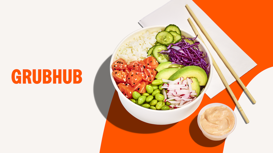
Image courtesy of Grubhub
Grubhub is serving up a fresh look that pairs with its appetite for growth. As of May 5, the food delivery platform has begun rolling out a revamped visual identity, created entirely in-house under the direction of creative director Jasmine Sharpe. The redesign aims to sharpen Grubhub’s brand presence while maintaining a sense of familiarity, like personalizing your favorite dish without losing the flavor.
The entrée of this menu is a retooled logo. Rather than a complete overhaul, Grubhub opted for evolution over reinvention. The refined wordmark now features a slightly heavier weight, giving it a more assertive, appetite-evoking profile. Subtle design adjustments, like a rebalanced ‘G’ and a crisper crossbar, enhance legibility and modernize the look without alienating long-time users.
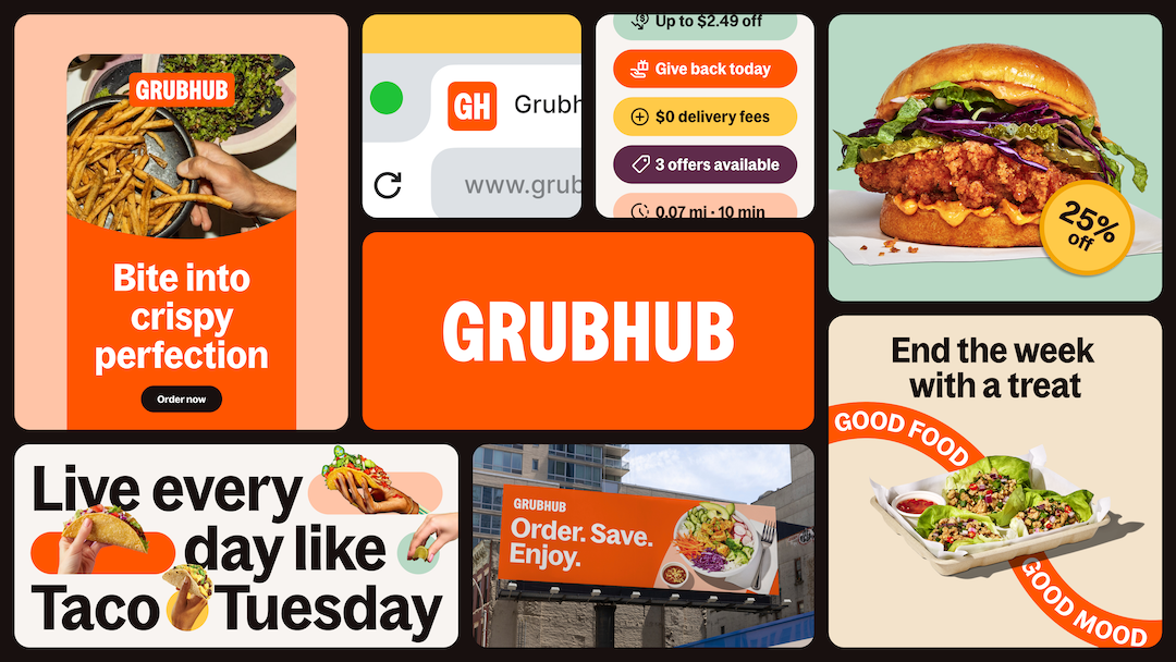
Image courtesy of Grubhub
Color plays a leading role in the refresh. While orange has been part of Grubhub’s palette since 2021, the new hue dials up the saturation for more contrast and energy. The amplified tone is now the anchor of a wider color system, designed to pair with vibrant food imagery and create an instantly recognizable visual tone across platforms.
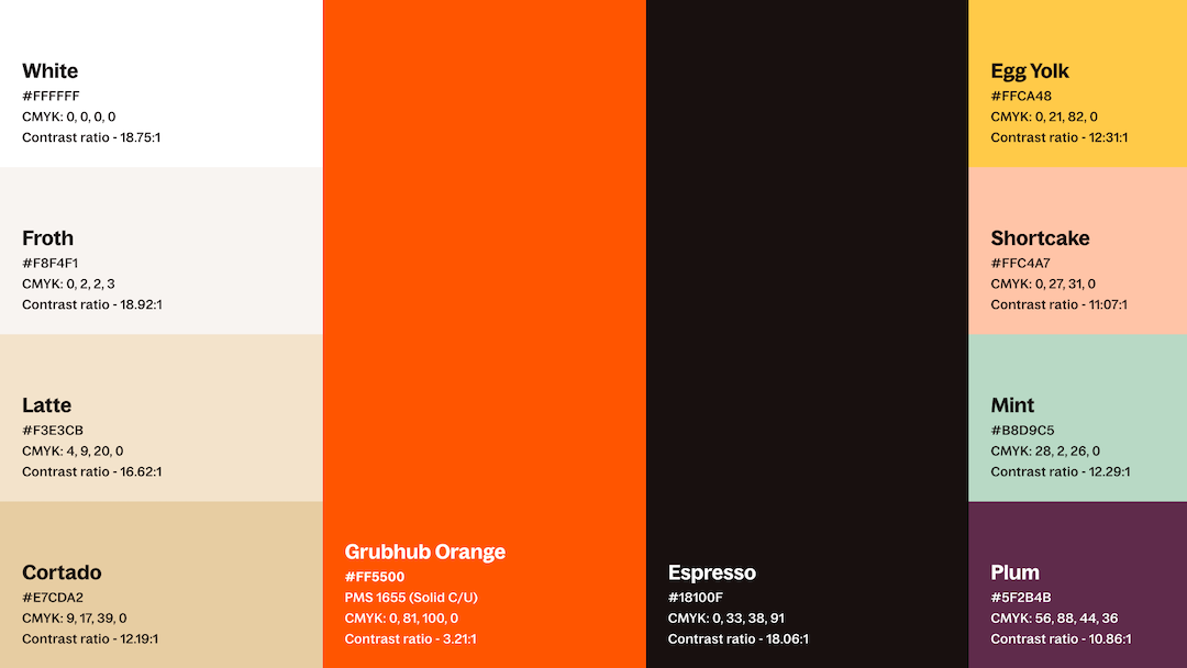
Image courtesy of Grubhub
Typography also got a makeover with the introduction of ‘Bagoss’, a custom sans-serif that Grubhub says embodies a mix of playfulness and polish. The variable font adapts fluidly across screen sizes and formats, from mobile menus to animated advertisements, helping Grubhub maintain a consistent voice across all media. Its rounded shapes and high x-height lend it a friendly, accessible feel that aligns with the brand’s updated messaging.
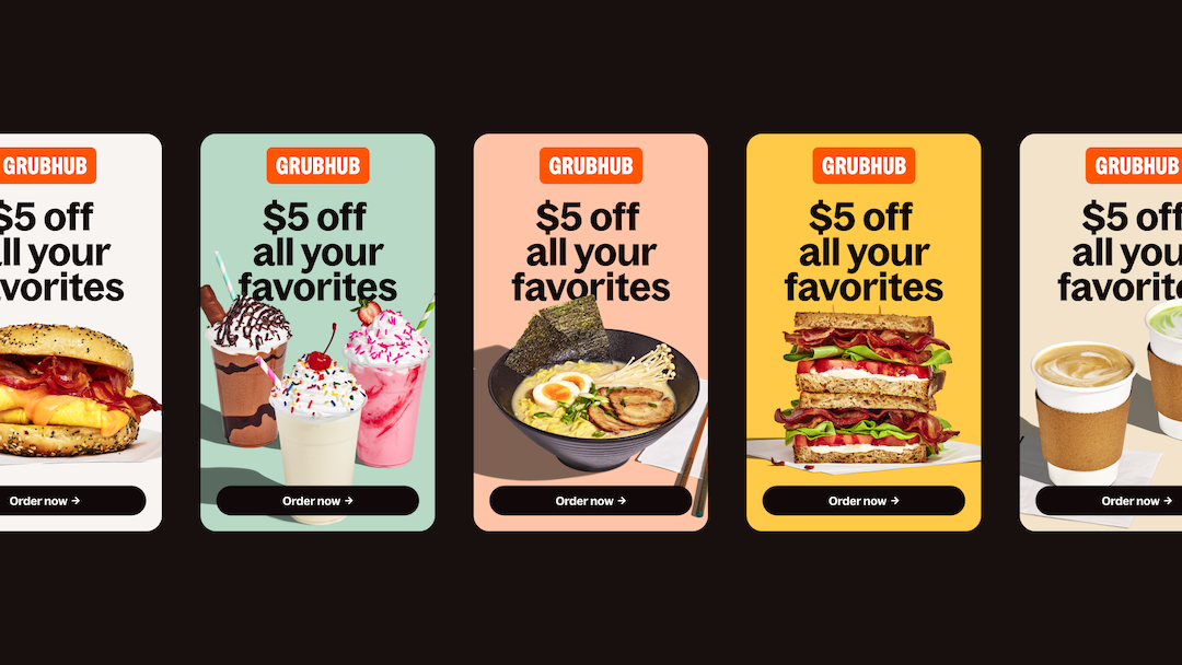
Image courtesy of Grubhub
Perhaps most importantly, Grubhub’s refreshed identity isn’t just built for now but designed to flex with future ambitions. The new logo, typeface, and color scheme were created with motion in mind, ensuring they look just as good in app animations and video content as they do on static packaging.
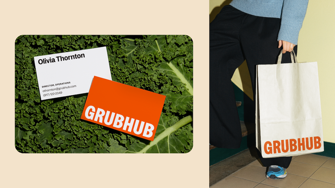
Image courtesy of Grubhub
[via Grubhub, images courtesy and featured with permission]


