
Goodreads Redesigns Its Logo—But Is It Just The Same Book With A New Cover?
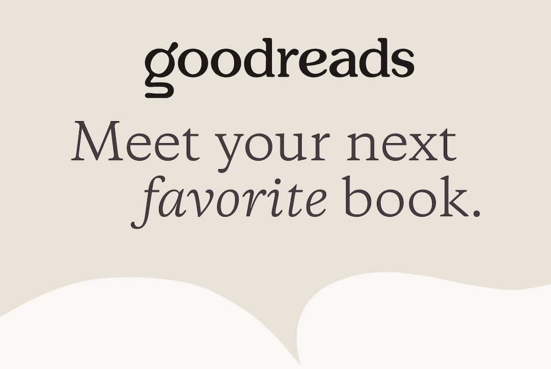
Image via Goodreads
Goodreads is finally judging its own cover after nearly 20 years of sticking to the same stripped-down look. The Amazon-owned platform has overhauled its logo to one that is seemingly laminated for the scroll-happy aesthetics of “BookTok” (the bookish corner of TikTok) and Instagram.
The redesign swaps out the old brown sans-serif wordmark for a softer, chunkier serif and introduces a new lowercase “g” that moonlights as both a magnifying glass and an open book.
goodreads had a rebrand, I'm really loving their new logo 🤌 pic.twitter.com/MNLwAPaohw
— Rushi (@AGIrushi) July 20, 2025
According to Goodreads, the updated emblem is meant to reflect the platform’s core promise: discovery, exploration, and connecting through stories. The symbol’s dual imagery captures that mission in one stroke. The icon’s top curve mimics a lens for searching, while the bottom flips open like a book, creating a neatly layered metaphor for the site’s reading-centered purpose.
It has been a long time coming. It was many chapters ago when Amazon acquired the brand in 2013. However, users have continued to call out the site’s dated user interface and slow feature rollouts. The logo’s refresh—along with a beefed-up audiobook catalog and integration with Amazon’s ‘Your Books’ shelf—is being positioned as the start of a wider modernization effort.
And although the redesign has been seen as a positive sign that the website is waking up from its long design slumber, readers are still awaiting the plot twist. Long-requested features like half-star ratings and a true dark mode remain off the table.
so you’re telling me goodreads updated their logo but not anything about the actual app itself that looks like it hasn’t seen an update since 2014?
— emily (@jaca3rys) July 16, 2025
pic.twitter.com/y2vS4HSKN8
“Hope this is a start to real improvements,“ one user comments on Reddit.
me: oh goodreads has an update!!!
— lukeâš¡ï¸ (@ripleyblxck) July 14, 2025
goodreads: we updated our logo and nothing else!!! pic.twitter.com/v5oDFDtfQN
Goodreads babes, I don’t care about that fuckass logo. Please just add half star ratings. Thanks. pic.twitter.com/HBEwHfOq7D
— merde (@iSocioPathetic) July 17, 2025
Everyone, for years: Wow, Goodreads could really use a million and a half UX updates—the whole app and website feels archaic!
— Brianna (@verygoodchat) July 17, 2025
Goodreads: Best I can do is a logo refresh. pic.twitter.com/wEQyV5bQWB
Not the fugly logo change instead of overhauling the entire thing, @goodreads pic.twitter.com/QASGEheMdC
— Sana (@artsymusings) July 16, 2025
[via Fast Company, Creative Bloq, r/Reddit, images via Goodread]


