
Eurovision’s 2026 Logo Gets Little To No Love, Sparking Redesigns From Public
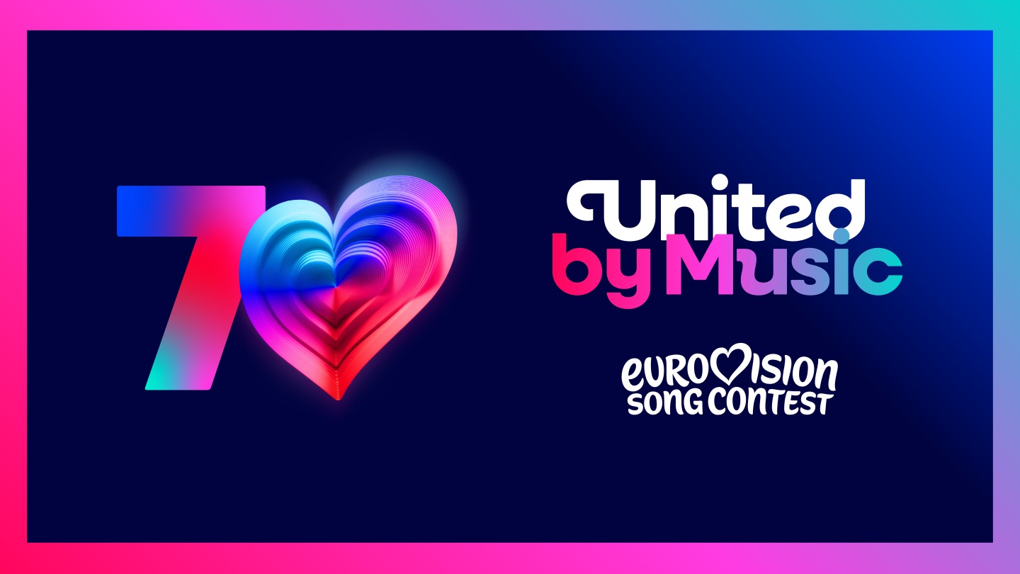
Image via Eurovision
The crowd’s not entirely clapping for Eurovision’s 2026 logo. As the contest gears up to celebrate its 70th edition in Austria next year, the European Broadcasting Union has pulled the curtain back on a brand refresh, introducing a custom typeface called ‘Singing Sans’ and a glitzy, multilayered emblem known as the Chameleon Heart.
But while the rebrand was meant to sing with emotion, many fans say it’s hit a flat note.
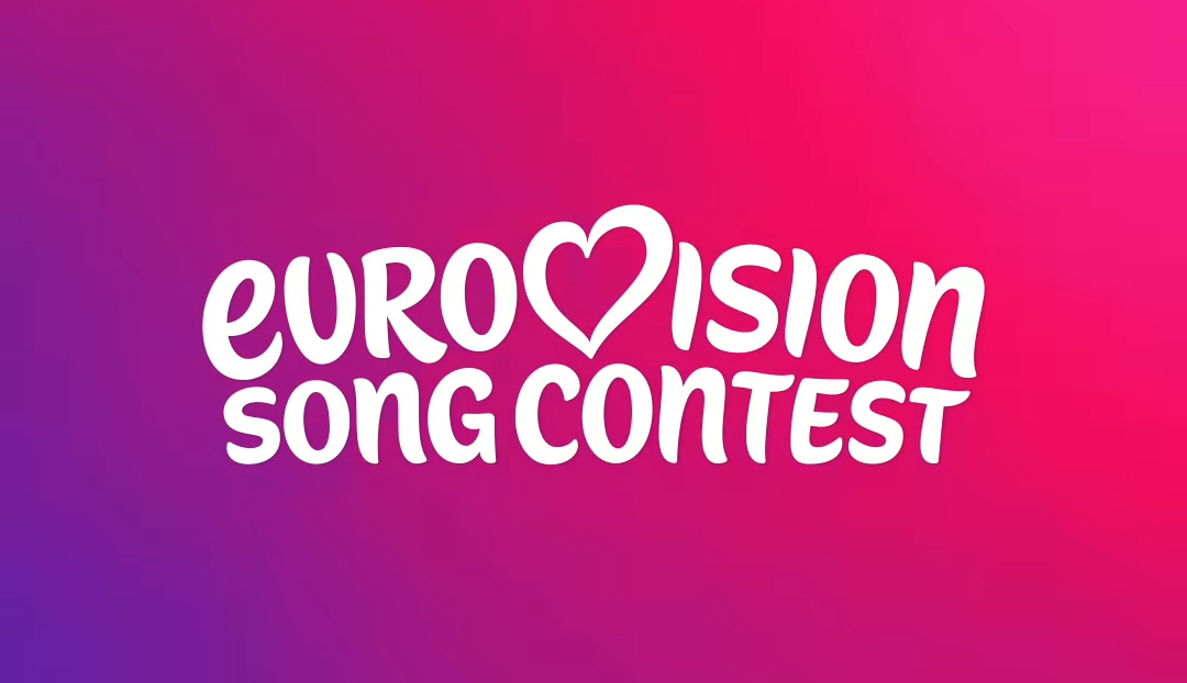
Image via Eurovision
The redesigned emblem, unveiled on Monday, trades the long-familiar handwritten script for a rounded, all-lowercase font. The heart remains where it’s always lived, tucked inside the word “Eurovision,” but now it’s rendered in 3D with 70 visible layers, each representing a year of the contest’s history.
View this post on Instagram
The aim, according to the EBU and branding agency PALS, is to present a modern and adaptable identity that works just as well on streaming platforms as it does on stage. It’s also Eurovision’s first major brand update since 2015.
The new look, however, hasn’t exactly united fans by design. One commenter calls it “the biggest downgrade in 70 years,” while others pointed to mismatched capitalizations and a loss of Eurovision’s handwritten charm as reasons for the backlash.
The biggest downgrade in the entire 70 years of Eurovision history
— Kerem (@Krm_H67) August 18, 2025
They changed everything what was good about the contest and kept everything that needs to be changed. What a shame, this looks terrible pic.twitter.com/vXYEIssa2n
The Chameleon Heart was pitched as a flexible, standalone visual element that can morph to suit different themes, countries, or cultural moments. While its adaptability may be well-suited for digital campaigns or broadcast graphics, some argue that it fails to reflect the sense of tradition, flair, and kitsch that defines the Eurovision brand. The original logo’s scrawled, energetic script has long been part of the contest’s identity, and the shift to a cleaner, more corporate aesthetic feels like a step too far for some.
It feels like there is not a single person on Earth that likes the new Eurovision logo more than the old one and I can definitely see why... pic.twitter.com/L1lssPnjQk
— Maria 🦋 (@_maria_polo_) August 18, 2025
A “Dislike Button” encouraging reactions stands as the leading comment in Eurovision’s announcement post.
“Congratulations to whoever made this logo, but in the nicest way possible, can we go back to the old logo please?” one observer pleads. “Like, as the old saying says, if it ain’t broke don’t fix it?”
fuck all bring back eurovision logos that were created distinctly for each year pic.twitter.com/ciV1igH3wa
— jen (@polskiegoaph) August 18, 2025
Scream if you hate the new eurovision logo
— yellonish🇮🇸🇺🇦🇳🇺 (@yellonish) August 18, 2025
pic.twitter.com/D4rmAMJcXP https://t.co/pRpNyaZheF
“CHANGE IT BACK,” one person demands. “WE'RE NOT ON DISNEY CHANNEL. IT'S NOT A CHILD CONTEST.”
babe wake up new eurovision logo just dropped pic.twitter.com/nwVqt65hOu
— kostesc 🇺🇦🇮🇸 (@k0stesc) August 18, 2025
Sums it up perfectly #Eurovision pic.twitter.com/Gp9lxWsnYT
— Bea from Ireland A.K.A Lesley Roy (@theBEAchannel) August 18, 2025
“There are so many problems with Eurovision but the logo is NOT one,” notes another. “The old one was MUCH BETTER, why try to fix something that ain't broken.”
Some fans have even taken things into their own hands by offering to redesign the logomark.
just change the subtitle back to Gotham font and we can talk. #eurovision pic.twitter.com/Vg5oajJMU7
— tweets by cian™ (@CianOMahony) August 18, 2025
I’ve never seen such unanimous dislike for a rebrand, but I actually think the Eurovision part isn’t bad. The best solution I’ve see is from @CianOMahony 👇ðŸ¼
— sᴜᴘᴇʀ ᴛᴠ(@superTV247) August 18, 2025
They need to do this! #Eurovision @EBU_HQ https://t.co/mVfNFcHvdz pic.twitter.com/KlmiXAffo4
Martin Green CBE, who serves as director of the contest, justified the redesign as a balance between honoring Eurovision’s legacy and streamlining its future. He emphasized the need for a cohesive identity across platforms, noting that this updated branding will be used across live events, digital content, and promotional materials.
“The Eurovision Song Contest has always been about evolution—musical, cultural, and creative,” Green details. “This refresh honors 70 amazing years while taking the brand forward to an exciting future. It’s bold, playful, and full of heart - just like the Contest itself. We’re so proud to unveil it to the world.”
Fans still have some time to warm up to the design. For now, their hearts remain torn.
[via Euronews, Eurovoxx, Creative Bloq, images via Eurovision]


