
ALDI Crunches Numerous Brandings Into One Household Name With Packaging Overhaul
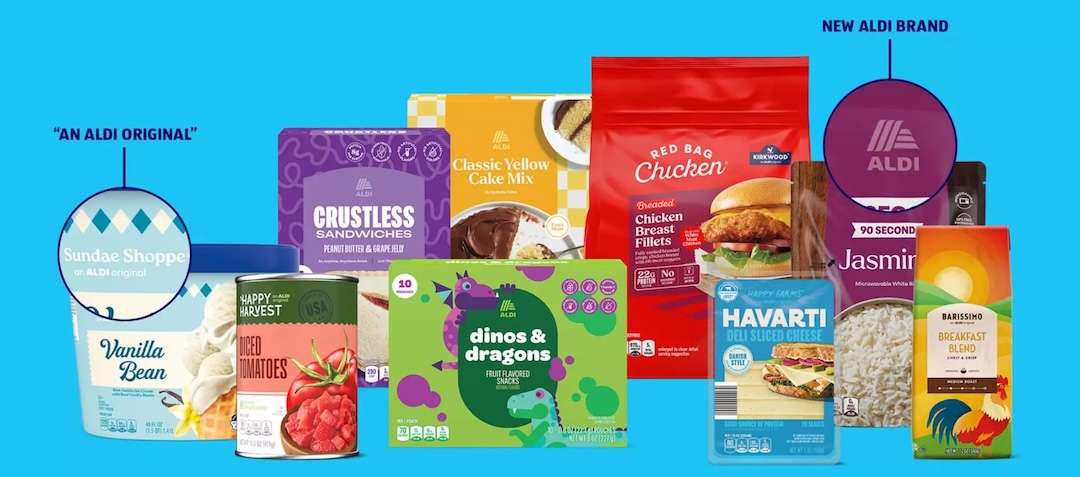
Image courtesy of ALDI, featured with permission
If you’ve ever described ALDI’s snacks as simply “ALDI chips,” you weren’t alone. Now, the discount grocer is leaning into that habit with its largest packaging refresh to date.
For years, the company’s shelves have been filled with dozens of sub-brands that ranged from the recognizable, like Simply Nature or Clancy’s, to the obscure, like Belmont or Baker’s Corner. All this was counterproductive. Customers largely ignored those distinctions, referring to everything generically as “Aldi brand.”
Executives took note, and the result is a unified visual identity—designed by creative agency Favorite Child—that reduces 90 labels to a leaner 26.
Some familiar names will stay, but they’ll now carry the endorsement “An ALDI Original.” Others will disappear entirely, absorbed fully into the ALDI name.
The refresh also includes ALDI’s first-ever namesake product line, an intentional move to anchor its identity more strongly in the minds of shoppers. CEO Atty McGrath, who stepped into the role earlier this month, framed the redesign as part of a wider effort to streamline the brands already speedy shopping experience. According to chief commercial officer Scott Patton, the new look reflects ALDI’s ongoing push for trust and transparency, emphasizing that product quality and testing standards remain unchanged.
“As we worked on this refresh for the past few years, we drew so much inspiration from our fans. Our customers already call our private labels ‘ALDI brands,’ and we’re excited to officially recognize them with a name they can see and trust,” Patton explained. “Our research shows customers associate ALDI with affordability, value, quality and convenience. Now, they can feel confident knowing our trusted name is behind every exclusive product in their cart.”
Favorite Child’s design system had to work across the retailer’s vast range of products—from chips to frozen pizzas to home staples—while avoiding the pitfalls of monotony. The agency leaned on flexible layouts, bold typography, and cohesive color strategies to strike a balance: shoppers will see consistency without losing the sense of variety that defines a grocery run. In effect, the ALDI name becomes both the umbrella and the signature.
The approach packs in playful nods to loyal fans, as well. For example, the beloved “Red Bag Chicken” now features its nickname on the bag, a gesture that acknowledges the viral popularity of certain products.
The timing isn’t without complications. Just as ALDI embarks on its redesign, it faces legal pressure from MondelÄ“z International, which has accused the grocer of mimicking the packaging of iconic products like Oreo and Wheat Thins.
ALDI maintains that the revamp doesn’t touch formulas or recipes, only appearances, and insists that shoppers will notice the difference in branding, not taste. Over the next few years, the transformation will roll out across all 2,570 US stores, gradually replacing the patchwork of private labels with a look that’s unmistakably ALDI.
[via Favorite Child and ALDI, images courtesy of ALDI and featured with permission]


