
PANTONE’s Color Of The Year Gets Its First Official Type Counterpart
Image via Monotype
PANTONE’s 2026 Color of the Year is now being painted to the letter. For the first time, type foundry Monotype has unveiled an official typographic expression for the annual color selection, pairing the soft white known as Cloud Dancer with a revived typeface that leans into calm, craft, and memory.
PANTONE’s hue is described as a billowy, balanced white meant to reflect rest and renewal in an increasingly overstimulated world. Monotype, collaborating directly with the color authority for the first time on this initiative, responded by selecting ‘Jensen Arabique’ as the color’s typographic counterpart.
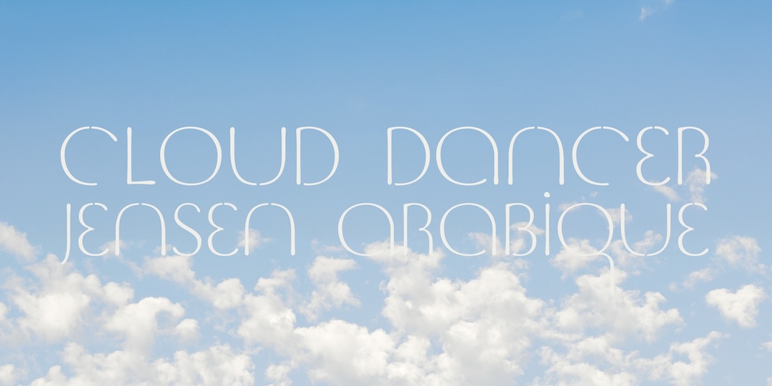
Image via Monotype
Jensen Arabique is not a new design, but its timing is newly resonant. The typeface was digitized in the 1990s by independent designer Jason Castle, based on lettering originally drawn by Gustav Jensen and published in a 1933 alphabet book. Its forms are soft and human, with a hand-drawn quality that resists rigidity. To Charles Nix, Monotype’s senior executive creative director, those characteristics made it a natural companion to a color defined by restraint and clarity.
According to Monotype, the decision was guided as much by mood as by technical considerations. Cloud Dancer’s emphasis on calm and openness is echoed in Jensen Arabique’s gentle curves and understated presence. Nix has described the pairing as an exercise in legibility and emotional tone rather than trend-chasing, reflecting what he calls a form of creative synesthesia, where visual elements are selected to reinforce feeling as much as function.
“In synesthesia, one sense evokes another. Creatives are ‘cultural synesthetes,’ using instinct, experience, and type tools to pair color and type every day to convey emotion and meaning,” shared Nix. “But this year is the first time we’ve ever given typographic expression inspired by the PANTONE Color of the Year, pairing Jensen Arabique with this year’s selection of PANTONE 11-4201 Cloud Dancer. Design is curation. Color thirsts for type and type thirsts for color. Finding that perfect pairing in a world of abundant creative assets is an ever-evolving art—now aided by powerful search and discovery tools, including AI.”
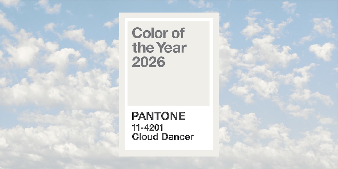
Image via Monotype
Nix drew on typographic history, cultural references, and hand-drawn letter studies, alongside Monotype’s discovery platforms such as WhatTheFont and newer AI-assisted search tools. With hundreds of thousands of typefaces now circulating across digital and physical media, Monotype argues that the act of pairing, rather than sheer novelty, is becoming the defining feature of strong design work.
That belief is rooted in research as well as tradition. Monotype’s 2025 Fonts, Feels, & Reels study found that 79% of Gen Z and 78% of Millennials consider font choice an important part of creating engaging social content.
The pairing debuted publicly at PANTONE’s Color of the Year 2026 launch event in New York City, where Jensen Arabique set in neon was used in an installation exploring the relationship between letterforms and light.
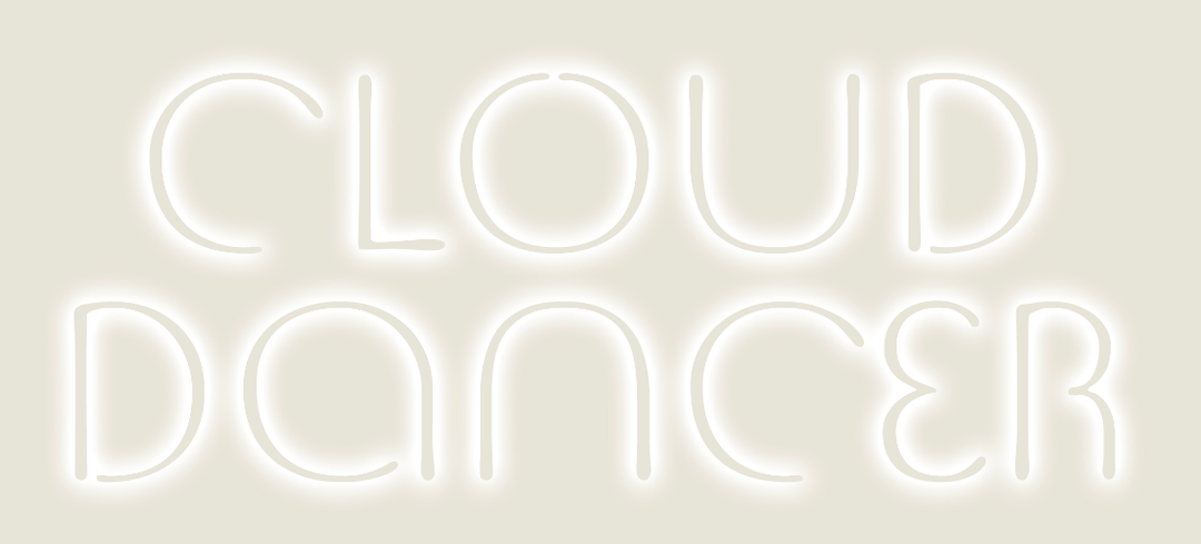
Image courtesy of PANTONE, featured with permission
“It is wonderful to see Jensen Arabique, which has been special to me for a long time, striking a chord with the times we are living in,” expressed Castle, founder of CastleType. “When I first created this font decades ago, I thought the forms were elegant and calming. The nature of type is that we never can predict where or when a design will resonate, and it is exciting to see it find a new meaning in a modern context.”
View this post on Instagram
With Cloud Dancer and Jensen Arabique stepping into a pas de deux, they prove how typography and color can work in tandem to shape how visual calm, clarity, and meaning are perceived.


