
Bruce Blackburn, Prolific Designer Behind NASA Logo, Passes At 82
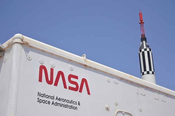
Image via ChameleonsEye / Shutterstock.com
Graphic designer Bruce Blackburn got to witness his iconic NASA worm logo, unearthed from the space agency’s archives after nearly 30 years of unuse, take off into space for the historic SpaceX mission in 2020.
On 1 February 2021, the acclaimed designer took his last breath at a nursing home in Arvada, Colorado. His death was confirmed by his daughter, Stephanie McFadden, according to a New York Times report.
The designer Bruce Blackburn, whose modern and minimalist logos — including the NASA “worm” — became ingrained in the nation’s consciousness, has died at 82. https://t.co/vybY9aTO4v
— New York Times Arts (@nytimesarts) February 18, 2021
Blackburn was also renowned for designing the quintessential American Revolution Bicentennial star. “They say in life there are moments that are once-in-a-lifetime opportunities,” expressed Blackburn. “And I got two of them.” Additionally, he worked on visual branding for IBM, Mobil, the Museum of Modern Art (MoMA), and more.
Bruce Blackburn, the designer of American icons such as the NASA worm logo, American Revolution Bicentennial logo, and many other influential identity programs, has passed away. Today we remember his brilliance and influential work. pic.twitter.com/CYVVmqi5p8
— DomestikaEN (@DomestikaEn) February 11, 2021
In the earlier leg of his 40-year career as a designer, Blackburn worked at branding firm Chermayeff & Geismar. He later left the company to found his own design studio, Danne & Blackburn, with Richard Danne in 1974.
The duo got their start with bigger clientele when the Federal Graphics Improvement Program approached the firm to redesign NASA’s ‘meatball’ logo. The classic emblem was deemed to look too vintage, and NASA wanted something that was more rooted in the space age.
Thus arrived the NASA worm in 1975, which depicted the NASA acronym in a minimalist string of red letters.
However, under a new administration, NASA abandoned the worm and returned to using the meatball in 1992, claiming to have done so to boost employee morale.
In Blackburn, a mini-documentary focused on his design career, Blackburn recounted that designers strongly retaliated at the decision. “They said, ‘This is a crime, you cannot do this… this is a national treasure, and you’re throwing it in the trash bin,’” he shared.
His daughter said that Blackburn’s “design sensibility was offended by what happened,” and proclaimed that he had thought the meatball symbol “was clumsy and sloppy and not representative of the future.”
Blackburn summed up his design style as “programmatic,” adding that work was to “[foster] imagery in the public’s eye that is permanent.”
“The art in design is problem-solving and then giving it visual life,” he elaborated.
In 1984, President Ronald Reagan presented the graphic designer with the Presidential Design Award. Blackburn also became the president of the American Institute of Graphic Arts in the 1980s.
Blackburn’s daughter related that the designer was surprised when NASA took the worm logo out of retirement last year and displayed it on a SpaceX rocket. “I think he was glad to know that his design was finally back in space,” she reflected.
He is survived by his wife, daughter, two sons, sister, and eight grandchildren.
RIP Graphic designer Bruce Blackburn (1938-2021)
— Typeroom (@typeroom_eu) February 7, 2021
A legendary figure who designed the iconic Bicentennial logo and one of the most spaced out logos of all time aka @NASA's WORM https://t.co/GW9CkVqVkM#bruceblackburn #graphicdesign #Logo pic.twitter.com/Kgg6ATTt7B
[via The New York Times, cover image via ChameleonsEye / Shutterstock.com]
Also check out these recent news


