Don't miss the latest stories
Sydney Council’s ‘Messy’ $90,000 Visual Identity Riles Up Internet Users
By Mikelle Leow, 12 Feb 2020
Subscribe to newsletter
Like us on Facebook

Image via Inner West Council
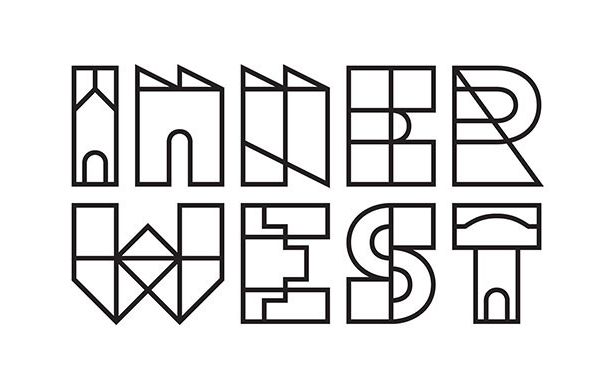
Taxpayers of Inner West Sydney are displeased with its council’s new abstract branding, which took 18 months and an A$90,000 (US$60,000) budget to complete.
On 3 February, the Inner West Council presented the visual identity. The rebrand, produced by design and strategy agency For The People, includes a logo spelled out in architectural shapes.
“The new logo reflects that the Inner West is a uniquely creative, vibrant and diverse community,” the council described in a press release.
This was a huge contrast to the council’s previous sans-serif wordmark—shown below—featuring a map of the area.
Posted by Inner West Council on Thursday, May 19, 2016
On its website, the Inner West Council’s logo is animated, and shows its characters appearing one by one. The council also filled the branding’s white interiors with colors and patterns, demonstrating how it could be applied for multiple platforms as well as “to celebrate the diversity in our community.”
Considering that the new design is worlds apart from the safer former logo, locals are expectedly unhappy with the revamp, which they have described to be “messy,” “hard to read” and “a waste of (our) money.”
“How bad must the rejected have been?” one Facebook user remarked.
The logo was the culmination of two concepts that took into account “input from the local community about what made the Inner West unique.” It will appear on posters, signage, pamphlets, presentations, and the council’s quarterly newsletter.
Image via Inner West Council
Posted by Inner West Council on Sunday, February 2, 2020
Um, so I’m not an expert in design, but I do feel like I get our community and also get how important it is to have...
Posted by Jenny Leong on Monday, February 10, 2020
Posted by Inner West Council on Sunday, February 2, 2020
[via 4BC, images via various sources]
Receive interesting stories like this one in your inbox
Also check out these recent news


