
Durex’s Cheeky New Brand Identity Includes Typeface Called ‘One Night Sans’
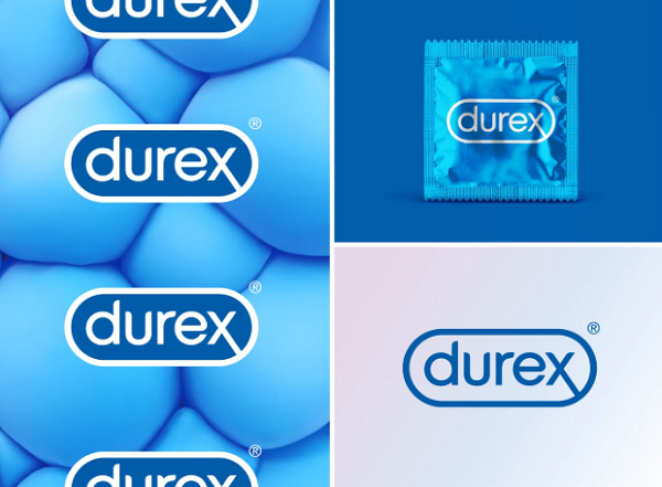
London-based creative agency Havas London and design agency Design Bridge have teamed up to create a new identity for condom brand Durex.
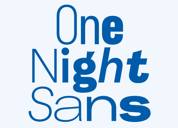
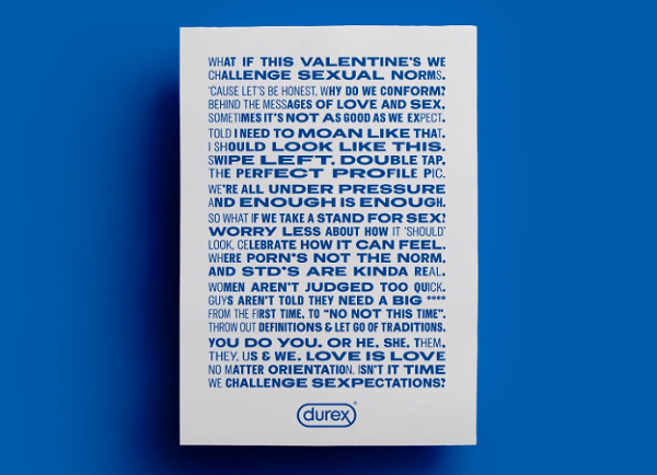
The visual language aims to “challenge conventional approaches to sexuality” with the introduction of inclusive imagery. The rebrand includes an updated logo, as well as a new custom typeface created by Colophon Foundry.
The refreshed identity was created based on Durex’s 2017 Global Sex Survey, where the company found that “underlying sexual anxiousness” was driven by “unrealistic representations of sex.”
To address this, Havas London’s head of design Lorenzo Fruzza told It’s Nice That that the team worked to position Durex as a “clear and honest brand” that “behaved like a stamp of authenticity and trust.”
Havas London, which was responsible for the brand’s strategy and positioning, also wanted to establish consistency in Durex’s global branding and create a look that would work for numerous markets and channels, hence the flat two-tone branding.
Fruzzi and his team also developed the logo’s lozenge shape symbol that doubles up as a photo frame. The wordmark and the lozenge are two symbols that spell out “product quality and trust,” Fruzza said.
To amp up the look, Colophon Foundry designed a “clear and trustworthy” typeface aptly called ‘One Night Sans’ to go with the lozenge shape and “amplify” the company’s voice.
Havas London’s global executive creative director Elliot Harris hopes that the new brand purpose will create “greater inclusion and acceptance” as well as “lead healthier conversations and attitudes towards sex.”
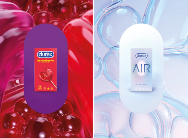
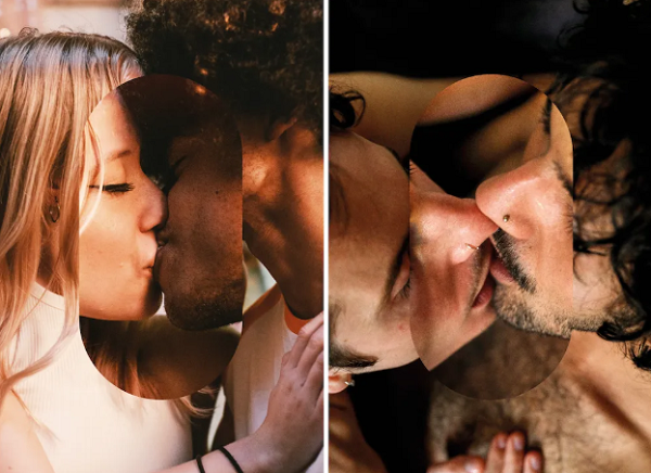
[via It’s Nice That, images via Havas London]
Also check out these recent news


