
Goldman Sachs Quietly Splits Capital Letters & Replaces Typeface In New Logo
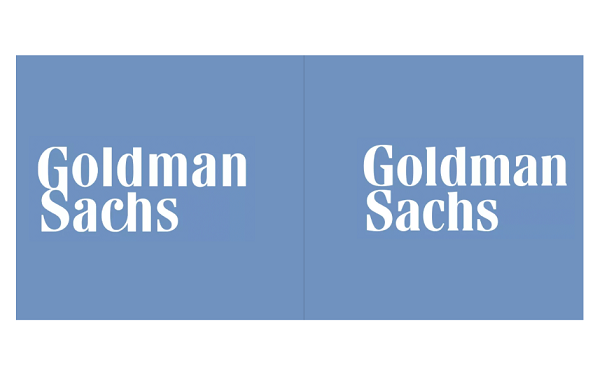
Left: Old logo Right: New logo
Investment firm Goldman Sachs has quietly unveiled a new wordmark.
The previous symbol saw a recognizable GS ligature in a rounder and softer typeface. The company decided to replace it all with a more vertically-inclined design and reduced kerning.
According to Axios, the new logo was created with the help of font foundry Dalton Maag after the previous one was “insufficiently legible at small sizes.”
Though the new wordmark swaps out the use of the 18th-century Bodoni, Dalton Maag managed to retain a similar outlook with a different typeface. The current look is also much more legible, but could have arguably “lost its flair” after the removal of the GS ligature.
Dalton Maag has also created a new typeface to go along with the new logo, called ‘Goldman Sans’. It will be rolled out later in the year.
Undoing the original mistakes... takes guts.
— Vlad Gorshkov ツ (@NuclearVee) March 11, 2020
New Logo for Goldman Sachshttps://t.co/JOqzipaQia pic.twitter.com/so8RaMDwIw
The 'blue box' Goldman Sachs logo was designed in 1970 by Lippincott. Recently been replaced as it was deemed "insufficiently legible at small sizes". They had used Bodini font (which was also changed), designed by Italian typographer Giambattista Bodoni in the 18th century. pic.twitter.com/r5i4By3YDU
— Team Bizdom (@teambizdom) March 13, 2020
[via Creative Bloq, opening image via Goldman Sachs]
Also check out these recent news


