
Facebook Wholly Redesigns With An Airy Facelift, Dark Mode & Quicker Load Times
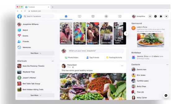
Video screenshot via Facebook App
Facebook is saying goodbye to the blues with a “fresh, simpler” desktop design.
On Thursday, the social network unveiled the redesign on Twitter, showing a new look that draws more attention to users’ updates, along with neatened sidebars and a dark mode.
A significant change is the removal of the blue navigation bar at the top. Facebook splashed the area in white, and added icons in the middle to quickly take you to your news feed, friends list, Facebook Watch, and more.
The old design
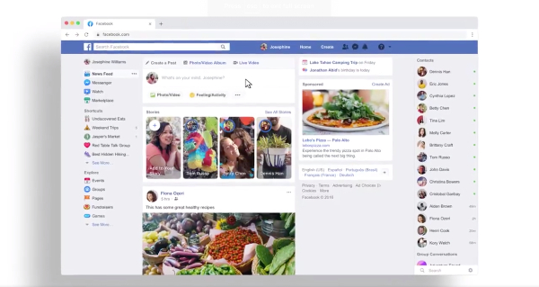
Video screenshot via Facebook App
Introducing a fresh, simpler https://t.co/Rw6MBNKIl3.
— Facebook App (@facebookapp) March 19, 2020
This desktop experience will be rolled out to everyone over the next few months. Check out how to opt-in below. pic.twitter.com/r2FBCuBHBl
The revamp does without the jarring borders that separate the news feed and side panels. Facebook also rounded the corners of posts for an airier feel.
As with its partner app WhatsApp, the Facebook app has given its desktop view a full dark mode, which can be activated by clicking on the downwards arrow on the top right.
The website also streamlined its UX with faster page loading times and transitions, and the whole flow just seems much more animated. It moves around as seamlessly as the new Messenger, which was reimagined from the ground up with over a million fewer lines of code.
Some users might already be able to view the new version by clicking on the arrow on the right, and then selecting “Switch to new Facebook.” However, this option should only be available to a select few, as Facebook says it will be rolling it out to all users “over the next few months.”
Cut down on screen glare with the new look of Dark Mode on https://t.co/Rw6MBNKIl3. pic.twitter.com/Rm4J5rCtbJ
— Facebook App (@facebookapp) March 19, 2020
Page loading time and page transitions on the new https://t.co/Rw6MBNKIl3 are faster than ever. pic.twitter.com/x4KMfozNWH
— Facebook App (@facebookapp) March 19, 2020
[via Facebook App]
Also check out these recent news


