Microsoft’s New Bing Logo Exudes Class With Soft, Rounded Edges & Sleek Curves
Old logo. Image via SergioVas / Shutterstock.com
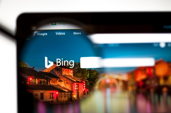
Microsoft has given the Bing search engine a logo update.
The new Bing logo still retains the lowercase ‘b’ letter, but Microsoft has replaced its sharp edges with a much curvier design. The wordmark now exudes a softer vibe with rounded edges and subtle gradients.
Though Microsoft could have extended the redesign to the name “Bing” as well, the new symbol is definitely more in line with the rest of Microsoft’s icons, which now sport a modern look.
It is still unclear when Microsoft will be rolling out the new look, but according to tech blog Thurrott, the company will be testing the logo with a limited selection of users first.
What's up new Bing logo (right)👀
— Daniel Rubino (@Daniel_Rubino) April 1, 2020
Yay or nay? pic.twitter.com/s5erzDlPJO
So, there's a new Bing logo being tested.
— • Futur3Sn0w • Get Touch on Twickd! • (@Futur3Sn0w) April 1, 2020
No one (until now) has been able to show off a high-res version of it- so here you all go!
I'll be uploading the PNG version to FluentNeo (as well as many MANY more icons) shortly! pic.twitter.com/Psx5QRzHTs
#Microsoft #Bing Is Testing a New Logo https://t.co/fFtBpSRXiM pic.twitter.com/uXjuruC0I4
— The Scottish Tech Guy (@tech_scottish) April 2, 2020
Microsoft has a new Bing logo that’s more Fluent Design pic.twitter.com/lNplVaENcg
— Tom Warren (@tomwarren) April 1, 2020
[via Creative Bloq, opening image via SergioVas / Shutterstock.com]
Also check out these recent news


