
Slack’s Logo Is Almost Indistinguishable From Google’s App Icons On Screens
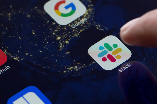
Image via Tada Images / Shutterstock.com
After a long stretch of criticism over its logo redesign in 2019, collaboration tool Slack is once again getting the stink eye for how its app icon looks on the home screen.
Despite claiming to adopt an “easily identifiable” look soon after the revamp, Slack’s app icon blends in with those of Google’s products, including Chrome, Google Podcasts, and the new Google Maps icon.
Slack replaced the purple background with white in the app icon in February 2019, making the graphic look nearly indiscernible from those of Google apps on phone screens. They all sport color schemes of white, red, green, blue, and yellow, though the blue in Slack’s logo is lighter.
“When designing the Slack logo, it seems like nobody paid attention to the Google apps being so similar in terms of color,” tweeted Stef Hamerlinck of podcast Let’s talk branding. “A shame because it’s lacking distinctiveness.”
When designing the slack logo, it seems like nobody payed attention to the Google aps being so similar in terms of color. A shame because it's lacking distinctiveness. pic.twitter.com/4cxWuWshlT
— Let's talk branding (@stefhamerlinck) April 8, 2020
On the Pentagram website Slack logo shown on purple background. why the change? A deliberate choice to visually attach Slack to Google apps? pic.twitter.com/wNEK94xjE6
— Richard Defraine (@defcorp) April 8, 2020
[via Let’s talk branding, images via various sources]
Also check out these recent news


