
Facebook’s New Map Shows If There Are People With COVID-19 Symptoms Near You
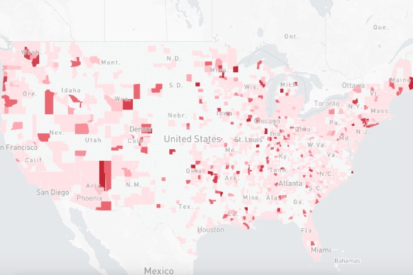
Image via Facebook
Facebook has revealed an interactive map for users to find out more about the COVID-19 situation in the US according to individual counties. The map will show how many people in the areas have reported symptoms of the virus and hospitals where the patients might be referred to.
The map utilizes data from a two-week survey of more than a million Facebook users by researchers at the Carnegie Mellon University, who are the only ones who can access the data, according to Mark Zuckerberg.
The resource will hopefully shed light on how the virus is spreading across the nation, and will be regularly updated to offer visitors the most recent information about the COVID-19 crisis. Facebook plans to run the surveys internationally in the following weeks.
The interactive map will offer a county-by-county breakdown on users who have reported COVID-19 symptoms and hospital referral regions. You can zoom in to the map below to find out more about the coronavirus situation in your area.
[via Business Insider, cover image via Facebook]
Also check out these recent news


