
Evian Serves Coors Light An Icy Diss For Utterly Familiar Brand Redesign
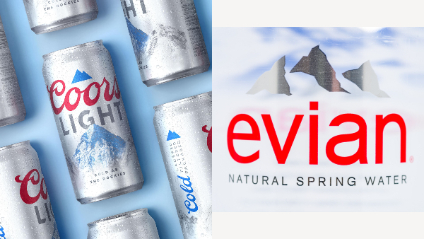
Images via Coors Light and Keith Homan / Shutterstock.com
Evian isn’t bottling up its feelings about Coors Light’s new visual identity.
Last week, the beer brand unveiled a lighter, cleaner and more modern look for its packaging, topping the new logo with a 2D visual treatment of Rocky Mountain provenance in Golden, Colorado.
Coors Light reassured fans on Twitter that despite its “refreshed look,” the light beer still comes with the “same mountain cold refreshment.”
Evian, a spring water brand also associated with mountains, was washed over by déjà vu from the reveal and decided to let Coors Light know about it.
“Beautiful!” the French label first agreed on Twitter. However, it later unleashed its inner ice queen with the sarcastic remark: “Should we send you our graphical guidelines next time?”
Similar to Coors Light’s refreshed branding, Evian’s visual identity features a blue, red and silver color palette. They both have mountain iconographies and red wordmarks at their bases, with gray text underlining the logos.
Jokes aside, Evian recently overhauled its packaging to be free of labels in a bid to eliminate single-use plastics. Its new bottles are completely clear, and are no longer colored nor feature the mountain symbol. The only hue left is a new pink cap. This means the two brands would be easily discernible even if their revamped packaging is placed side by side on shelves.
Evian People pic.twitter.com/mYIfh4A1VR
— HG Otakuni - 4MitsuMido #BlackLivesMatter (@CEW_Otakuni) August 10, 2020
Beautiful!! Should we send you our graphical guidelines next time? 😘 https://t.co/fpJl7yIWk8
— evian France (@evianFrance) August 10, 2020
[via Evian France, cover image via Coors Light and Keith Homan / Shutterstock.com]
Also check out these recent news


