
Joe Biden Unveils Striking Campaign Logo With Kamala Harris’ Name On It
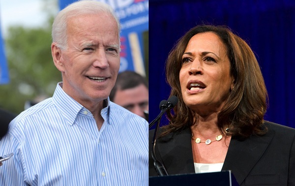
Left image via Pix_Arena / Shutterstock.com, right image via Sheila Fitzgerald / Shutterstock.com
Former vice president Joe Biden recently introduced Senator Kamala Harris as his running mate, and his campaign has now unveiled a new logo that includes Harris’ name.
The new Biden-Harris logo uses the sans-serif typeface ‘Decimal’ from Biden’s campaign redesign in July. The typography was designed by Hoefler&Co, the renowned type foundry behind former president Barack Obama’s campaign typeface ‘Gotham’.
Senior creative adviser for Biden’s campaign, Robyn Kanner worked together, with an in-house creative team to design the logo with Harris’ name on it. It builds on Biden’s original symbol, designed by ad agency Mekanism.
“It represents an America that is strong, bold, and unified, The visual alignment of Biden and Harris in the logo helps convey the powerful impact of a strong partnership and unified America,” Kanner told Fast Company.
Industry experts weighed in on the new wordmark with Fast Company for its recent feature.
Founder and creative director Ben Ostrower—who is behind Harris’ campaign brand—said the “updated logo is a logical and elegant evolution of the brand.”
“‘Decimal’, inspired by the typography of vintage watches and clocks, feels timeless yet forward-looking. It manages to strike a perfect balance between being strong, trustworthy, official and warm and accessible,” he said.
A few creatives, however, noted that voters might be biased towards a logo because they support the candidate. “Politics are personal and emotional. If you like a candidate, you’ll likely like their logo,” design director Jennifer Kinon explained.
“Frankly, the Biden-Harris logo could have been scribbled on a napkin and I’d be happy,” Debbie Millman, chair of the Masters in Branding program said. “Trump’s brand is beyond repair. Biden’s choice of Kamala Harris is inspiring and history making, and Jonathan Hoefler’s typography is strong and impactful.”
Other experts suggested additional edits to the new logo, such as Biden’s and Harris’ name in the same scale and weight, while others thought that it wasn’t “groundbreaking.” However, the logomark speaks to everyone in America and while it probably doesn’t give off a lot of “energy,” it brings people back to the days when Obama was still in the administration.
“It’s familiar and comfortable territory for the part of the centrist Democratic base that long for a return to ‘normalcy’. It’s not the most exciting approach, it’s not the most progressive, but it might just work,” Deroy Peraza said.
To read more reponses, head over to Fast Company.
JUST IN: Joe Biden picks California Sen. Kamala Harris as his VP running mate. Logo for Biden/Harris campaign below: pic.twitter.com/IKmbhTIARr
— KARK 4 News (@KARK4News) August 11, 2020
I confess I don’t quite get why the E in Biden is emphasized in the logo?
— Catherynne M. Valente (@catvalente) August 12, 2020
Is it for “Elect”? “Election?” “Excellence?” “Equality?”
“Eleganza?”
So, @joebiden has announced his VP. The most important thing that means is a new logo. And unlike most presidential campaigns, Biden actually slightly changed it, instead of just adding his VP's name in the same font. The font is now simultaneously less sharp and less fat. pic.twitter.com/fS1O6K21ix
— Anthony Emerson🌹🇾🇪 (@AnthonyEmerso14) August 11, 2020
Today is full of fantastic decisions by the @JoeBiden campaign — logo revision is sharper, better constructed with just the right dose of badass. pic.twitter.com/jJaBSMqH17
— Paul Zolandz (@zolandz) August 11, 2020
Front page of Joe Biden's campaign site right now, with new logo to boot. pic.twitter.com/JYU6FxlOZd
— Cristobal Spielmann 🌐 🇨🇱 (@tobalspielmann) August 11, 2020
[via Fast Company, opening image via Pix_Arena / Shutterstock.com, Sheila Fitzgerald / Shutterstock.com]


