
Google Rebrands G Suite As ‘Google Workspace’, Unveils Gmail Logo Redesign
Image via In Green / Shutterstock.com
Google has announced a big change to its G Suite services, which is now called Google Workspace, and it comes with a whole new set of logos for Gmail, Meet, Drive and more.
The updated branding is more than just a new name; it includes changes both in function and also its appearance. Apps can now work together in efficient ways. For instance, in Google Chat, you will be able to paste in a document or a presentation and work on it in real time without having to open up the full app.
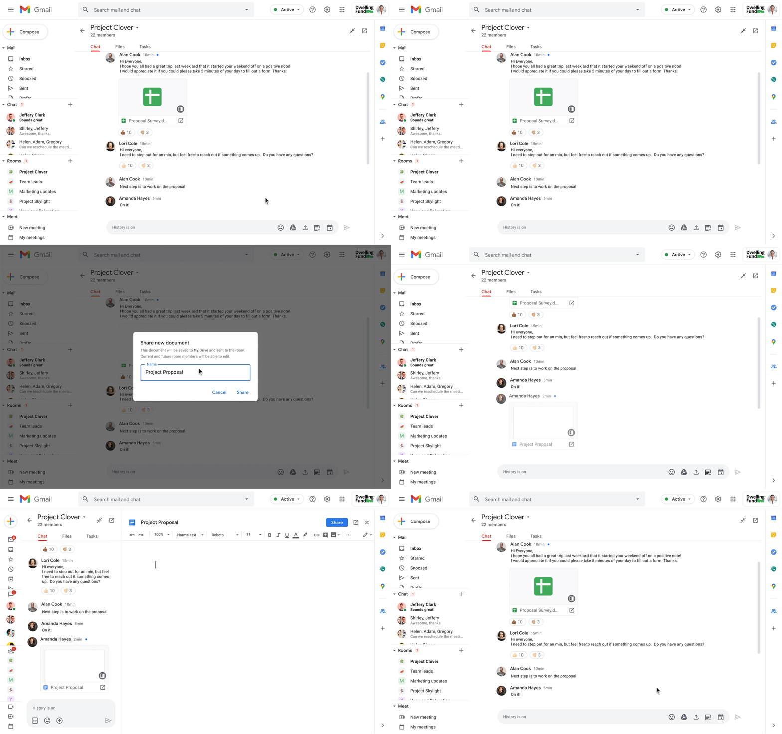
Image via Google Cloud
Google aims to achieve consistency throughout its apps, and its redesigned icons now see them adopting the company’s color palette of blue, red, yellow and green. The biggest change is the Gmail logo, which was previously of a classic envelope shape with the letter ‘M’ formed by a red stripe.
The new icon retains the shape, but ditches the white envelope and adopts Google’s four signature hues. The user’s eyes fills the blanks of where the envelope should be in this negative-space design.
The new icons for Google Drive, Meet, Calendar and Docs have also received major makeovers. While they all retain their basic shapes, they now bear the four colors for visual uniformity across Google’s services.
Google intends to bring its services together to make them feel like a single, connected experience with a consistent visual identity.
We're hitting "send" on a fresh new icon look. Check out all the exciting rollouts happening with #GoogleWorkspace to see how to use all your favorite apps, all in one place → https://t.co/wiPzm3J97u pic.twitter.com/vaDRXcP8Sr
— Gmail (@gmail) October 6, 2020
Everything you need to get anything done, now in one place: introducing #GoogleWorkspace → https://t.co/kq8N4Duo4o pic.twitter.com/Z7SDP5xcUC
— Google Workspace (@GoogleWorkspace) October 6, 2020
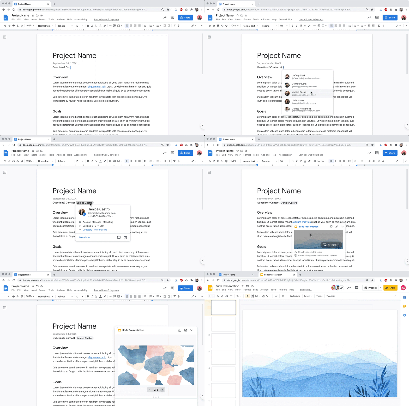
Image via Google Cloud
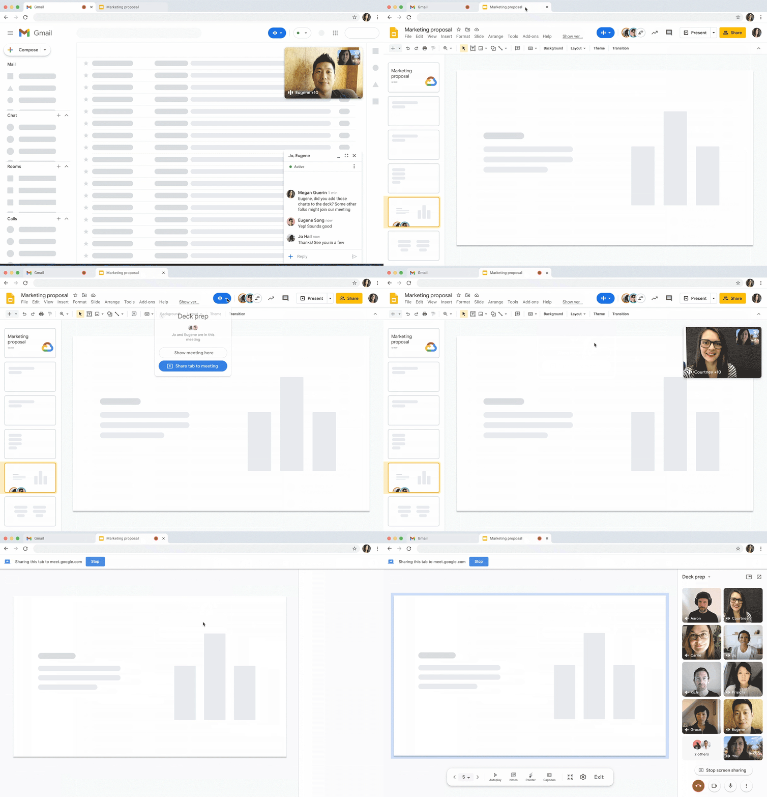
Image via Google Cloud
[via Tech Crunch, cover image via In Green / Shutterstock.com]
Also check out these recent news


