Don't miss the latest stories
Pizza Hut Savors A Slice Of Its Past By Debuting Vintage Official Typeface
By Mikelle Leow, 15 Oct 2020
Subscribe to newsletter
Like us on Facebook

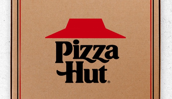
Image via Pizza Hut
Pizza Hut has returned to using one of its most beloved success recipes: its charming 60s-style brand identity.
You might have noticed that the pizza chain has re-adopted its old logomark featuring a thick serif and aligned red roof, a striking contrast to the previous thin script lettering and hand-drawn roof.
The vintage rebrand was introduced in June last year after Pizza Hut found that customers resonated with distinct branding traits like its red-topped eateries. The brand also wanted to start “celebrating where we came from.”
The logo’s typography is now baked into Pizza Hut’s entire visual identity, as the restaurant has enlisted Austin, Texas-based lettering artist Simon Walker to expand the 1967 logomark into a full custom typeface, with some help from advertising agency GSD&M, for use in ad campaigns.
Walker, who recently shared visuals of the ‘Pizza Hut font’, described the collaboration as a “dream project.” As shown in the images, the old Pizza Hut treatment has been scaled up to include numerics and special characters, too.
Creative professionals have been relishing the warm and retro font, which has appeared in television commercials for awhile now. One Twitter user called it “deliciously amazing,” and another even said, “I’ve been chattin’ up the font while watching TV.”
60s- and 70s-inspired typography, such as the Knives Out logo, has come into prominence recently, but it’s hard to imagine this timeless appeal going away anytime soon. Pizza Hut’s graphical dose of nostalgia is here to stay.
With some help from the amazing team at @GSDM I made a custom font for @pizzahut based on their old logo from the 60s. dream project. pic.twitter.com/IkYaPnxgmt
— Simon Walker (@simon_letters) October 14, 2020
View this post on InstagramContactless delivery. From our Hut to Yours.
A post shared by Pizza Hut 🍕 (@pizzahut) on
View this post on InstagramCan't decide on dinner for tonight? Double It. 😋🍕
A post shared by Pizza Hut 🍕 (@pizzahut) on
[via Simon Walker, cover image via Pizza Hut]
Receive interesting stories like this one in your inbox
Also check out these recent news


