
Joe Biden’s Administration Refreshes White House Logo, And It Took 30 Do-Overs
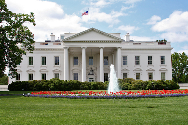
Image via Shutterstock
It’s clear to all that President Joe Biden’s team has revamped the White House website and brought new touches to the Oval Office, but what’s lesser-known is that the new administration has also dusted down the White House logo and given it a little more dimension.
The project, helmed by creative agency Wide Eye alongside White House creative director Carahna Magwood and Dallas-based illustrator John Mata, pushes the pristine work of architecture to the forefront, with the White House’s architectural elements, like its pillows and windows, now becoming more accentuated.
Seems the White House got an updated logo today.
— Shira Tarlo (@shiratarlo) January 21, 2021
Trump —> Biden pic.twitter.com/okSSb2aEVa
I am excited to learn not to cringe when I see the little white house logo and the words "Executive Order". I didn't realize how ingrained that was in me until yesterday when the conditioned response no longer fit. pic.twitter.com/TW9bCwQk7l
— Rebecca Bauer 🏳️🌈 (@TheRebeccaBauer) January 21, 2021
Despite featuring minor tweaks that would probably be unnoticed by many, the rebranding took around 30 tries before getting to where it is. Not only that, the team also took the selected design and created an entire logo system out of it to be applicable across various platforms and contexts, Co.Design reported. This means the emblem will never look out of place, whether as a letterhead or a social media thumbnail.
The revamp, although miniscule, speaks volumes in its subtlety—the new look mirrors some of President Biden’s vision. Rob Flaherty, White House director of digital strategy, empathized the added texture to the otherwise 2D logo, sharing with Co.Design that the refresh is “both forward looking while having its roots in something very traditional.”
“We are bringing the country together and winning the battle for the soul of the nation, but also trying to do it in a way that makes people’s lives materially better,” Flaherty added.
There were discussions of showcasing the charming south facade of the White House, but the designers decided to embrace tradition and went with the original viewpoint. The front of the White House also looked more “accessible,” they found.
A breath of fresh typographic air at https://t.co/1rNBfaeyxx. Kudos to @benostrower and @WideEyeCo for the redesign, cleverly flipping the Mercury and Decimal typefaces that were used in the campaign. →
— Hoefler&Co. (@HoeflerCo) January 20, 2021
In addition, the new wordmark reprises the two typefaces designed by type foundry Hoefler & Co. for Biden’s campaign bid. The serif version, Mercury, and the Decimal sans-serif will be used depending on the scenario, though Mercury will appear more prominently due to its traditional and more magisterial presence.
Official logo for the Biden-Harris @WhiteHouse >> pic.twitter.com/RPC4GOeMZ9
— Matt Hill (@MattHill46) January 20, 2021
[via Co.Design, cover image via Shutterstock]
Also check out these recent news


