Twitter Unveils Bold Visual Identity Mirroring Its ‘Imperfect,’ ‘Complex’ Nature
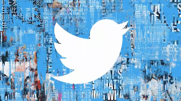
Image via Leslie Berland, CMO of Twitter
Twitter has since evolved from a mere channel to broadcast the last time you had cereal into a platform with diverse voices and drivers for social impact. The company has thus unveiled a new brand aesthetic for a community whose thoughts cannot be contained in 280 characters.
The new visual identity, recently showcased by Twitter’s Chief Marketing Officer Leslie Berland, aims to embrace the growing complexity of the social network.
“We felt the brand expression we launched five years ago didn’t fully reflect the complexity, fluidity and power of the conversations today,” Berland shared on Twitter .“So the team embarked on a unique challenge: to build a creative system for an iconic brand that’s complex and imperfect, by design.”
To portray “imperfection,” Twitter’s communication materials will take on a grunge effect featuring elements like ripped papers, faded imagery, and scratched-out typography.
As always, we started with Tweets at the center. We then tore stuff apart and layered over again. We threw paint on photos, ripped posters, scratched out words, and faded images. We added textures and pixels, movement and memes. pic.twitter.com/VygJaLmniO
— Leslie Berland (@leslieberland) January 27, 2021
— Leslie Berland (@leslieberland) January 27, 2021
With the facelift, Twitter’s usual typeface Helvetica has been swapped for a versatile and “bold” bespoke sans serif called ‘Chirp’, designed by Swiss type foundry Grilli Type.
We also created a new typography that’s flexible and expressive, bold, agile and fun, reflecting the voices that make Twitter, Twitter. We named it Chirp 😉 pic.twitter.com/0d7TROyh0y
— Leslie Berland (@leslieberland) January 27, 2021
Twitter also intends to “[push] the boundaries” of the iconic bird logo moving forward, though the icon will feature more prominently in its marketing efforts instead of receiving a redesign.
The makeover will be splashed across Twitter’s marketing designs, such as “in videos and posters, presentations, GIFs and banners,” Berland confirmed. “You’ll see some pops and winks in the product too,” she added.
Here are more examples of the work👇
— Leslie Berland (@leslieberland) January 27, 2021
We’re excited to hear your thoughts and share more as this evolves over time reflecting the beautiful, bold, complex conversations that shape Twitter, our lives and the world. pic.twitter.com/AOEMZU6jkT
We felt the brand expression we launched 5 years ago didn't fully reflect the complexity, fluidity and power of the conversations today.
— Leslie Berland (@leslieberland) January 27, 2021
So the team embarked on a unique challenge: to build a creative system for an iconic brand that’s complex and imperfect, by design. pic.twitter.com/CZ6KY3cNqw
You’ll start seeing this new work in videos and posters, presentations, GIFs and banners. You’ll see some pops and winks in the product too. Our logo isn’t changing, that Bird is iconic and lives on! But we’ll be playing around with how it shows up. pic.twitter.com/VhlcVtFlNQ
— Leslie Berland (@leslieberland) January 27, 2021
— Leslie Berland (@leslieberland) January 27, 2021
— Leslie Berland (@leslieberland) January 27, 2021
— Leslie Berland (@leslieberland) January 27, 2021
[via Ad Age, images via Leslie Berland, CMO of Twitter]


