Don't miss the latest stories
PANTONE Predicts Which Colors Will Highlight Fall & Winter In 2021/2022
By Mikelle Leow, 16 Feb 2021
Subscribe to newsletter
Like us on Facebook
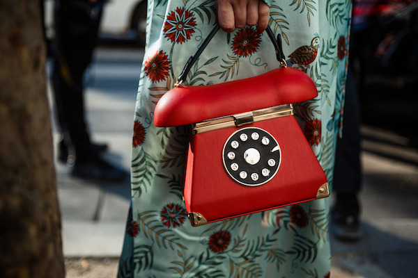
Image via eversummerphoto / Shutterstock.com
The most prominent hues of next fall and winter will embody the growing need for self-expression and joy while keeping everyday life practical and zen, PANTONE anticipates.
In its Autumn/Winter 2021/2022 trend report for New York Fashion Week, the color authority pronounces 10 vivid yet sensible swatches to highlight the fashion sphere in the colder months, along with four classic and neutral tones to tie them together.
Bold hues like Fire Whirl, Fuchsia Fedora, and Mykonos Blue inspire creativity, personal expression, and reinvention, while comforting fundamentals like Coconut Cream and Soybean offer a sense of serenity, healing, and hope. Together, the two palettes illustrate a spectrum of possibilities for a bifurcated lifestyle.
Nodding at this duality, the forecast also features 2021’s two Colors of the Year, Illuminating and Ultimate Gray.
“Offering a range of pragmatic hues infused with vivifying bright pops, colors for Autumn/Winter 2021/2022 offer a plethora of possibilities that support our lifestyle of continual reinvention and convey a promise of reemergence,” described Leatrice Eiseman, Executive Director of the PANTONE Color Institute, in a statement shared with DesignTAXI.
Explore PANTONE’s predicted colors for the fashion world in fall and winter 2021 through 2022 down below.
Color palette
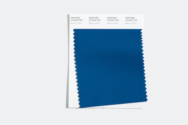
Mykonos Blue (PANTONE 18-4434): “A brisk blue evocative of the Aegean Sea.” Image courtesy of PANTONE, featured with permission
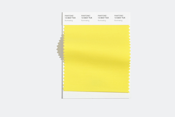
Illuminating (PANTONE 13-0647): “Friendly and joyful, an optimistic yellow offering the promise of a sunny day.” Image courtesy of PANTONE, featured with permission
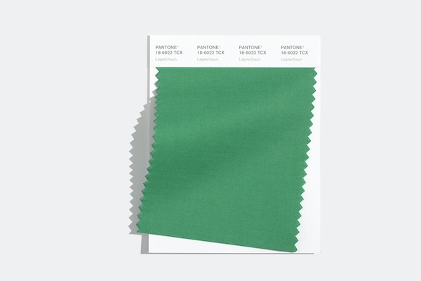
Leprechaun (PANTONE 18-6022): “A wondrous green hue emblematic of the mythical imps featured in Irish folklore.” Image courtesy of PANTONE, featured with permission
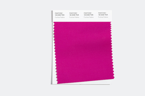
Fuchsia Fedora (PANTONE 18-2330): “A flirtatious bold pink with allure.” Image courtesy of PANTONE, featured with permission
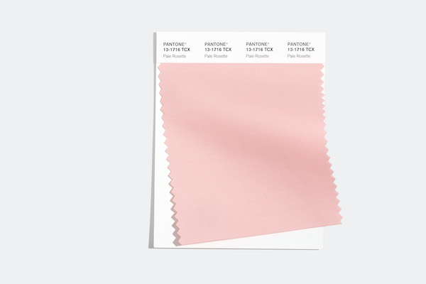
Pale Rosette (PANTONE 13-1716): “An endearing and gentle romantic pink.” Image courtesy of PANTONE, featured with permission
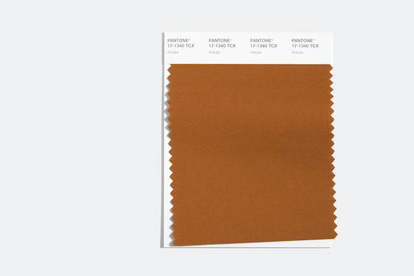
Adobe (PANTONE 17-1340): “A warm and supportive sundried clay.” Image courtesy of PANTONE, featured with permission
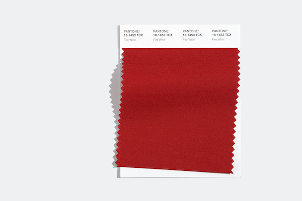
Fire Whirl (PANTONE 18-1453): “A vigorous red with a dynamic presence.” Image courtesy of PANTONE, featured with permission
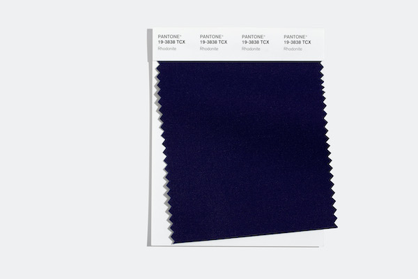
Rhodonite (PANTONE 19-3838): “A balancing blue-based purple that aids in achieving one’s highest potential.” Image courtesy of PANTONE, featured with permission
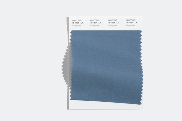
Spring Lake (PANTONE 18-4221): “A quiet and restful midtone blue.” Image courtesy of PANTONE, featured with permission
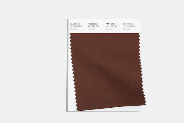
Root Beer (PANTONE 19-1228): “An herbal brown tone symbolic of the root bark of the sassafras tree.” Image courtesy of PANTONE, featured with permission
Core classics
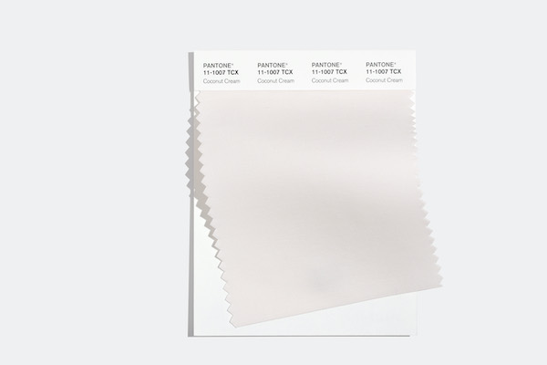
Coconut Cream (PANTONE 11-1007): “A thick and rich velvety white.” Image courtesy of PANTONE, featured with permission
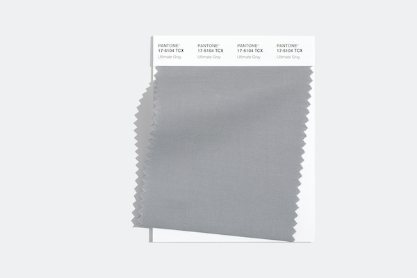
Ultimate Gray (PANTONE 17-5104): “Quietly assuring and reliable, Ultimate Gray encourages composure.” Image courtesy of PANTONE, featured with permission
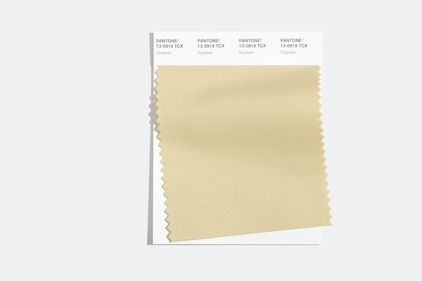
Soybean (PANTONE 13-0919): “A mild and companionable blonde beige.” Image courtesy of PANTONE, featured with permission
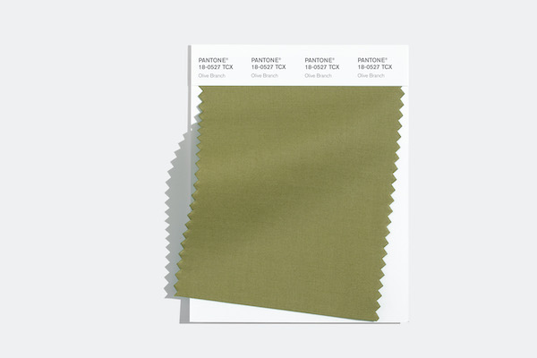
Olive Branch (PANTONE 18-0527): “A tasteful green symbolic of growth.” Image courtesy of PANTONE, featured with permission
[via PANTONE, cover image via eversummerphoto / Shutterstock.com]
Receive interesting stories like this one in your inbox
Also check out these recent news


