
Did You Know: Toblerone’s Shape Has A ‘Sexier’ Muse Unrelated To The Swiss Alps
Did You Know? is a design trivia segment brought to you by DesignTAXI in which we explore some of the most surprising tidbits of well-loved designs or brands.
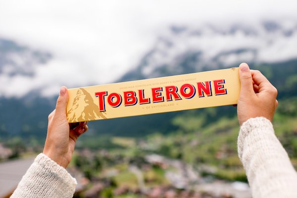
Image via RossHelen / Shutterstock.com
It is widely believed that Toblerone’s chocolate peak packaging is shaped after the highlands of its place of origin. However, there’s been much debate about this.
Toblerone claims that there’s a “sexier” side to the story transcending the Matterhorn and Swiss Alps. In fact, you’ll have to scoot over to Paris to possibly trace the roots of its packaging.
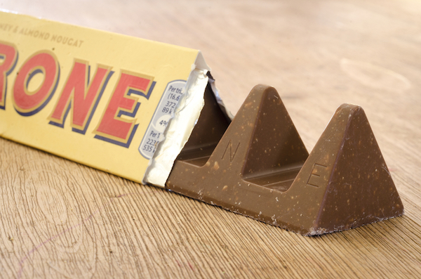
Image via Lenscap Photography / Shutterstock.com
Coca-Cola’s Got the Hourglass Figure. As for Toblerone…
As shared by the company itself, the sons of Toblerone founder Theodor Tobler argued that the triangular packaging was inspired by a cabaret show he attended at the Folies Bergère in Paris.
The performers, clad in frilly red and cream attire, formed a “shapely” human triangle during the finale of the night. Tobler was apparently so enamored with the choreography and their athleticism, he eternalized this pyramidic shape into the Toblerone bar.
It’s a “sexier” chunk of heritage that Toblerone has come to embrace.
There’s More to Bear
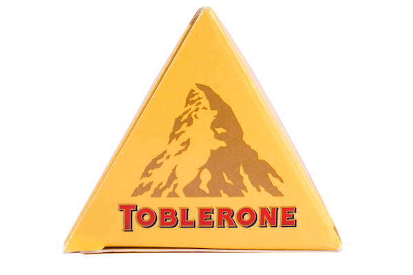
Image via chrisdorney / Shutterstock.com
Another tidbit to share, something that has been properly established as a fact by Toblerone parent Mondelēz International, is that there’s a bear at the side of the mountain in the Toblerone packaging and logo.
The creature is a nod to the coat of arms of Bern, the Swiss capital, which is also known as the City of Bears.
[via Interpack, Spoon University,The Packaging Company, 1000 Logos, images via Shutterstock]
Image via RossHelen / Shutterstock.com
It is widely believed that Toblerone’s chocolate peak packaging is shaped after the highlands of its place of origin. However, there’s been much debate about this.
Toblerone claims that there’s a “sexier” side to the story transcending the Matterhorn and Swiss Alps. In fact, you’ll have to scoot over to Paris to possibly trace the roots of its packaging.
Image via Lenscap Photography / Shutterstock.com
Coca-Cola’s Got the Hourglass Figure. As for Toblerone…
As shared by the company itself, the sons of Toblerone founder Theodor Tobler argued that the triangular packaging was inspired by a cabaret show he attended at the Folies Bergère in Paris.
The performers, clad in frilly red and cream attire, formed a “shapely” human triangle during the finale of the night. Tobler was apparently so enamored with the choreography and their athleticism, he eternalized this pyramidic shape into the Toblerone bar.
It’s a “sexier” chunk of heritage that Toblerone has come to embrace.
There’s More to Bear
Image via chrisdorney / Shutterstock.com
Another tidbit to share, something that has been properly established as a fact by Toblerone parent Mondelēz International, is that there’s a bear at the side of the mountain in the Toblerone packaging and logo.
The creature is a nod to the coat of arms of Bern, the Swiss capital, which is also known as the City of Bears.
[via Interpack, Spoon University,The Packaging Company, 1000 Logos, images via Shutterstock]
Also check out these recent news


