
Inter Milan Reveals New Crest, And Fans Think It’s Too Volkswagen-Like
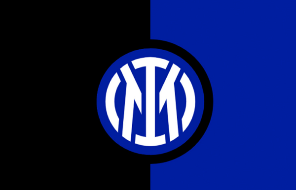
Image via Inter Milan
Inter Milan has released a new logo as part of its wider identity update. The soccer club aims to reach a more international and youthful audience.
The club teamed up with Munich-based design studio Bureau Borsche for the new look, which will be displayed on kits after the end of the current season. It will also be accompanied by a campaign promoting the club’s founding values, per Inter Milan.
Speaking about the rebrand, the club said, “The aim is to make the Inter brand more relevant and recognizable beyond its fanbase and to allow a younger and international audience to identify with the values of inclusion, style, and innovation.”
The new emblem displays the club’s initials front and center and ties into a new narrative of “I M,” based on the words “I am.” The ‘FC’ bit has been removed, but it remains in the club’s name and identity.
The new crest aims to present the club in a “more streamlined and minimalist guise,” while being adaptable in the age of entertainment. The primary typeface for the emblem is Giorgio Bold, while the secondary typeface—Univers Roman 55—will be used for copy.
The club decided to retain its black and blue color palette, but the revamped palette is now “more vibrant and vivid.”
Fans, however, have noticed that the new crest looks similar to the logo of automaker Volkswagen.
“Inter Milan really just flipped the Volkswagen logo,” a Twitter user joked. “The new Inter Milan logo looks awfully like the Volkswagen badge,” another user said, sharing a side-by-side comparison of both emblems.
Inter Milan really just flipped the Volkswagen logo 🤣 https://t.co/pscta2c4La pic.twitter.com/WDFrXuWfPS
— Hasmit (@Hasmitarora) March 30, 2021
The new #InterMilan logo looks awfully like the #Volkswagen badge....🤣 pic.twitter.com/RpegICznEL
— Grant Rivers🕯🌈 (@SnowAndBeach) March 30, 2021
They went from inter Milan to an off brand Volkswagen https://t.co/4GRDUA6S5N
— Bianconero Zone (@BianconeroZone_) March 31, 2021
If true, the new @Inter logo really reminds me of @VWGroup_DE’s logo. #Inter #InterMilan #Volkswagen #VW pic.twitter.com/A39FHJ41oD
— Lionel Piguet 🇨🇭🇫🇷 X 🇹🇼🇵🇭 (@lionelpiguet) March 28, 2021
The definition of “Yo can I copy your homework? Yeh sure just change it a little so it’s not obvious” #InterMilan #Volkswagen pic.twitter.com/kjrFRiAolv
— LUFCLIAM🍥 (@LUFCLIAM_) March 30, 2021
[via Sport Bible, cover image via Inter Milan]
Also check out these recent news


