Papa Johns Unveils Major Rebrand Honoring Pizza Instead Of Problematic Founder
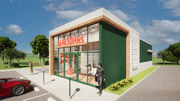
Image via Papa Johns / Business Wire
Papa John’s is now Papa Johns. And, yes, if you’re a grammar nerd, the missing apostrophe means something.
Three years after the company’s controversial founder John Schnatter resigned for being caught making a racial slur, Papa Johns is overhauling everything from its logo to advertising and restaurant designs.
The new logo features a funky sans-serif reading “Papa Johns,” with various interpretations of it bulging in the middle. The brand removed the possessive apostrophe, possibly suggesting that it’s no longer under Schnatter’s control.
Image via Papa Johns / Business Wire
Back in 2018, Schnatter was heard uttering the N-word in a conference call with a marketing agency. The conversation was discovered to be part of a roleplaying exercise for crisis management in public relations, triggered by his own comments in 2017 blaming waning sales on NFL’s “poor leadership” that let players protest social injustice and ultimately affecting his pizza business.
However, CNN learns from Papa Johns’ chief commercial officer Max Wetzel that the makeover is more about embracing the pizza restaurant’s ingredients than a dramatic cutting of ties with the boss.
The company is now using green as a reference to fresh basil, red to represent tomato, off-white to symbolize pizza dough, as well as light purple for garlic and bright yellow-green for pickled pepperoncini.
Meanwhile, the bouncy custom typeface in the logomark alludes to Papa Johns’ fresh, never frozen, stretchy pizza dough.
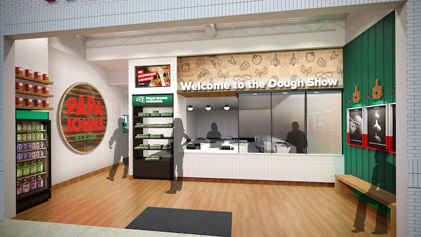
Image via Papa Johns / Business Wire
According to a press release, Papa Johns will lavish its communications materials with “photos celebrating the best pizza moments” and adopt a “hand-drawn happiness” illustration style to embody its playfulness and handcrafted nature. It will also put emphasis on its use of quality ingredients by spotlighting them in advertising.
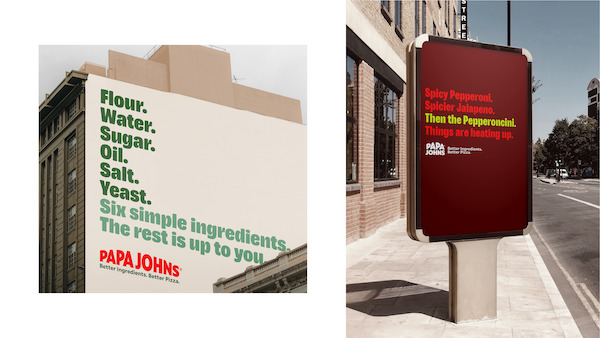
Image via Papa Johns / Business Wire
Outlets will feature an open-floor layout and new ways to easily take food to go, such as pickup counters and self-service checkouts.
Papa Johns will begin this grand transition at the end of the year, though updates will be “gradual.”
[via CNN Business, images via Papa Johns / Business Wire]


