
PANTONE Unveils 2022 Color Of The Year, ‘Very Peri’, A Hue Invented From Scratch
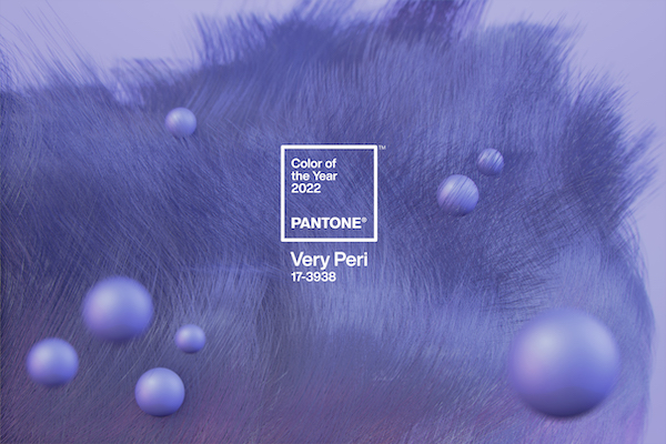
Image via PANTONE
As we step into the last days of the year, PANTONE is looking forward to 2022 with its annual Color of the Year. For the year ahead, the global color authority has chosen the shade ‘Very Peri’: a periwinkle blue that inspires calm but is vivified by a violet red undertone.
Instead of dipping into its existing database of hues, this is the first time the company has created a brand-new shade. The team blended the constancy of blue with the excitement of red, resulting in a blue hue that’s both carefree yet empowering.
“Creating a new color for the first time in the history of our PANTONE Color of the Year educational color program reflects the global innovation and transformation taking place,” said Laurie Pressman, Vice President of the PANTONE Color Institute.
“As society continues to recognize color as a critical form of communication and as a way to express and affect ideas and emotions and engage and connect, the complexity of this new red-violet-infused blue hue highlights the expansive possibilities that lie before us.”
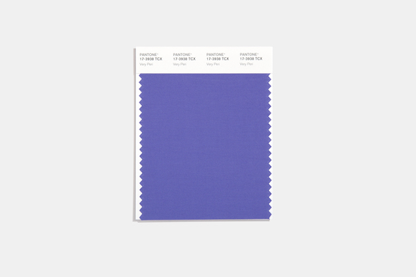
Image via PANTONE
While society emerges from a prolonged period of isolation, Very Peri represents the transformative times we’re living in, with our notions of daily living changing, and our physical and digital lives becoming more intertwined.
The “happiest and warmest of all blue hues” illustrates the complexity and fusion of modern life together with an “empowering mix of newness.”
“The selection of PANTONE 17-3938 Very Peri brings a novel perspective and vision of the trusted and beloved blue color family,” explained Leatrice Eiseman, Executive Director of the PANTONE Color Institute.
“Encompassing the qualities of blues, yet at the same time possessing a violet-red undertone, PANTONE 17-3938 Very Peri displays a spritely, joyous attitude and dynamic presence that encourages courages creativity and imaginative expression.”
Image via PANTONE
Image via PANTONE
[via PANTONE]
Also check out these recent news


