Aardman Animations Debuts Thumbprint-Coated Branding Honoring Its Unsung Heroes
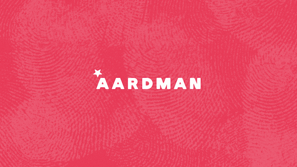
With clay, artists leave signatures in the form of fingerprints on their work, whether intentional or not. All this, however, is wiped out in polishing. In a massive visual rebrand, Wallace & Gromit creator Aardman Animations is adding them back in a warm yet subtle nod to the people behind its success.
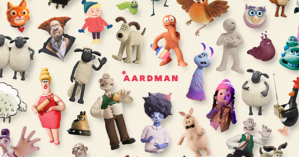
In its first major makeover in decades, Aardman, whose numerous other Plasticine-modeled masterpieces include Shaun the Sheep and Chicken Run, accentuates its visual identity with thumbprints, imprinting on it both its claymation roots and the hands that sculpt its story—“from development and production to the operations, sales and marketing teams that all play a vital role in the studio’s success,” the Bristol-based studio details. The overhaul was completed in-house, in line with Aardman’s becoming an employee-owned entity in 2018, according to It’s Nice That.
For authenticity, Aardman director and designer Gavin Strange told the publication he “looked inwards,” ultimately creating a look and feel untouched by the influences of other branding projects. “I looked at Aardman the company and the people and used all of that as inspiration,” he shared with It’s Nice That. “I feel really strongly about communicating the charm, craft, and warmth of this place, so that’s why it was important to look inwards at the work we make to try and find a graphical solution.”
Image via Aardman
Nothing can truly come as close to Aardman’s core as the expression of tactility. “Historically we always loved to see thumbprints on the clay to get across the handmade-ness,” described Strange. However, the team isn’t looking to be defined by fingerprints; after all, it’s now pivoted to take on projects like 3D video games and immersive 4D experiences. So designers decided to “show, don’t tell” and let the work speak for itself instead, said Strange.
The new Aardman website encompasses this new, homemade feel, as well as more prominently recognizes the creators behind the animations.
Elsewhere, Aardman has introduced a softer revamped logo, retaining key elements like the star and the color red. Meanwhile, it has expanded its color palettes to offer more adaptability for partners of its growing portfolio. ‘Rubik Black’ is now its header font, while ‘Source Serif Pro’ will be used for body text.
“This new branding is a reminder that from its local roots in the South West of England, the studio competes internationally with the biggest in the business, thanks to an incredible team of creatives, producers, artists, sales and marketing experts, and operational masterminds,” noted Sean Clarke, Managing Director of Aardman. “It paves the way for a successful future in which we continue to bring the most compelling and inspiring stories to audiences of all ages, all over the world.”
[via It’s Nice That and Aardman, images via Aardman]


