
Google Chrome Unveils Its First Logo Change In 8 Years To Be Easier On The Eyes
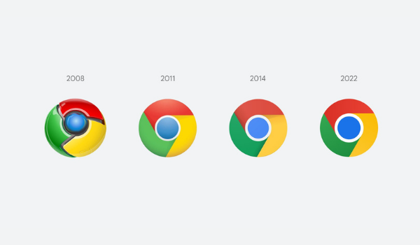
Users of Google Chrome could soon see a subtle change to its logo, with the company rolling out the web browser icon’s first redesign in eight years.
According to 9to5Google, back in 2011, Chrome’s logo saw its most dramatic update from a 3D emblem to a flat one, and the firm tweaked it a little three years later. Since then, it’s remained unchanged—till now.
Google said it has modernized the icon once again to better align with its “modern brand expression,” by removing the shadows between the red, yellow, and green while “refining the proportions and brightening the colors.”

Additionally, as per designer Elvin Hu, the team added a “subtle gradient” to reduce an “unpleasant color vibration” between the green and red.
Alongside the update, Google will be customizing its icon to suit specific operating systems, tailoring the browser’s experience to fit seamlessly with Windows, Mac, or Android.
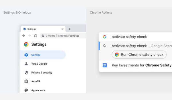
“We tailor Chrome’s experience to each OS, with features like Native Window Occlusion on Windows, day-one M1 support on macOS, Widgets on iOS/Android, and Material You on Android,” explained the designer.
News18 noted that users of Chrome Canary, the developer version of the browser, will be able to see the new icon immediately, while Google will roll it out to everyone on the regular browser over the coming months.
Take a look at the changes in more detail in the Twitter thread below.
We simplified the main brand icon by removing the shadows, refining the proportions and brightening the colors, to align with Google's more modern brand expression. pic.twitter.com/Hyig51gqJq
— Elvin 🌈 (@elvin_not_11) February 4, 2022
[via 9to5Google and News18, images via Elvin Hu / Google]


