
Baskin-Robbins Debuts A Fresh Lick Of Frosting In Major 50s-Style Rebrand
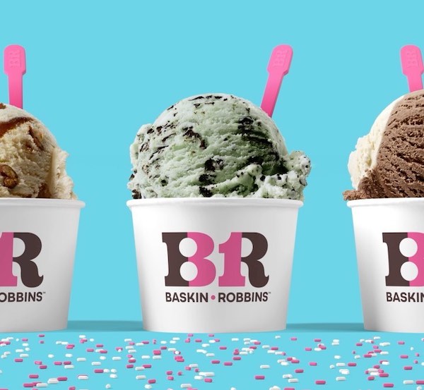
Image via Baskin-Robbins
I scream, you scream, and Baskin-Robbins screams for a fresh start. The ice-cream chain has adopted a vastly different visual identity to freeze its legacy into the future.
The revamp, designed by branding agency ChangeUp, moves away from the irregular letters of the past logo in favor of a mid-century-esque serif font, along with a swirl in the ‘R’ that reminds us of the texture of ice cream.
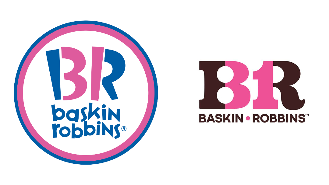
Old logo (left) VS new logo (right). Images via Wikimedia Commons and Baskin-Robbins
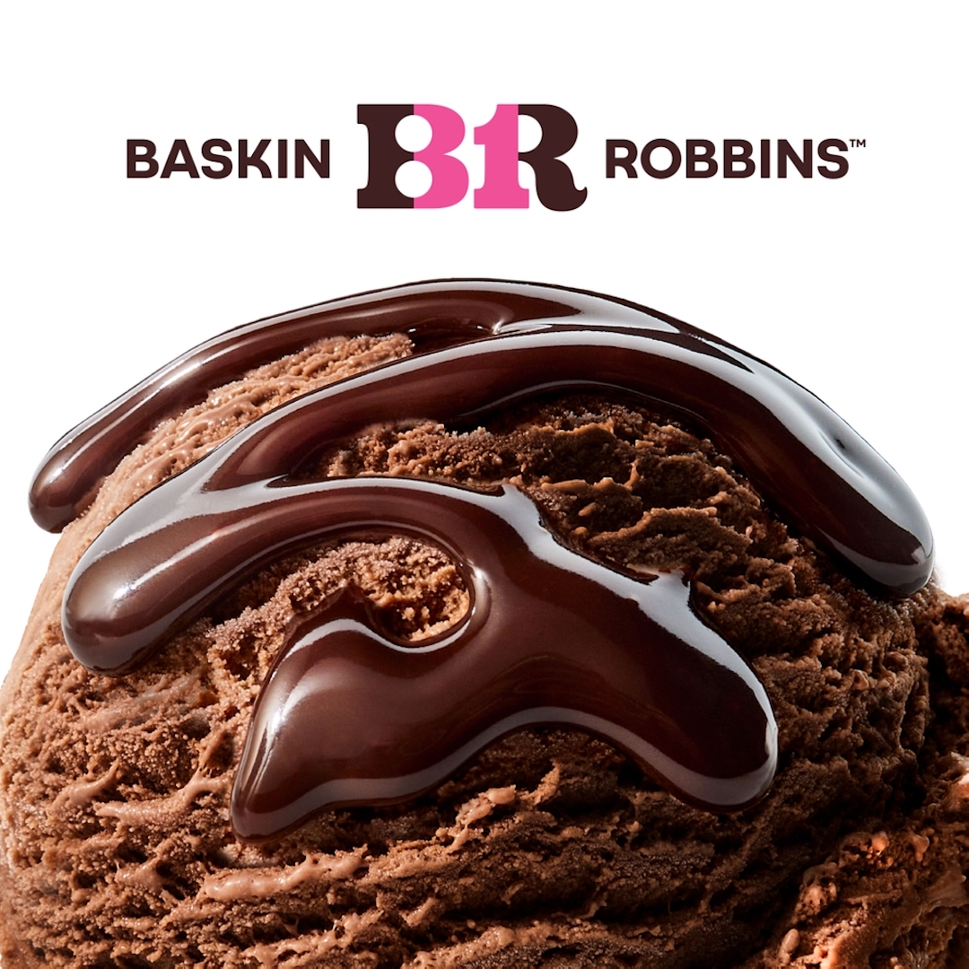
Image via Baskin-Robbins
This new flavor of logo will see mix-ins of brown and pink, brown and blue, and pink and white, as reported by CNN.
Although unfamiliar, the fresh redesign crystallizes Baskin-Robbins’ heritage by once again highlighting the ‘31’ between the brand’s initials, pointing at the 31 flavors that the shop served for every day of the month. The monogram, of course, is a nod at founders and brothers-in-law Irvine “Irv” Robbins and Burton “Burt” Baskin.
The logo takes inspiration from the brand’s first advertisement under the Baskin-Robbins Ice Cream moniker (adopted in 1953) and its circus iconography, Jerid Grandinetti, VP of marketing and culinary at Baskin-Robbins, told CNN.
When gauging customers’ perceptions of the company, Baskin-Robbins learned that they associated it with sweet nostalgia and were reminded of their childhood with their parents or grandparents. Accordingly, consumers also had the impression that Baskin-Robbins had room to become more relevant.
Perhaps the cherry on top for fans with a sweet tooth for change is that Baskin-Robbins is now selling ice cream-inspired bicycles as part of its merchandise, in addition to swag like sweatshirts, bucket hats, and scrunchies. Not to mention, three new ice cream flavors.
All these add up to give meaning to Baskin-Robbin’s newly-scooped tagline, “Seize the Yay,” which calls for customers to celebrate every moment, whether big or small.
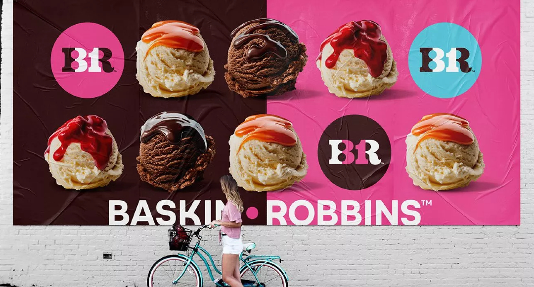
Image via ChangeUp
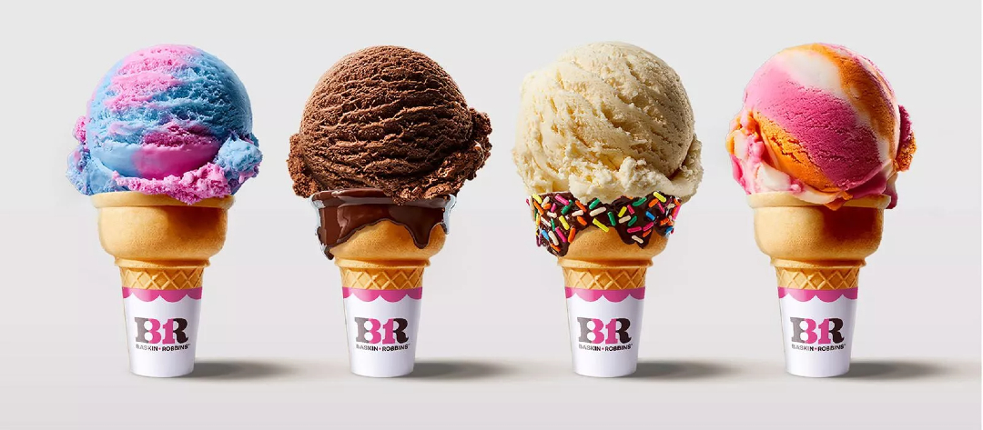
Image via ChangeUp
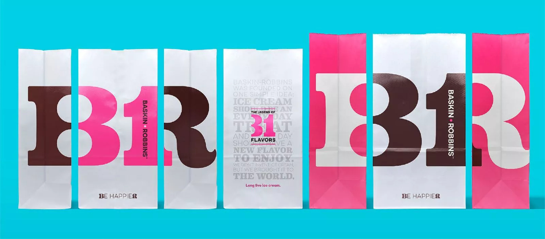
Image via ChangeUp
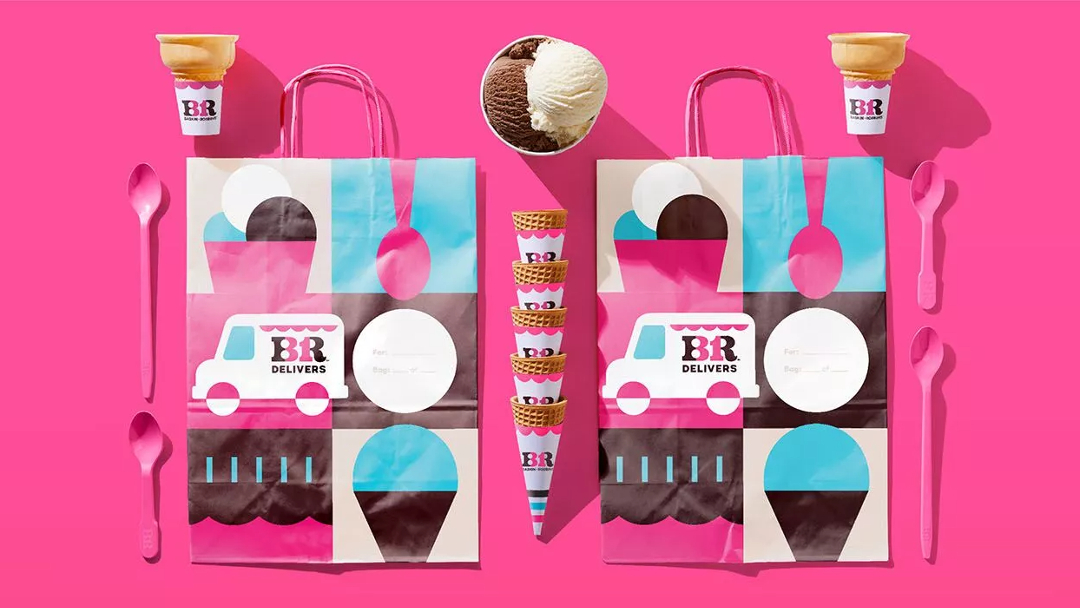
Image via ChangeUp
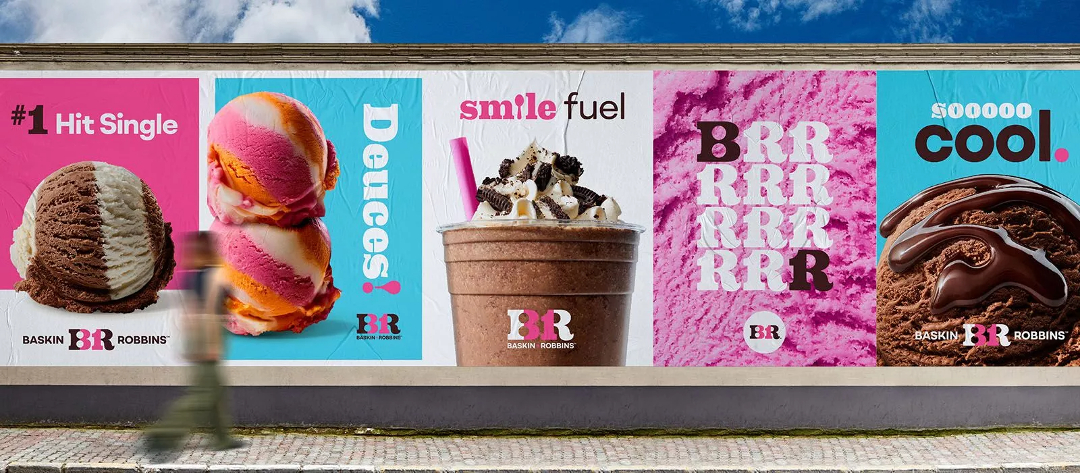
Image via ChangeUp
[via CNN and Baskin-Robbins, images via various sources]


