
Mastercard Creates Ad For Visually Impaired To Match Its Accessible Cards

Video screenshot via Mastercard
When advertisers promote their products, they seem remarkably adept at targeting the right audience—except when accessibility comes into play. It’s often expected that the abled persons in the circles of people with disabilities would see those commercials and buy those products for their friends, but the intended users are far more capable than others credit them to be.
Mastercard walks the talk with a thoughtful spot that encapsulates what its accessibly-designed, differentiated cards are all about.
For starters, the video—produced by filmmaker Fredrik Bond and advertising agency McCann—is narrated with audio descriptions, allowing the partially sighted and the blind to follow the plot at the same pace as everybody else, and making the film enjoyable for all.
Spotlight stars Marilee Talkington, a legally blind actor and activist, whose character Marjorie explores her neighborhood in near darkness, illuminated by a spotlight that is cast on other subjects. Throughout, the protagonist is very much in her element and doesn’t seem bothered by changes in stimuli.
Sound effects differentiate their actions, and Dolby Atmos spatial audio enables listeners to trace everyone’s movements.
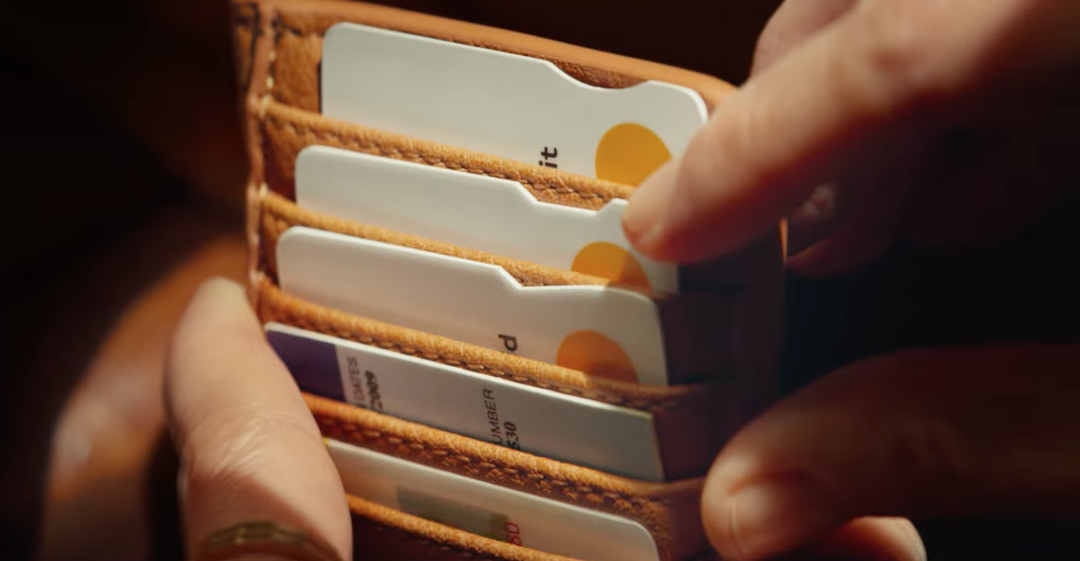
A full scene finally comes into view when Marjorie enters a café and feels her cardholder for the right Mastercard Touch Card.
Video screenshot via Mastercard
The new inclusive cards are notched so visually-impaired owners can tell them apart by touch. A square cutout tells them it’s a credit card, a circle means it’s a debit card, and a triangle represents prepaid.
The film concludes with the tagline: “Because a world designed for all of us is Priceless.”
[via Colossal and LBB, video and screenshots via Mastercard]


