Don't miss the latest stories
Advertise Newsletter
Network
  • The Bazaar
  • The Creative Finder
  • Deals
Shop

Follow

Share this

PANTONE
Art
Colors
Creativity
Imaging
NASA
Space
More
  • Cars
  • WTF
  • Instagram
  • Entertainment
  • Creativity
  • IKEA
  • King Charles
  • McDonalds
  • Nike
  • Tesla
  • Branding
  • Music
  • Advertising
  • Art
  • Travel
  • Creativity
  • Imaging
  • NASA
  • Space
  • Cars
  • WTF
  • Instagram
  • Entertainment
  • Creativity
  • IKEA
  • King Charles
  • McDonalds
  • Nike
  • Tesla
  • Branding
  • Music
  • Advertising
  • Art
  • Travel
MENU
  • Advertise with us
  • Submit tip/feedback
  • Work with us
  • Subscribe to newsletter
  • Subscribe to RSS
Advertise here
Advertisement

PANTONE Condenses NASA’s Stunning James Webb Images Into Color Palettes
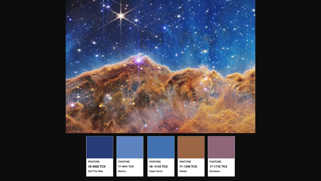
By Mikelle Leow, 27 Jul 2022

Share on Facebook Twitter
Subscribe to newsletter
Like us on Facebook

Image via PANTONE


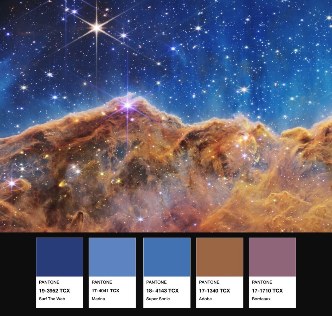
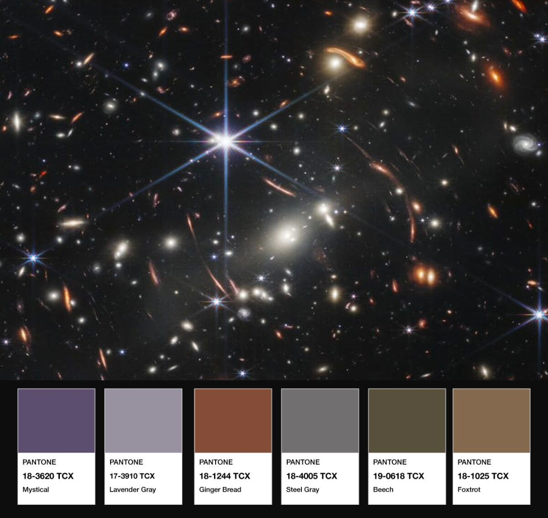
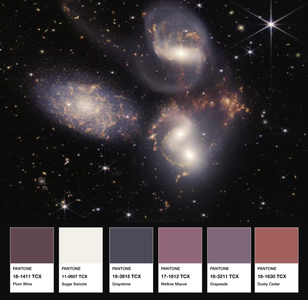
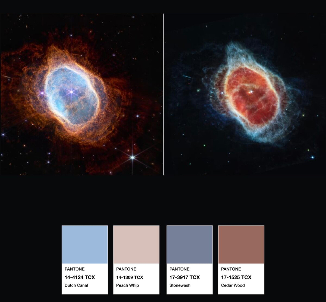
It’s been a stellar month for NASA and space enthusiasts, as the world caught a glimpse of the first official images from the James Webb Space Telescope, revealing the sharpest look at the universe yet.


The pictures are a colossal jump from those taken by the Hubble Space Telescope, so you can’t blame scientists for getting emotional over the results. NASA has been so moved by the crispness and vibrancy of the images, it’s enlisted PANTONE to capture their colors into solid swatches.

Advertisement
Advertisement


Through the high-definition shots, the imagery “[communicates] every phase of 13.5 billion years of cosmic history—from within our solar system to the most distant observable galaxies in the early universe to everything in between,” the color authority explains on LinkedIn. Much of this remains beyond humans’ depth of understanding. What we can comprehend, though, is the powerful language of color.


As users have pointed out, these snapshots are imaged by humans and only depict hues that the human eye can see; imagine an entire universe of cosmic colors we haven’t experienced yet. Some of the colors are ironically labeled with earthly names like ‘Adobe’, ‘Marina’, ‘Dutch Canal’, and ‘Cedar Wood’, which kind of proves that point.


Image via PANTONE


Image via PANTONE


Image via PANTONE


Image via PANTONE


[via PANTONE]

Share on Facebook Share on Twitter
If you’re enjoying DesignTAXI, please consider supporting our work with a contribution. Thank you. Cancel anytime.

Receive interesting stories like this one in your inbox
Advertise here

More related news

Advertise here
Also check out these recent news
Meta
Link to news page

Meta Rolls Out Free AI Image Generator Trained On Instagram & Facebook Pics

PANTONE
Link to news page

PANTONE x Cariuma Sneakers Take 2024’s Color Of The Year ‘Peach Fuzz’ To Streets

Adobe
Link to news page

Adobe Unveils Creative Predictions For 2024, Where AI Art Mixes With Calm & Joy

PANTONE
Link to news page

PANTONE Releases Official Wallpapers For 2024 Color Of The Year & Before

IKEA
Link to news page

IKEA Stretches Into First-Ever Workout Line To Turn Homes Into Space-Saving Gyms