Tabasco Comes In Hot With Bright Visual Identity Made To Linger Globally
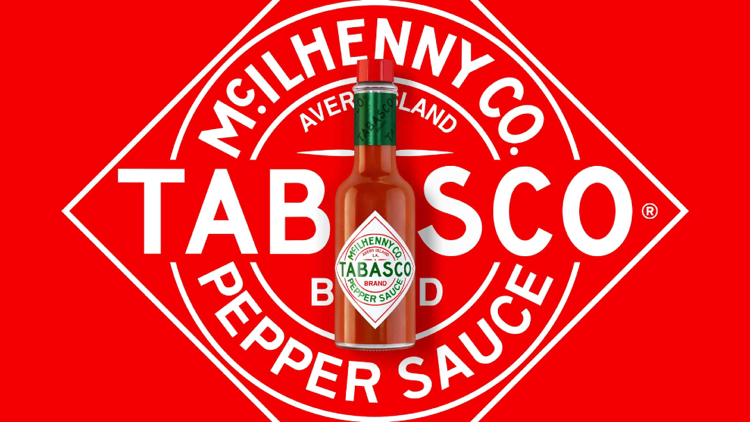
Tabasco has brought the spice for more than 150 years, but it never got the recipe for its branding right. Its look varied depending on where you lived. It’s been a long time coming, but the hot sauce brand has finally debuted its first-ever visual identity system, unifying its branding all over the world.
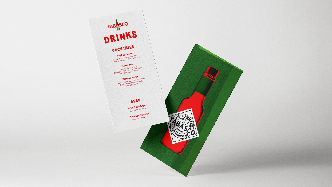
For the perfect amount of sizzle, Tabasco enlisted New York creative agency Mrs&Mr to build its global visual identity, with ‘Light Things Up’ as its theme and new tagline. The revamp refines classic elements of the brand, so it’s still the same Tabasco that ignited fans’ hearts.
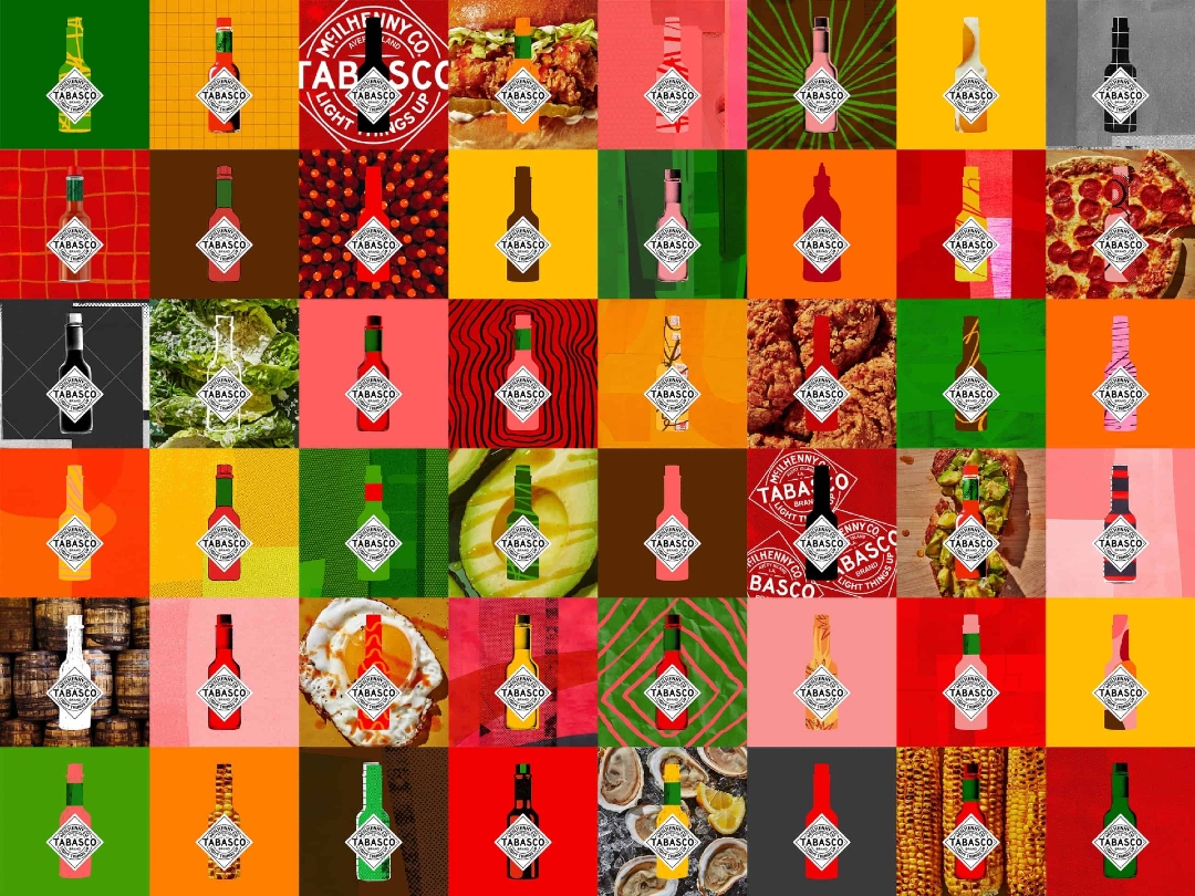
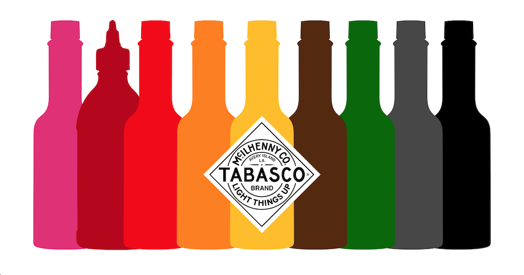
Steering clear from tacky imagery to insinuate heat, like flames, the new brand system embraces bold colors and artwork instead. It is designed to be versatile, serving as a template that can be readily seasoned to reflect the needs and tastes of local markets, flavors, as well as activations.
The diamond-shaped logo has been redrawn, and illustrated backgrounds give off a more authentic, handmade quality.
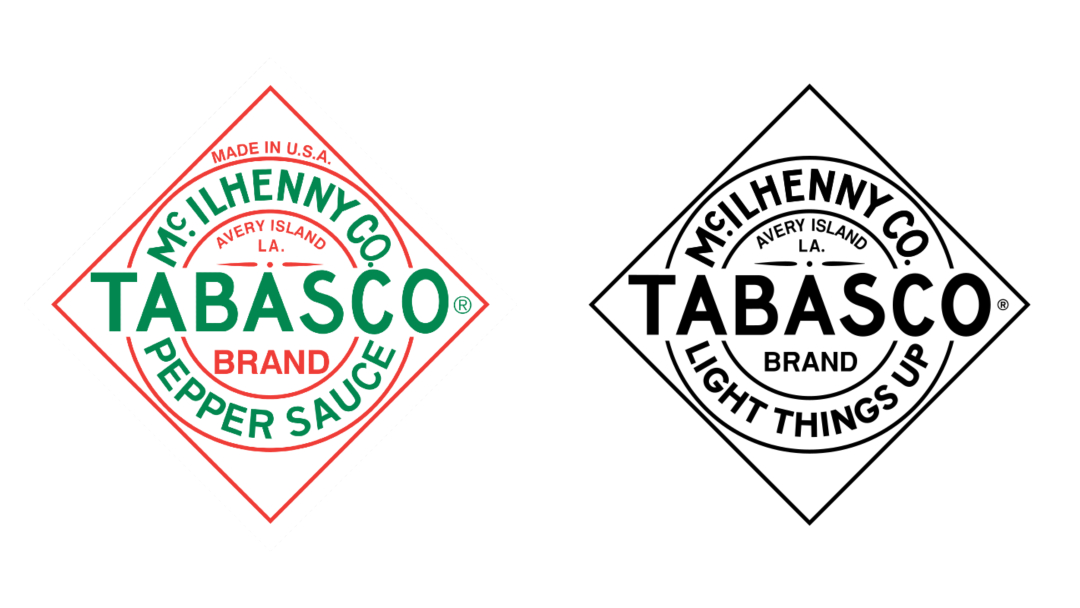
Old logo VS new logo. Images via Wikimedia Commons and Mrs&Mr
Other additions to the visual identity include vibrant food photography, a refreshed color palette, and polished typography.
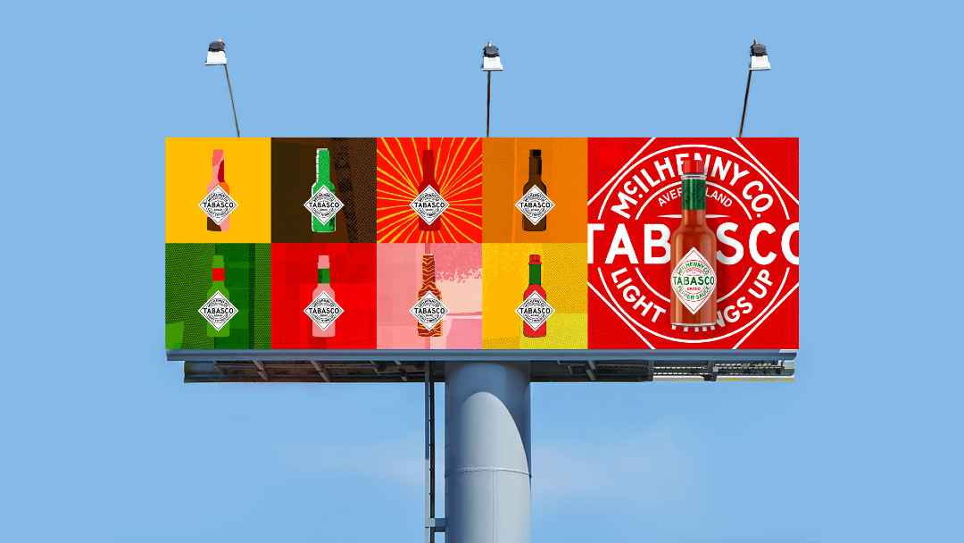
The saucy overhaul will make its way across Tabasco’s communication channels worldwide.
[via Creative Review and LBB, videos via Mrs&Mr, images via various sources]


