Spotify Refreshes Home Screen Design To Make New Favorites More Discoverable
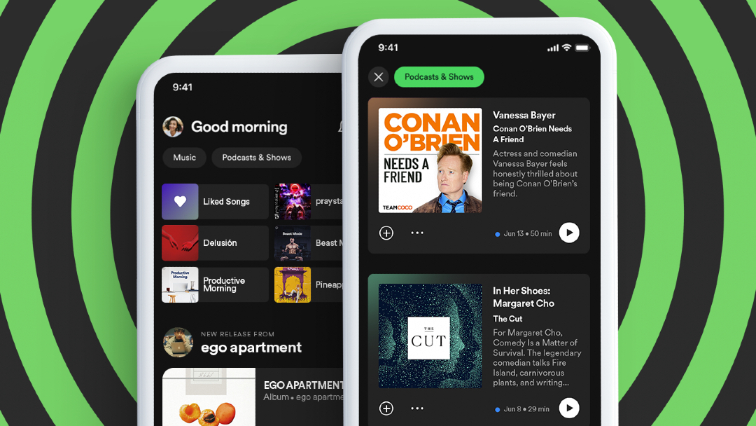
Image via Spotify
Practically every song you can think of that’s worth its salt (or not) exists on Spotify. While that’s a good thing for subscribers, it could mean that there are other great gems out there that haven’t been discovered.
On top of that, Spotify has recently brought in a whole tier of podcasts, inadvertently making its interface more cluttered. The streaming service thinks it may have a fix for that. It has refreshed its homepage so that music stays in its own lane and podcasts live in theirs.
The existing Home screen remains, but there are now two new feeds at the top leading listeners to ‘Music’ and ‘Podcasts & Shows’. The intention is for users to find what they’re looking for without the hassle while enabling them to plow deeper into the rabbit hole of content to discover.
Image via Spotify
The ‘Music’ tab allows listeners to jump straight to song, album, and playlist recommendations based on their preferences. There’s also a social networking aspect to it where suggestions are accompanied by buttons for users to share, like, and play music.
The ‘Podcast & Shows’ feed displays new episodes of users’ favorite shows, along with recommended podcasts. With the extra real estate, Spotify is now also able to share more details about the podcasts and shows, such as episode synopses.
Image via Spotify
The refresh will first make its way to Android devices before being added to iOS. Users who still prefer the old home feed can simply tap the ‘X’ to revert to the usual experience.


