YouTube Rolls Out Dramatic Redesign Mimicking TVs In A Dark Room
Watching a flick with the lights switched off hits different. As the surrounding furniture fades to black, you’re suddenly one with your favorite characters.
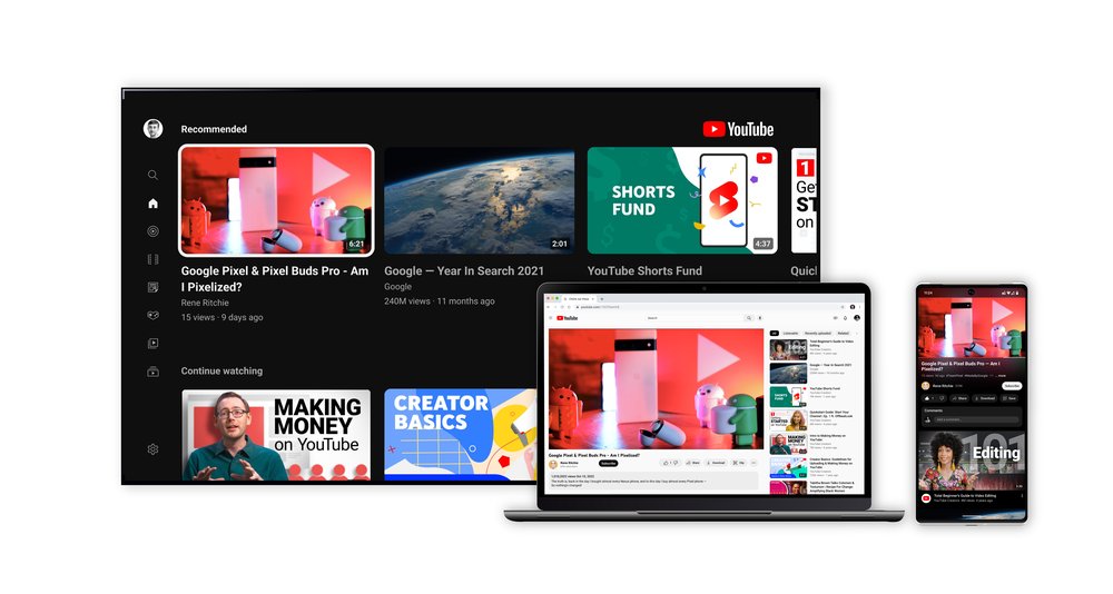
It’s a world apart from the experience of staring at a moving thumbnail on your web browser. YouTube is finally taking notes. It’s recreated the comforting feeling of seeing a film in the darkness of a theater or your living room as part of a massive redesign that’s currently being rolled out to desktop and mobile users.
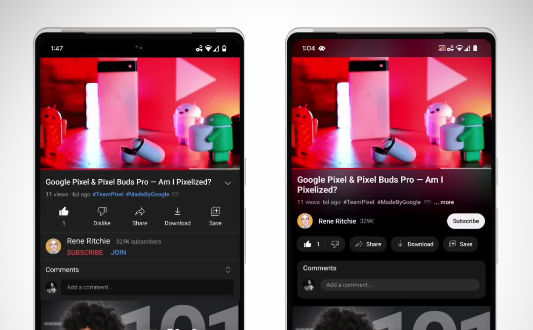
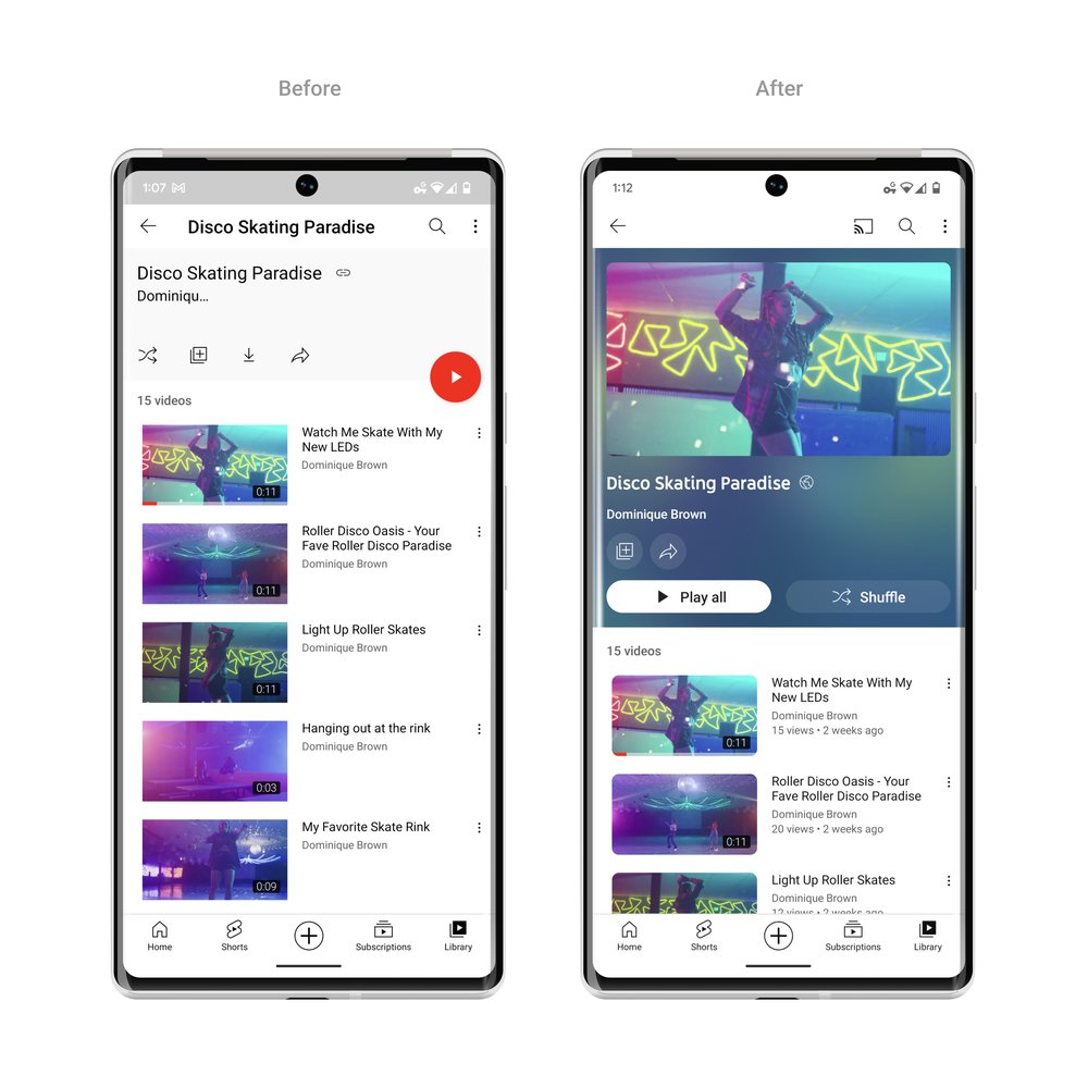
The first, no-brainer move was to make dark mode “even darker,” and YouTube has done this by evolving the former dark gray into a deep black. This mimics the dark bezels that televisions come with, and focuses the gaze on the content.
That’s only the beginning of it. YouTube’s designers also noticed how the light emitted from televisions bleeds past the frame and into the rest of the room.
The new YouTube view, called ‘Ambient Mode’, uses “dynamic color sampling” to gently reflect hues from the video into the background, even brushing them over buttons for the most natural viewing experience—just like the way colors bounce off television screens into your living space.
Video via YouTube
Aside from a visual overhaul, YouTube has made its mobile interface more intuitive with a pinch-to-zoom feature that lets you look at details in footage up close. The gesture is available for both iOS and Android users.
Video via YouTube
Pinch-to-zoom isn’t just helpful for users, but it’ll also expand creative possibilities for YouTubers. A spokesperson tells Fast Company that creators have been enamored with the idea of dropping Easter eggs that viewers can only discover when they zoom into a video.
Elsewhere, YouTube has subtly rounded its buttons. The difference is minimal, but this is apparently the look testers liked best. They ranked it above other iterations including an exaggerated one, endeared by the team as ‘Bloobtoob’, where buttons were bubble-shaped.
No longer bright red, the ‘Subscribe’ button is now black and white. It also now sits above the ‘like’ and ‘dislike’ icons. On a similar note, YouTube has shuffled the UI’s visual hierarchy around by moving the creator up, placing their name next to the ‘Subscribe’ button.
Separately, you can now scrub videos more precisely by dragging your cursor or swiping across the screen to open a row of thumbnails showing key moments you can jump to.
Video via YouTube
The feature is especially useful for longer-form content, since the slightest shift of your finger could have otherwise taken you minutes forward into a clip.
YouTube is confident the full makeover will appease viewers. After all, this look is the reigning version of 100 distinct concepts it had test-driven with users. So not only is it approved by YouTube, but by fellow YouTube-obsessed audiences too.
[via Fast Company, TechCrunch, YouTube, videos and images via YouTube]


