PANTONE x H&M Home Elegantly Splash Your Space With Color For Calm & Joy
H&M Home and PANTONE are painting the town red, blue, pink, green, and orange with stylish interior décor inspired by the way colors alter moods and bring inspiration to everyday life.
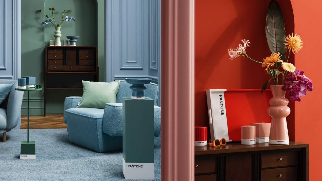
To match the emotional highlights you seek, the colorful yet softened selection is split into two palettes: ‘Calm & Soothing’ and ‘Energy & Joy’. Color has the power to stir up emotions. Blue—as H&M Home describes—reminds one of the sky, sea, and open spaces, and is thus traditionally associated with freedom and calmness. Red, on the other hand, brings heat, passion, and perhaps the dose of courage you desire.
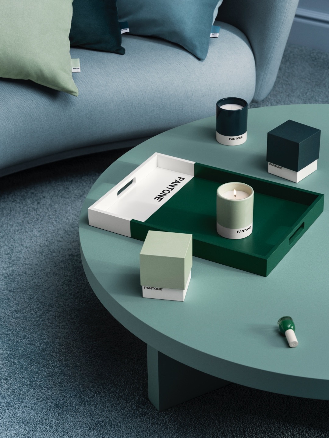
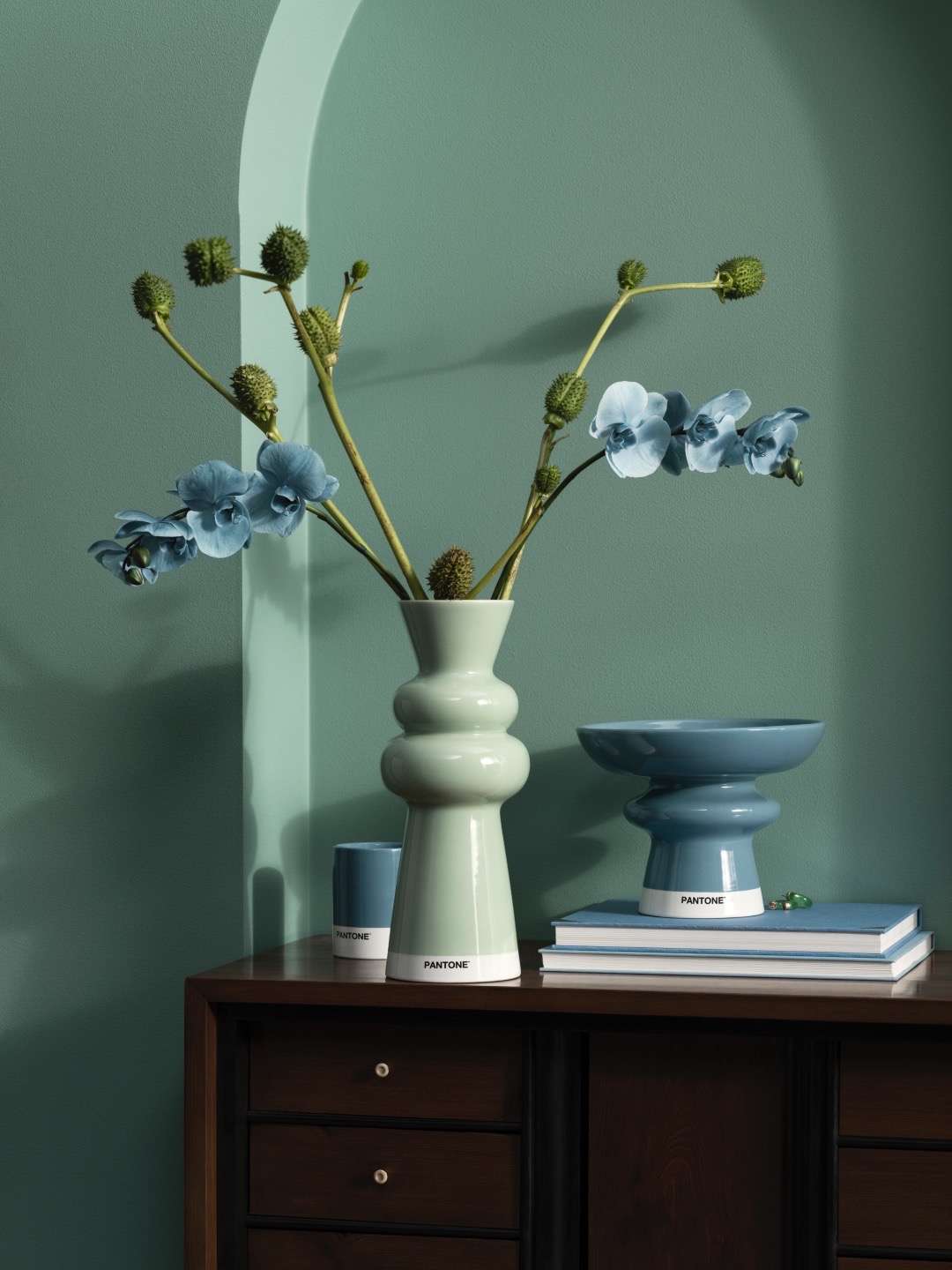
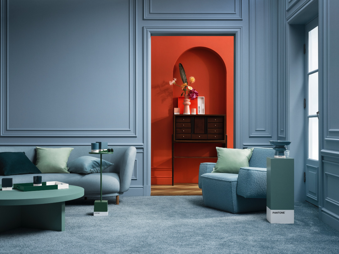
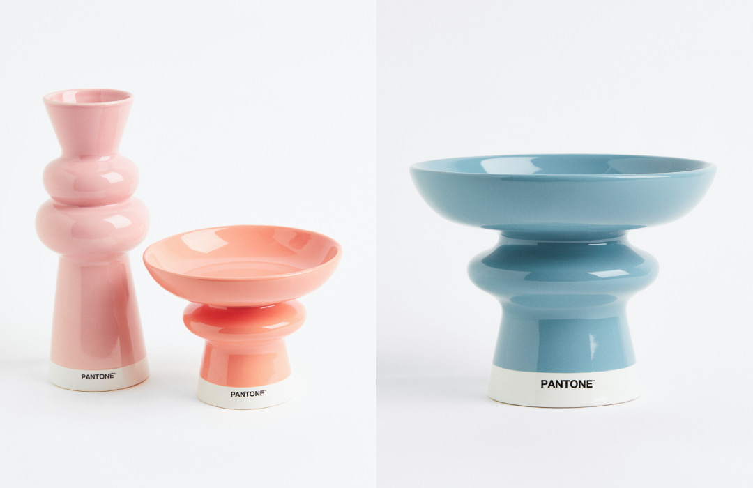
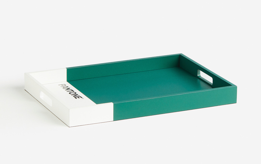
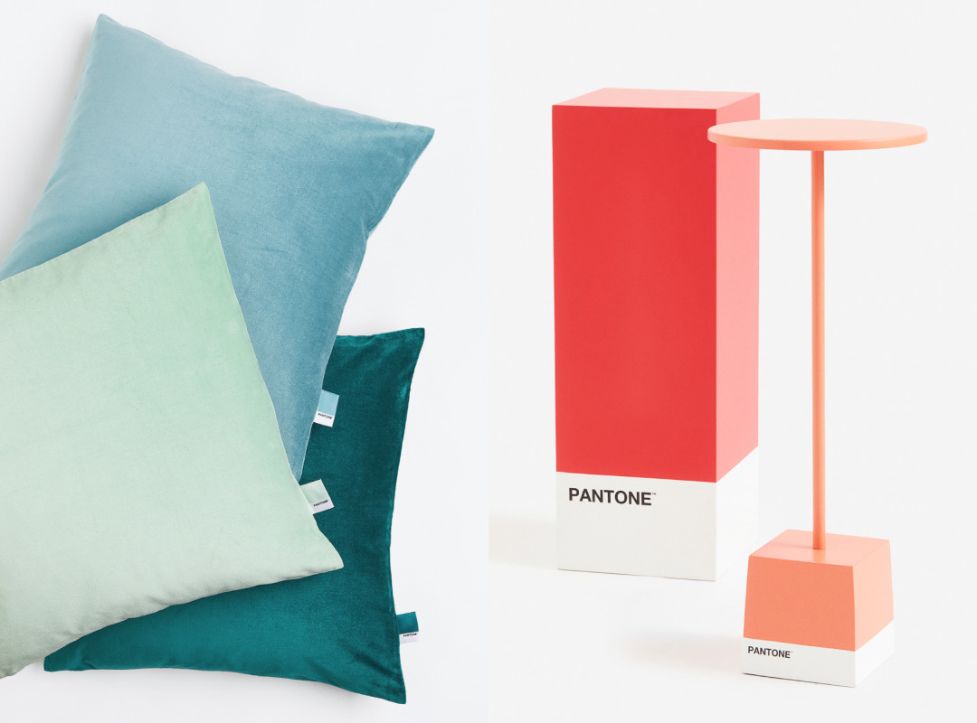
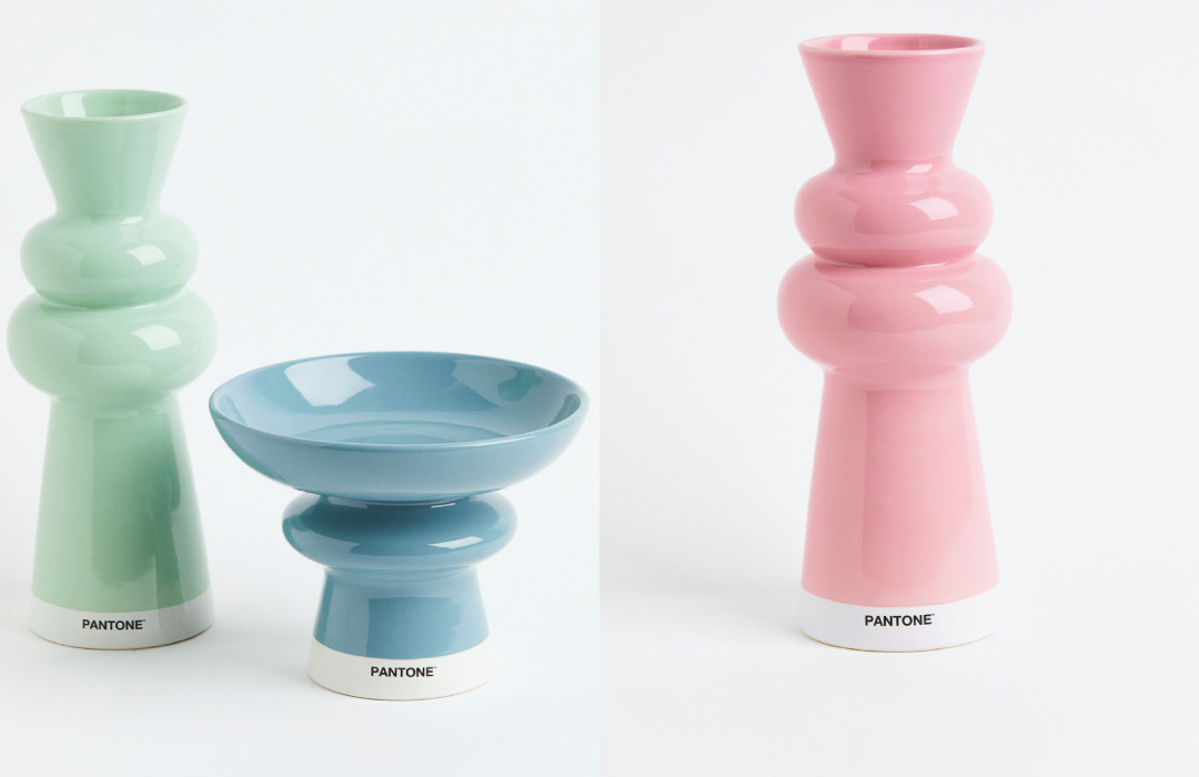
In the case of this lovely spectrum, the ‘Calm & Soothing’ lineup is tinted with PANTONE’s Pistachio (2260C), Petrol (548C), green (5545C), and Mid Blue (2178C) for a wave of tranquility and stability.
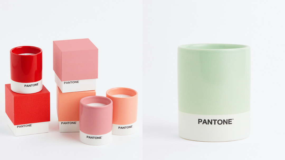
‘Energy & Joy’ is evidently more fired-up—it’s represented by hues like pink (707C), red (3517C), orange (2027C), and apricot (2022C) to add a pop of vitality and joy into your home.
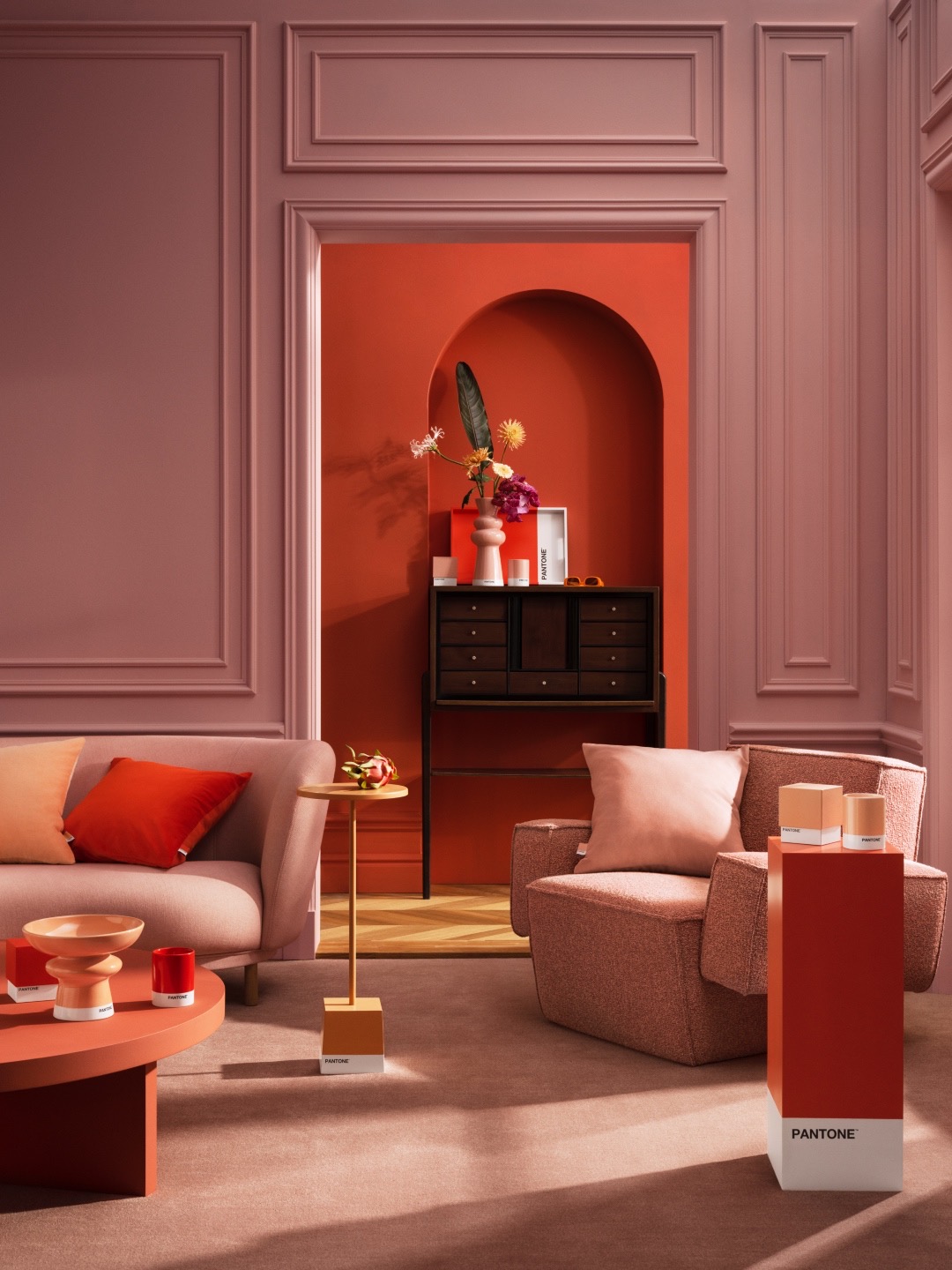
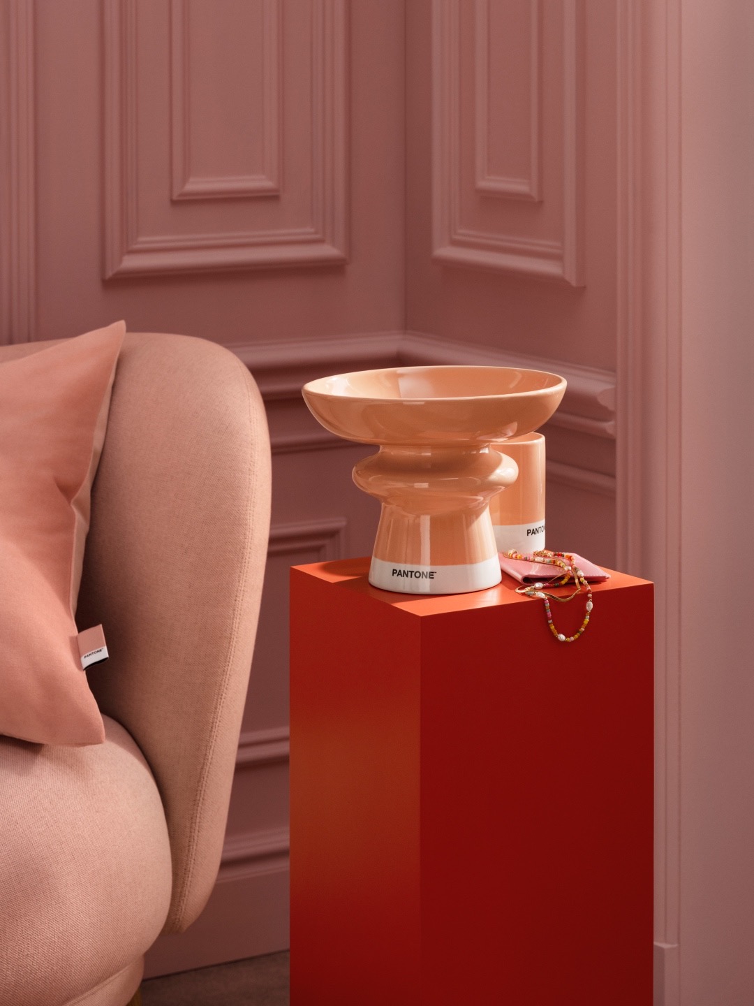
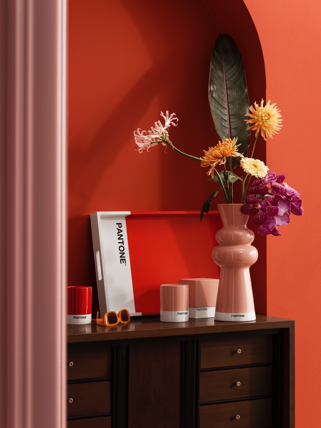
The warm and cool tones are splashed across modern keepsake items and homeware such as an architectural vase, cushion covers, trays, a side table, an ornamental pedestal, and scented candles in six colors.
“Color is essential for both our home and our senses. No one understands this better than PANTONE, who are the foremost experts on how color can influence how we work and live,” says Evelina Kravaev-Söderberg, Head of Design & Creative at H&M HOME.
H&M HOME ♥ PANTONE has arrived at stores and is also shoppable online. Does this range color you impressed?
[via Cosmopolitan UK and House Beautiful, images via PANTONE]


