
Netflix Overhauls Aesthetic To Favor Cinema Over ‘One-Dimensional’ Look
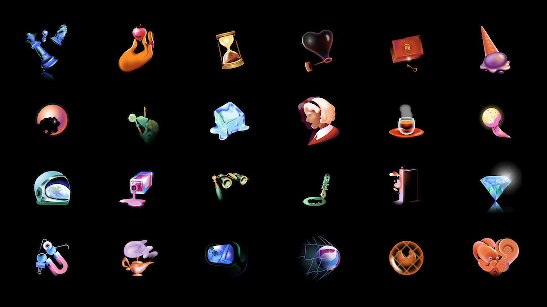
In recent years, the silver screen has been transported to your living room. Netflix bottles up this experience in its new graphic system, helmed by brand design studio Koto.
The visual toolkit encapsulates dynamic touches for the streaming giant’s iconography, typography, and illustrations. Koto drew from the language of cinema to stray from the “over-saturated, over-done, one-dimensional” design choices made by countless others in the tech and streaming spheres, instead opting for nods to effects and techniques present in the filmmaking process.
View this post on Instagram
Notably, the facelift includes compelling illustrations in a colorful filmscape of magenta, cobalt, and emerald. Their abstract appearance and soft gradients suggest that there’s more to the story… do you wish to continue watching?
Video via Koto Studio
Video via Koto Studio
Another clever consideration is the upgrading of Netflix’s white icons to a now-“widescreen” format, alluding once again to the cinema.
Video via Koto Studio
Video via Koto Studio
According to Creative Review, the spot illustrations and animations were created with Gica Tam and Michael William Lester of animation studio Beginners.
Video via Koto Studio
The new look “speaks to film enthusiasts, and feels immediately Netflix,” describes the studio. At the same time, it honors the platform’s core values of being “pioneering, welcoming, and always stimulating.”
Since Netflix’s audience tunes in from all sorts of devices, the graphic system includes variable interpretations of the bespoke Netflix Sans for consistency and legibility. “Our typography also had to remain legible in functional applications, and flex to bold, cinematic title cards, genre-specific, or thematic comms,” elaborates the studio.
Video via Koto Studio
Everything—from the icons to fonts, illustrations, and colors—join forces to form one joyful “cinematic universe.”
Video via Koto Studio
[via Creative Review and Koto Studio, images via Koto Studio]


